The Graphics Factory

Daniel

Of Ace Stevens fame.
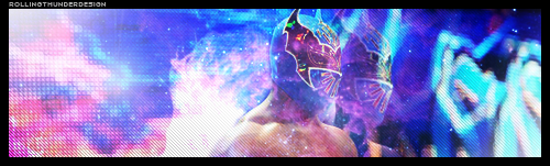
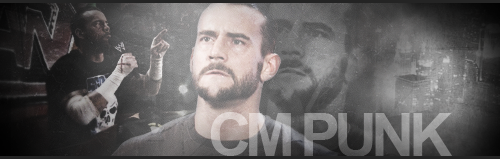
Yes, ladies and gentlemen, it's my brand new showcase thread! Here, I will post all of my graphics (that are good). They will sometimes be posters. They will sometimes be signatures. But I guarantee you that they will always be awesome. Hopefully.

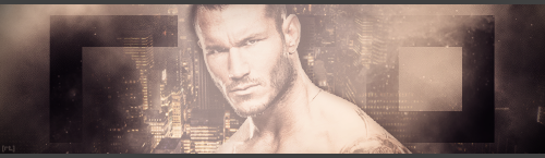
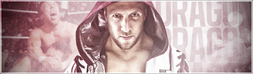
The first creation to make it's way into the Graphics Factory is a signature featuring the man of the moment in the wrestling universe: Zack Ryder.

zack_ryder_by_rollingthunderdesign-d3jpp4x.png

Making this was simpler than it seems. I started with the render and the New York skyline and then simply went from there. There was a fair bit of editing going on with the images, too much to really go into detail. I added a sparkly effect which I downloaded and changed the colour to purple. I put in his logo and changed the setting to "soft light". Then there's a line pattern and some light white and black brushing. I threw a whole bunch of adjustment layers into the mix and then turned my attention to the text. I made it look 3D and an outer glow. I felt it looked very Zack Ryder. An edited version of my logo and a border finished it off.

As always, give me feedback if you would like to. I assure you, it's always appreciated. Also, if you are that way inclined, you can find me on deviantART under the name RollingThunderDesign. So, yeah, do that.
 
So CM Punk, one of my all-time favourite wrestlers, is leaving WWE soon. So I thought I'd make a little something.

cm_punk_by_rollingthunderdesign-d3jsj9r.png

I selected my three main images and simply edited them. I can't remember exactly what I did but there was some brightness/contrast altering going on for sure. There's some grunge brushing going on, and then I did a few adjustment layers. I wanted to keep the background desaturated and have some colour in the main image. I then moved on to the text, still keeping it relatively simple. I think the font really suited the poster in general, as well as Punk. There's a vertical line pattern over the top, a bit more brushing, a logo and a border to finish things off. I don't really excel at grunge art but I'm happy with how this turned out.

Thoughts and shit are welcome.
 
I noticed a huge flaw in my original Zack Ryder sig. The text slightly overlaps the border. This was a rookie mistake which annoys me no end. So, I just re-did it. Yes, I am that anal.

zack_ryder_by_rollingthunderdesign-d3jpp4x.png

OK, now this would be the point at which I write "and now for something completely different". However, this is signature is pretty much the same. There are slight differences (it's a bit lighter, the methods are slightly different). But they are similar, and I'd be the first to admit that. However, it's these types of graphics that I love - the smooth and glossy ones.

the_miz_by_rollingthunderdesign-d3jw3sb.png

OK, I basically started a tutorial, got bored and did my own thing. I had a picture of WrestleMania knocking around on my computer so I thought I'd use that. There some render smudging to get a nice outer glow on The Miz. There's also a fractal render in their. I love using diagonal rectangles for some reason so I threw a couple in their. That's pretty much it really. It's just a really simple sig, but I like it.

As always, comments are welcome. In fact, they're not just welcome, they're encouraged. So if you have some time to spare, please tell me what you think.
 
These are both really nice. I too am quite fond of these glossy bitches, also the font you've used happens to fit the style perfectly. What font is that, out of interest?

Be nice if everyone employed the same level of quality control as you have in their showcases.
 
Thanks very much, Karilas. It's appreciated. The font is called Quer.

On to another one. It's Glastonbury weekend at the moment. I think it's known worldwide, but if not let me inform as to what it is. It's one of the biggest music festivals in the world. When it's on, the whole nation knows it's Glastonbury weekend and it's always covered in the news. I thought I'd do a poster to commemorate it. Beyonce is headlining on Sunday so I thought I'd pick her to centre the poster around.

glastonbury_poster___beyonce_by_rollingthunderdesign-d3jzk2x.png

It's prett simple but I enjoyed doing it. I started with the render of Beyonce and a photo of Glastonbury. I did some manipulation of the background image. Just a few adjustment layers and adjustment to make the lights stand out. I then moved on to the render and did the same thing really. There's also a sparkly fractal which I'm a fan of using. The text was easy, just a border, gradient overlay and an outer glow. I then moved onto the border. I used a technique I love which is basically duplicating the existing image, changing it a great deal and then erasing the centre to make it into a border. I put in the Glastonbury logo to make it look a bit more official. That's pretty much it. Oh, I also realised the render was a bit too sucky at the end - it was very grainy. A simple bit of light blurring worked a treat in making it look a bit less grainy.

So that's it. Thoughts and comments are always awesome.
 
It's BAAAAAAAAATISTAAAA!

batista_by_rollingthunderdesign-d3k65y6.png

I started this a while ago to fulfil a request. But Theo got there first and it got put on the back burner. However, a recent lack of creativity on my part made me persist with it. I'm going to have trouble remembering what I did. I started with the two images of Batista. I smudge the main one many times and added a red photo filter. I put in a photo of Sin Cara's minitron that I had. You can't tell it's that, I just wanted that LCD look. Some black, whie and red brushing followed. Then it came to the text. I struggled with it for quite a while until I settled on this. Copious amounts of adjustment layers, a logo and a border finished it off.

Thoughts, comments, criticisms and praised are actively encouraged. Oh, and if you want to use any of my sigs, be my guest. Beats them sitting around in this thread doing nothing.
 
Something very quick and simple, now.

sin_cara_by_rollingthunderdesign-d3kmtuc.png

I saw something similar to this on the internet and just wanted to see if I could do something similar. I started with an image of Sin Cara and increased the contrast. I put in a picture of a nebula and set it to lighten. I added a couple of splatter brushing, did a bit of light white brushing and put in a diagonal line pattern. I duplicated the original image, re-sized it, and erased some of it so I was left with a faint image of his head. Added a thick border, my name and I was done. Real simple, but sometimes there's nothing wrong with that.
 
Love this Sin Cara one. The blur/feint graphic of his head adds a different and brilliant dimension. It's actually beautiful to look at. Possibly one of my favourite things I've seen on here and that's not me trying to be really, really nice. Looks brilliant.
 
Something very quick and simple, now.

sin_cara_by_rollingthunderdesign-d3kmtuc.png

I saw something similar to this on the internet and just wanted to see if I could do something similar. I started with an image of Sin Cara and increased the contrast. I put in a picture of a nebula and set it to lighten. I added a couple of splatter brushing, did a bit of light white brushing and put in a diagonal line pattern. I duplicated the original image, re-sized it, and erased some of it so I was left with a faint image of his head. Added a thick border, my name and I was done. Real simple, but sometimes there's nothing wrong with that.

While I think this is one of your weaker pieces, it is still very good and shows Photoshop prowess. My main flaw with it is that your main image is Sin Cara, and it feels like the background (which is nicely done) is overshadowing him. I feel Cara needs to be emphasized more. But, again, it is still a good signature. I couldn't do this type of work.
 
It's BAAAAAAAAATISTAAAA!

batista_by_rollingthunderdesign-d3k65y6.png

I started this a while ago to fulfil a request. But Theo got there first and it got put on the back burner. However, a recent lack of creativity on my part made me persist with it. I'm going to have trouble remembering what I did. I started with the two images of Batista. I smudge the main one many times and added a red photo filter. I put in a photo of Sin Cara's minitron that I had. You can't tell it's that, I just wanted that LCD look. Some black, whie and red brushing followed. Then it came to the text. I struggled with it for quite a while until I settled on this. Copious amounts of adjustment layers, a logo and a border finished it off.

Thoughts, comments, criticisms and praised are actively encouraged. Oh, and if you want to use any of my sigs, be my guest. Beats them sitting around in this thread doing nothing.

Dude I love this sig! I love the colors, the flow, and the render you used.
I come by your Graphic page often, and you always seem to amaze me with your work! Love how you gave it a one color feel.
And made the edges black, and faded... simply awesome dude!

May I use this as my sig please?
 
I haven't posted in this section for a while now. So here's a little somethin'.

cm_punk_by_rollingthunderdesign-d410n7i.png

I'm going to struggle to remember what I did. I started with the two main images and increased the contrast and such. Then there's a bit of brushing in there, a texture or two and a stock of the Chicago skyline. I added some clouds and duplicated the main imaged, enlarged it, increase the contrast and decreased the opacity. The text and border finished it off.

I haven't made a "proper" graphic for over a couple of weeks, so feedback is more appreciated than normal. Thanks.
 
I don't know why I chose Randy Orton. Everything was flowing and it just felt right.

rko_by_rollingthunderdesign-d41e3g8.png

Clouds are pretty important to this sig. They help in providing a simple background, adding a misty effect and when set to soft light they can increase the contrast slightly. I then added a skyline (I love using skylines in my work) and then the render of Orton. Over the render I did a little light brushing, which I think provides the sig with some flow. I wrote "RKO" in the Quer font and set that to overlay. I added some adjustment layers (which aren't interesting enough to go into detail about), a border and I was done.
 
I can't believe I let this slip to the second page. Never again, I tells ya'. Never again...

Anyway, having finished sixth form, I've applied to do an Art and Design course at college with a view to studying graphic design at university. Therefore, I'm working on design "pieces" for a portfolio to get me into college. That means no more wrestling signatures and more "conceptual pieces".


the_power_of_words_by_rollingthunderdesign-d46zp9j.png


Words are powerful. I think we can all agree on that. I love words and they inspired me to make this. I started with a purple and white canvas and added a paper texture. I then got my text in early (Times New Roman - a very unfairly maligned font and one of my favourites). I then put in the background text, which is the opening passage of Genesis. I'm not religious, but the King James Bible is undeniably the most influential collection of words in the history of our civilisation. Then there's a lot of boring stuff like adjustment layers and that's it.

If you like it, then cool beans. If you don't, I'm sorry but it's all I'm going to be posting for a while.
 
I haven't posted in this section for a while now. So here's a little somethin'.

cm_punk_by_rollingthunderdesign-d410n7i.png

I'm going to struggle to remember what I did. I started with the two main images and increased the contrast and such. Then there's a bit of brushing in there, a texture or two and a stock of the Chicago skyline. I added some clouds and duplicated the main imaged, enlarged it, increase the contrast and decreased the opacity. The text and border finished it off.

I haven't made a "proper" graphic for over a couple of weeks, so feedback is more appreciated than normal. Thanks.

Wow!!!Man love it and love how much of a awesome technique you use to make this sigs.This Cm Punk really brings out uniqueness out if.So I will give you an A on it for this aweome sig with some unique features.
 
I really liked my Sin Cara signature and I wanted to produce something similar for my college portfolio. After all, I want to keep the wrestling graphics I show them to a minimum. I've been listening to a lot of Cee Lo Green lately, so I thought I'd make this. It's rather simple and it's more about how it looks rather than the processes used.

cee_lo_green_by_rollingthunderdesign-d47m6be.png

So yeah, I found a great base image. It oozes both coolness and passion at the same time. I altered the contrast a little bit and put in an image of a nebula. They're a fantastic tool when used right. They make graphics look more complex than they actually are. Then there's a few photo filters and gradient maps. Finally, I added a lens flare, some light brushing around the edge and the border. It's that simple. I prefer the Sin Cara one as I had more freedom to alter the image.
 
A while back, I produced a Mickie James poster. To this day, it remains one of my favourite pieces. It all just flowed very nicely. I wanted to something like that in my college portfolio, so this is a remix.

paul_mccartney_by_rollingthunderdesign-d47zy6j.png

I started with the background. A grey background. Then a I put in a paper texture and did some splatter brushing. Then came the image (which I cut out myself). I put in a couple of other textures, made them into small rectangles and cut them out a bit. Then came both the background and foreground text (the font is called "The King and Queen font" and the background text is the lyrics to Penny Lane). Then there's a whole bunch of adjustment layers and a border to finish it off.
 
I've decided to create a series of posters concerning superheroes, who in my eyes are pop culture in a proverbial bottle. Here is the first one.

2u44xt3.png

Pretty simple, really. I started with an awesome action shot and a skyline. I settled on blue as my colour and went from there. There's a couple of textures in there to give it that grungy, battered feel. I then went around the image with a black brush andd started on my text. The font is Impact and I wanted to keep it minimal but noticeable. Then there's a lot of adjustment layers to lighten it and do other stuff, and then there's a border.

That's about it. Feedback is appreciated and if you have a suggestion for a superhero, let me know and I'll probably do it.
 
28l9qv4.png
2dm5qo8.png
zkq0e0.png
So I haven't been very active in producing new stuff. I haven't been feeling particularly creative for a while. However, I just realised that I had these posters knocking around on my computer, so I thought I'd post them here. They a part of the same collection as the above Captain America poster. The idea is that they would be used as early promotional material for the new Avengers film coming out next year.

They all follow the same processes. I started with a coloured background, a city backdrop and a few textures. I want to get that paper poster feel, like something you'd see pasted on a wall in a New York street. I found the great action shots online and used some splatter brushes just behind them. Then there's a lot of adjustment layers (gradient maps, photo filters and the curve tool mainly). The text (impact font) and borders finished them off.
 
  • Like
Reactions: TLC
I'm slowly getting back into graphics and sig-making and stuff. I've had this idea in my head for a while now so I thought it was time to actually do it.

alberto_del_rio_by_rollingthunderdesign-d4dhlcw.png

I wanted to make a del Rio sig with a villa in the background to imitate his titantron/minitron set-up in WWE. I started with an image I found on Google and then added the render which is an action shot, not a posed one. Generally, I find using action shots of wrestlers preferable to posed photos. Then I added a few gradient maps (blue and gold) and a texture which gives a great grainy feel (if you can see the white flecks, that's the texture at work). I don't normally like using logos in sigs, but I feel in this one it works. Not other font I tried could beat the logo. Then there's another few adjustment layers (more gradient maps, desaturation, curves in particular), a cinematic border and that's it.
 
Here's something to commemorate that rarest of things: a positive TNA decision. I'm a huge James Storm fan and was delighted when he won the world title. I might even start watching Impact Wrestling again.

james_storm_by_rollingthunderdesign-d4dmx8j.png

I started with the two images I knew I wanted to include. There's a bit of basic brushing, a grunge texture and smudged duplicate of the main image to help it blend in. I then added a Bokeh stock (search for them on Google and start using, they're awesome), a nebula stock both set to soft light. I put in the text which was pretty much pain-free, and used a shattered glass image in the centre set to soft light again. Then there's a red and purple gradient map and a 3-pixel border and that's it.

Feedback would be cool if you have the time, even if it's only a few lines.
 
HOW DO YOU MAKE SUCH WONDERFUL PIECES?

Maybe I'm just feeling creatively drained but I'm in awe of all your pieces and your latest one especially. The colors, the composition, everything about it is just stellar. I love how you filled all dead space. I was worried about the right side as I gave it a glance but putting Storm's face in it fits perfectly. The text is just fantastic. Everything is fantastic. I'm jealous.
 
Thanks, Doc. I felt creatively drained from the start of September up till a couple of days ago when a did the del Rio sig. I feel like I've got a second wind now, or something.

I, like everyone else, am anticipating the moment when Daniel Bryan snaps and becomes a crazed submission machine. So I quickly made something for the impending return of the American Dragon.

daniel_bryan_by_rollingthunderdesign-d4dpa7w.png

I started with the two images (the main render is an awesome shot of him) and used a smudge brush for the background. A grunge texture came next (grunge textures really are a saviour) along with a Bokeh stock on the right side. I added the repeating text (I wanted to also write "return of the dragon" but I couldn't find the right place to put it). There's a bit of white brushing over the top to help it all blend in. I then used the curves tool, along with the lighting effects tool to get the contrast right. Finally there's a few gradient maps, a gradient fill and the cool, dotted border to finish it off.

I'm really happy with this one, and if anyone wants to use it (or anything in this thread), feel free. Also, I might make my first tutorial soon if I can find the effort, so look out for that (possibly).
 
Dude, where have you been? I've been looking for someone like you to show up on this forum.

The lighting in your work is second to none. I will happily concede to you that you are legitimately the best graphic artist on this forum when it comes to the use of lighting and shadowing - it's really brilliant, what you do. My idea of creating depth is just using the high pass filter, you go so far beyond that. If you're going to do a tut, do a tut on how to be awesome at lighting, because that's one concept that has literally always escaped me in my GFX career.

You might be the only person on this forum who I look forward to seeing your next work, consistently. I'm not claiming to be the best on here (until you showed up), but in my eyes, nobody else has been worth waiting it out to see the next big thing until this thread. You sir, are my salvation in the Digital Art section of this forum. =D
 
Wow, Superhero, you're a bloody genius.

I love all of your sigs, they're all so beautiful to look at, seriously. I'm so jealous of your ability. I particularly love the Sin Cara one, that's awesome. Did you use a nebula stock in there somewhere? I've alway been pondering when to use a nebula stock but, I never can agree on when to use it. There's not a doubt in my mind, you're the best Graphics artist on here by a mile.
 
Dude, where have you been? I've been looking for someone like you to show up on this forum.

The lighting in your work is second to none. I will happily concede to you that you are legitimately the best graphic artist on this forum when it comes to the use of lighting and shadowing - it's really brilliant, what you do. My idea of creating depth is just using the high pass filter, you go so far beyond that. If you're going to do a tut, do a tut on how to be awesome at lighting, because that's one concept that has literally always escaped me in my GFX career.

You might be the only person on this forum who I look forward to seeing your next work, consistently. I'm not claiming to be the best on here (until you showed up), but in my eyes, nobody else has been worth waiting it out to see the next big thing until this thread. You sir, are my salvation in the Digital Art section of this forum. =D

Thank you very much. That put a big smile on my face. I'm just getting back into sig-making after a little while out and I wasn't particularly active before that anyway.

As for the lighting thing, I'm not sure. I just throw things at it until it looks good - although lens flare and and lighting effects are always my friends. I will definitely study my processes to try and create some sort of tutorial.

Wow, Superhero, you're a bloody genius.

I love all of your sigs, they're all so beautiful to look at, seriously. I'm so jealous of your ability. I particularly love the Sin Cara one, that's awesome. Did you use a nebula stock in there somewhere? I've alway been pondering when to use a nebula stock but, I never can agree on when to use it. There's not a doubt in my mind, you're the best Graphics artist on here by a mile.

Cheers. I've never so much flattery thrown my way.

I did use a nebula stock in the Sin Cara one. Really, I don't think there's ever a bad time to use one as long as you can make it suit the sig. I used one in the James Storm sig, believe it or not. I desaturated it, increased the contrast, set it to soft light and erased it a bit. As long as you use it well in between layers and don't show that it's actually a nebula, it can be a good substitute for a splatter brush.
 

Users who are viewing this thread

Members online

No members online now.

Forum statistics

Threads
174,826
Messages
3,300,732
Members
21,726
Latest member
chrisxenforo
Back
Top