Hey, so I thought it was time to do a thread. I'm a photographer really, but I saw you sig makers and I was really jealous of the stuff you have done so I thought i'd give graphics a go. I've been using GIMP for around four days now, i've found it to be quite user-unfriendly compared to Photoshop, but it's all I have at the moment.
Oh, and i'm not looking to show off, i'd really like advice, criticism, tips and tricks.
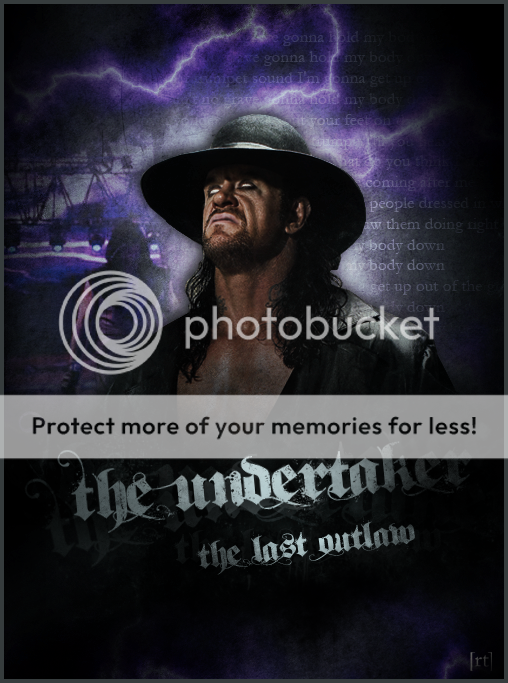
This one is the first graphic I made. It's of my favourite comedian and a bit of a hero of mine, Bill Hicks. I borrowed the phrase on it from another image I saw of him, however, they are different graphics. Like I said, the graphic is very simple. The background is one image to which I added the text and border. The words 'american' and 'hero' have a striped background (I would have like to have given them an American flag background but I didn't know how to do it). I gave motion blur to the word 'fucking' to make it a bit more interesting.

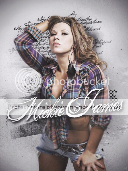
So this is the second one I did. It's of Lucky Cannon, obviously. I used the blending tool to do the silver background. I then put in a picture of Mark Henry and made it more transparent so he would blend into the background. The text was originally black, but I used the lighting tool to make the words lighter. Finally, I put in the star of the show, Lucky Cannon and a simple border.

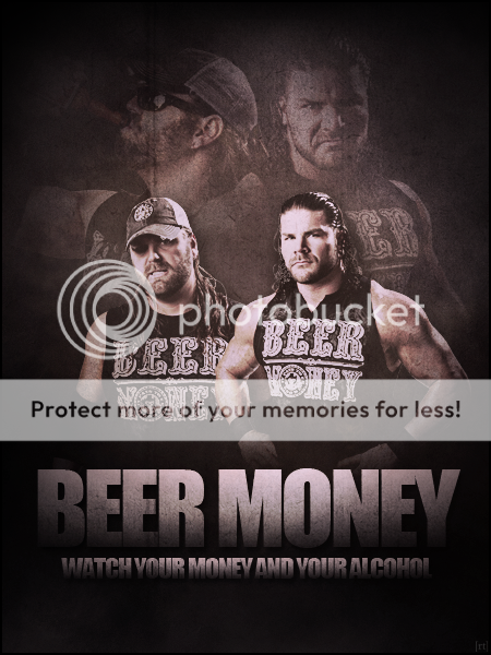
Finally, a sig of my favourite wrestlers when I was younger, Too Cool. Making this gave me nostalgia of when I was seven or eight. Again, I used the blending tool to create the black background with the silver line. I downloaded the image and the font (called TurnTablz) and did nothing to them apart from changing the text colour. I created the light tubes effect by again using the blending tool and then I did the border with the same colours. It was by mistake that the 'tubes' went over the border, but when I changed it I preferred the original mistake.

There you go. Hope you liked them. Please comment if you have the time, i'd really appreciate it.")
Oh, and i'm not looking to show off, i'd really like advice, criticism, tips and tricks.
This one is the first graphic I made. It's of my favourite comedian and a bit of a hero of mine, Bill Hicks. I borrowed the phrase on it from another image I saw of him, however, they are different graphics. Like I said, the graphic is very simple. The background is one image to which I added the text and border. The words 'american' and 'hero' have a striped background (I would have like to have given them an American flag background but I didn't know how to do it). I gave motion blur to the word 'fucking' to make it a bit more interesting.
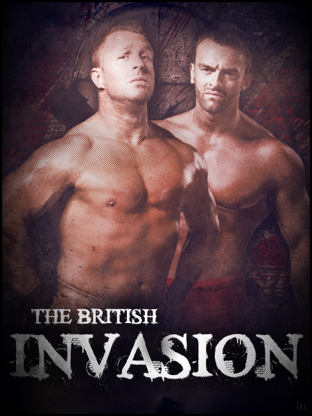
So this is the second one I did. It's of Lucky Cannon, obviously. I used the blending tool to do the silver background. I then put in a picture of Mark Henry and made it more transparent so he would blend into the background. The text was originally black, but I used the lighting tool to make the words lighter. Finally, I put in the star of the show, Lucky Cannon and a simple border.
Finally, a sig of my favourite wrestlers when I was younger, Too Cool. Making this gave me nostalgia of when I was seven or eight. Again, I used the blending tool to create the black background with the silver line. I downloaded the image and the font (called TurnTablz) and did nothing to them apart from changing the text colour. I created the light tubes effect by again using the blending tool and then I did the border with the same colours. It was by mistake that the 'tubes' went over the border, but when I changed it I preferred the original mistake.
There you go. Hope you liked them. Please comment if you have the time, i'd really appreciate it.