Straightedge Martyr's graphics

straightedge martyr

The Chosen One
Hello everyone,

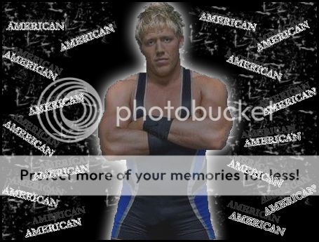
I recently tried making a few graphics for a friend of mine, but would really appreciate some helpful advice on how to improve. i know most of them aren't very could yet but i could really use some constructive somments. i have already made a few half-decent ones and am almost finished with a few more, so i will post them as they are completed.

Thanks for the help

miz.png


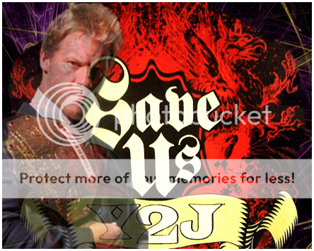
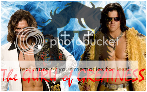
This is probably my best one, still not perfect but im quite happy with it. Any tips to help me improve on it, or any other constructive comment is appreciated.

edge.png


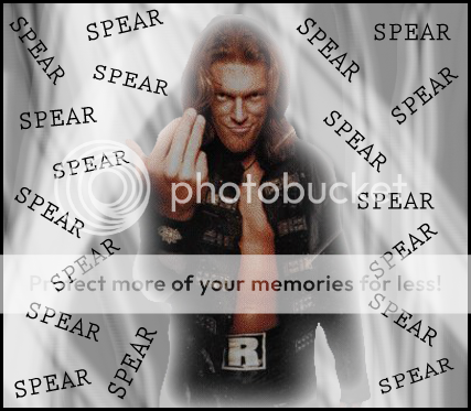
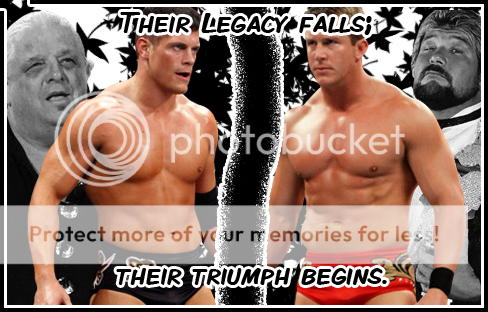
This was my first graphic that i completed, and turned out okay, i guess.

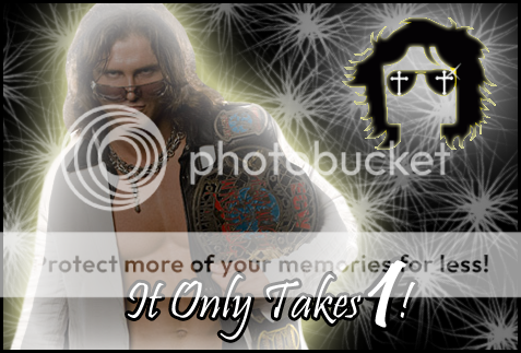
I will post more at a later date and any help would be much appreciated.
 
i've finished a few more graphics as well, so once again im going to ask for any sort of help as i would love to improve.

jericho2.png


This is my jericho sig, which was an okay early attempt i think, i'm not sure how well the image faded into the background worked out, so im open to objection on that. i was also hesitant about the puple glow, so let me know what you think.

JohnMorrison.png


Ah, John morrison, i found it quite difficult to find the images i wanted, but i think i found ones that work. i wasn't sure if the background should be so bright, as it de emphisised his logo, let me know your opinion on that one if you can.

batista.png


Ah, the batista sig, it was also difficult to find pictures of him, post heel turn 2009. anyway i went alot more simple with this design, but i dont know if its maybe too boring, ity up to you of course.

Thanks again.
 
OK, let's see here.

First off, what program do you use? GIMP? Photoshop? I can help you better if you use Photoshop but I can still give you some style pointers.

First off: I didn't notice the borders at first, because they'r white. Or at least your first few are. Might want to tell us that.

In your second sig, the text looks very out of place. The color does not work, and it would be nicer if you selected the text and center-justified it.

Other than that, they're OK. Very beginner, but of course that's to be expected.

Your third isn't half bad for someone starting out. I like the blending done there. The text color works as well, but the purple stroke around Jericho doesn't really.

The text totally throws off the JoMo one. The red is an awful color in a sig dominated by blue. Maybe make it a blue text with white stroke or vice versa. Same goes with Batista. Your text and colors need to match up to the general color scheme of the sig better.

For all of them, you NEVER want to squish pictures. In Photoshop, when you resize pics, hold SHIFT as you drag the corner handle. That may work in GIMP as well. Squishing pics is a grade-A No.

There's a lot of work to be done. Try looking at graphics you like and trying to figure out why you like them so much. Practice is the only thing that will help you improve, so keep on trying. :)
 
Okay, these are the last i have for a litte while at least. i have another 4 sigs to post so i hope you enjoy them and can help me out.

HartDynasty.png


This one i was not so sure about for a few reasons. firstly, i went with the simple design agaain, and im not sure how well that is working yet. also, after i had completed it, a second guessed my choice of background color. it may just be too pink. i origonally thought that, hart dynasty being pink and everything, that pink should be the background color. but i am torn as to whether or not it is a bit girly sort of pink. let me knw on that one if you can.

jericho.png


i took another shot at a jericho sig, and i think i might prefer the old one. but in any case i think it looks alright, just his logo really takes the emphisis off him. let me know, please.

RandyOrton.png


I went for an rko sig this time and am quite happy with this. i went a similar style to my earlier edge sig, and i think i prefer it in this style. but my opinions dont mean all that much, which is why i would much appreciate feedback.

y2jpunk.png


this is my first sig with multiple superstars in it, and i tried to find some common ground for the text to link it in. i think i did okay with that. i tried to do a more abstract background this thime, so let me know if you like that or not.

Again, any and every bit of advice is much appreciated.
 
OK, your sigs are all suffering from what I talked about earlier, except for the Hart Dynasty one. The Hart Dynasty one is very nice, though I believe a larger picture of the Dynasty would have been better. As it's a sig about a wrestling team, the team should be the main focus of said sig, instead of appearing like an afterthought, which is how it looks now.

The first Jericho one is not very good, as I believe the blending doesn't work very well. The other sigs have squished images or bad text colors, which need to be fixed. A hint for picking a good color for text is to use the color picker and sample one directly from your sig.

EDIT: Just realized "Dynasty" is spelled wrong. And you'll want to make it stand out more, possibly with a small pink stroke.
 
Thanks doc, for all the advice. its a lot easier to find your mistakes and fix them after they've been pointed out, so i will take everything on board for future reference. with the text in most of the images, i was trying to use contrasting color , otherwise i found the text to be lost in the background. but i still can see what you mean about it clashing badly and will rethink my text color scheme in the future.

I really appreciate you taking the time to look at my work, and will do my best to improve.
 
Okay, i took all the advice Doc gaveme and tried working on another Miz sig.
i made sure the text matched the image, the images aren't squished and fixed the border properties as well.

miz2.png


So let me know i this one works any better than the other, then i'll know if i'm on the right track or not. thanks for all the help.

Btw, doc i am using photoshop, is GIMP any better?
 
No, Photoshop is a lot better than GIMP. I use Photoshop.

Good work, dude. I like it a lot. My big complaint though is that the text is slightly hard to read, though you did a good job on matching. When I do text I sometimes add a stroke (outline) to it by going to the Layers palette and clicking the button that looks like an "Fx". Click on stroke and adjust it as needed. I would suggest having your stroke be 1 or two pixels big and making it either white or yellow, to match colors in the image.

Other than that it's a great improvement. I like it, and it shows off a good sense of style. Remember to keep practicing and trying your best. Try looking up different techniques and doing them yourself. The important thing though is to have fun.

:)
 
Okay, i've used the stroke on my text like doc suggested, and have come up with this.

dolphdrew.png


let me know if im heading in the right direction, and thanks for the help
 
okay, this time i went in a new direction, so i want to see what people think, its quite a different style to my other images, but i like how it ended up.

edge2.png


Any and every opinion is welcome and encouraged, so thanks in advance
 
Ooh, nice. I'm really liking it. You blended the image of Edge well.
However, I think the "SPEAR" text would have looked a little nicer if the opacity was lowered, or if the blending mode was set to Overlay. That's really the only thing I can criticize though. The sig has a nice flow, things are placed well, and it's a unique and interesting concept. Keep it up!
 
Okay, thanks doc for all the encouragement and help, i really appreciate it and i can definately see improvemnt from your guidence.

Here is my next grphic, please let me know how im going so i can continue to improve.

JohnMorrison2.png


Thanks again for all the help.
 
Glad to see you're taking my advice. This one is not half bad at all but I believe the inner glow on Morrison throws off the whole effect of the sig and if you had faded it or made it a different color it would have been better. Other than that it is pretty good. Keep it up!
 
i was away for a few weeks but now im baxk and i hae a few more graphics.

when i made the second edge graphic, doc said it was a good concept but it still had a few things wrong with it, so i tried another in that style again.

swagger.png


and being a huge miz and morrison mark, i thought i would try one with them together. so here goes.

mizmorrison.png


id also like to thank doc and eveyone else that have helped me so far, i really appreciate the time you put in to looking at my work.

i almost forgot these 2 graphics, they were quite experimental in that i tried to make the text relevant and important. like it acually has meaning as is more important in the image.so quite possibly these aren't my best work, but please let me know.

cody-ted.png


jomo-cmp-mix.png
 
The Swagger one looks really good, but your cut is very messy which really hurts the sig. Have I told you about PSD Dreams? you can find it by clicking here. It offers many pre-cut images. Just register for the site, and you can have access to tons and tons of images of wrestlers with backgrounds already removed. It is an essential resource for sig makers.

The Miz and Morrison one is quite nice-looking, but "revolution" is spelled wrong. Other than that, it's good.

The Legacy one is really nice. The middle separation is a little too big but other than that it's cool. Good idea, just needs to look a little more polished. Placement of the background images and text is off. Maybe make the text smaller?

The last one is good, and everything matches well. The problem is that Miz's logo looks a bit blurry. Otherwise it's not bad at all.

Keep practicing! :)
 

Users who are viewing this thread

Members online

No members online now.

Forum statistics

Threads
174,826
Messages
3,300,732
Members
21,726
Latest member
chrisxenforo
Back
Top