The Graphics Factory

One thing you may not know about me is that I love magic. Not the stereotypes of magic like strange men pulling rabbits out of top hats (that imagery is about as old as the top hat itself), but modern, cool magic. David Blaine is incredible. Penn and Teller are hilarious and fascinating in equal measure. And then there's this man: Dynamo. A guy who has fused hip hop and magic into something the world has never seen before.

dynamo_by_rollingthunderdesign-d4ebvn7.png

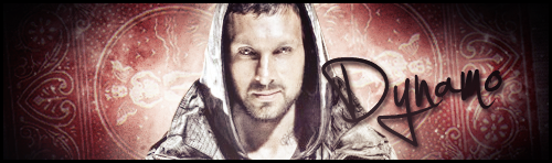
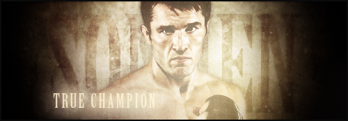
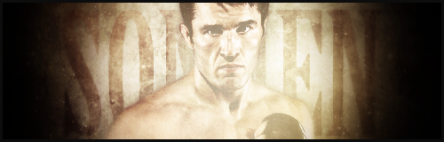
The point of this sig isn't so much the processes that went into this (I've made more challenging graphics), but the idea behind it. I wanted to express the power of magic (I actually listened to Power by Kanye West when making this). So there's quite a high contrast in this one along with a fair bit of light around the focal (which has an outer glow). There's a nebula stock set to soft light in there as well as a red gradient map to bring out the colour of the playing card background. The text is handwriting because I wanted to pay homage to the magic staple of a "signed card".

There isn't really much else to say. It's very simple, but I really like it. Thoughts and stuff are welcome.
 
I haven't done anything signature-related for a couple of months, mainly because I couldn't be bothered. But I've got that itch again, so here's Dolph Ziggler.


Fairly simple sig here, particularly in it's layout. I started with a blue background, added a desaturated city skyline set to screen and a few adjustment layers that I can't remember the exact details of. I loved the render of Ziggler and just had to use it. That has a light drop shadow, as does the text behind it (Bebas Neue, by the way). Then there's a texture which gives a wash-like effect, and a bit of light brushing over the focal. I really like the light brushing as too much contrast can really damage a signature. Finally, there's a white cinematic border (it's in a quotation box thing so you can see it) to finish it off.
 
The Royal Rumble is on Sunday. Not only is it the start of WrestleMania season, it's also one of the best PPVs of the year. So yeah, I made a poster.

royal_rumble_2012_by_rollingthunderdesign-d4nt7kt.png

I started with the image of Jericho. What he does at the Rumble is probably what I'm looking forward to the most. I went with a blue colour scheme to match his jacket lights and a stadium background because, well, why not? I believe I've extolled the virtues of a bit of white brushing, so I won't go into that. However, what I did do was use a blue soft brush and set that layer to colour dodge. It brings out the blues in the poster, and adds a bit of depth. There's dark brushing around the edge, and then we come to the text. I couldn't find a Rumble logo that would fit the poster, so I had to settle for a minimalist font with an outer glow. All in all, I think it works quite well.

If you have anything to say about this, then I'd greatly appreciate it. Cheers.

It's great, man. Just like in your Dolph Ziggler sig, the blue works so well with Jericho. The lighting effects are simple but, well done and that is common theme in you sig-making. You don't always make the hardest to make pieces but, you definitely make the most effective and powerful ones. Also, I notice you probably think Bebas Neue is your favourite font. It's mine too. It makes everything look awesome and sophisitcated in a weird way, doesn't it?
 
I've been getting into MMA recently. That's entirely the fault of this man. This wonderful, wonderful man.

chael_sonnen_by_rollingthunderdesign-d4riq9b.png

This looks fairly simple as sigs go, but it was pretty difficult to get right. Probably because I had no plan going into this. I started with gold/white clouds, added the Sonnen render and the background text. There's a couple of textures, a nebula stock and some weird "effect" I downloaded off of PSD-Dreams - not necessarily in that order. Finally, there's boring stuff like adjustment layers and a border.

That's it, really. All hail the real UFC Middleweight Champion of the world!
 
I call this "Chael Sonnen V2".

chael_sonnen_v2_by_rollingthunderdesign-d4riy9k.png

So this is a slight variation on the above, obviously. After posting the sig, I felt that it perhaps looked a little flabby with the secondary text. So, I tightened the screws a little bit. Got rid of the text and cropped a little more. Sure, it looks a little plain, but I'm OK with that. I just didn't like having so much space at the bottom. Also, I increased the contrast slightly with this one by copying the completed piece (apply image), adding a vertical motion blur and setting it to screen.

If you've got an opinion on which one you prefer, I'm eager to hear. Hear? Read. Read.
 
I've started watching NXT, and I happen to find these two rather enjoyable to watch.

hawkins_reks_by_rollingthunderdesign-d4rluz6.png

I started with a city background and turned the contrast up considerably. I then added the renders, which put across the tag team well - Hawkins is the talker, Reks is the muscle. There's some adjustment layers that I can't be bothered to list, a wash texture and a touch of sparkle brushing. I added the text and my favourite thing in the whole sig - the lens flare. Finally, there a horizontal motion blur, which just makes the sig pop a little more.

I'll say the second cause in this you can actually read the words abit better.

Yeah, that was another concern of mine. Thanks for the input.
 
paige_by_rollingthunderdesign-d4tcoft.png

Damn she fine.

So lets see. This is pretty gothic and took forever to get right. There's layer upon layer of textures and stock images. In particular, I used this image: http://img.portwallpaper.com/imgwal/the-city-of-clouds.jpg. It really works well with smudge brushing. The background text are the lyrics to "R U Mine" by Arctic Monkeys. I've been loving that song lately. To finish it off, I used my new favourite technique: sharpening. I applied the image and went filter > sharpen. So simple, yet it really gives a much more polished look, I think.
Solid ass sig, but one thing I'd nitpick about it is a lack of dimension. It's not like you suck at dimension, though, because the tag in your signature has tons of it. For this piece though, try doing an Apply Image on top of everything, High Pass set to 10, then set to overlay. Works wonders for simple depth and dimension.
 
Nice factory you have but i can't see much graphic work here. Through your thread title i was expecting that here i found lots of graphic work to see but i was wrong.
 

Users who are viewing this thread

Members online

No members online now.

Forum statistics

Threads
174,825
Messages
3,300,727
Members
21,726
Latest member
chrisxenforo
Back
Top