Your "style".

Status
Not open for further replies.

The Doctor

Great and Devious
Staff member
Super Moderator
I want to pose a question to all the graphics people here. What do you consider to be elements of your signature "Style"?

I mean, it's easy enough to tell the difference between a Doc sig, a Theo sig, a KillJoy sig, etc. So what makes you...you?

Personally, I like colors and contrasts. I mean, look at this sig:

teamcanada.png


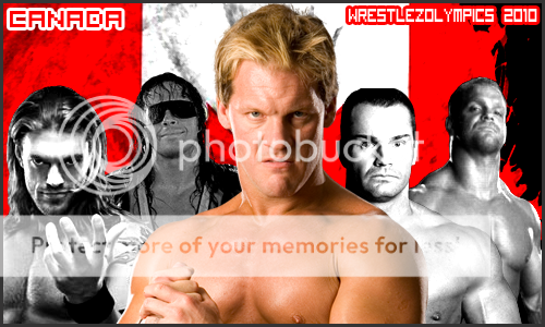
You see, the lesser wrestlers are in black and white, while the team captain is in color. That's one example of contrast. The background is the Canadian flag which is red and white, another example of color and contrast. And finally, I did some levels adjustments on the black and white wrestlers to make your whites whiter and your darks darker.

I also like to have the wrestler be the main focus of the sig. I prefer upper body shots to full body shots, as I believe the wrestler(s) should take up the sig the most. Again, look at that one. All of those wrestlers are shown from the chest up. This brings focus to who I believe to be the "stars" of the graphic.

But that's me. What about you?
 
I can tell who made a sig by what's underneath it:

Credit to Doc = A Doc Sig
Credit to Theo = A Theo Sig
Credit to Phoenix = A Phoenix Sig
Credit to Dave = A Dave sig

you get the point
 
I can tell who made a sig by what's underneath it:

Credit to Doc = A Doc Sig
Credit to Theo = A Theo Sig
Credit to Phoenix = A Phoenix Sig
Credit to Dave = A Dave sig

you get the point

The only sigs I've been credited for are the JOB Squad sigs I made. Other than that nobody else has credited me after I make a sig for them. Hence why my sigs carry a logo on them. I like to leave a bit of me on it.
 
A lot of times I don't get credit. See: Team Canada.

Way to be sarcastic, Lee.

The "little bit of you" is what I'm talking about, Robert. I mean, you have the little logo, but I've also noticed you like to blend images into the graphics. I've also noticed that Theo's backgrounds are more..."scribbly" than others'.

I tend to make mine look more "artistic" by making it blend together with the background. I also vary with overall styles. Sometimes I make them pop out and other times they're the regular square ones. I don't know why I do it. Force of habit I guess.
 
I love my scribbly background style. Definitely my newer stuff as the scribbly stuff is from the new set I downloaded. I just can't get away from it haha. Before that I was in a bit of a darkish stage and had some darker sigs and the images blended it with it.
 
Looking at your Hart Dynasty sig makes me think of ye olden days.
I used to rely on strokes a lot, since I used to have really bad cuts. Now I've moved away from them and instead work on making the images of the wrestlers vivid. Washed out graphics really don't do it for me. I think sigs need to be striking. Some may disagree of course, and that's why we have more than one graphics guy to request from.
 
Natalya Sigs are my style :)

The best style there is.

Here is a new one from me. A bit of a different approach to a sig as I did some things I've never played around with before. Still has a little bit of old school me in there with the darkness. Not sure it'll be a permanent style, as I don't quite remember everything I did haha.

5pg70x.png
 
I don't have a style, per se. I try to differentiate my sigs and vary the styles of each. With that said, they all are very basic and have a basic background. I guess my style, if I have one, is that I make my sigs very basic.

I can definitely see other's styles, however.
 
Theo "Hitman" Mays;1716887 said:
The best style there is.

Here is a new one from me. A bit of a different approach to a sig as I did some things I've never played around with before. Still has a little bit of old school me in there with the darkness. Not sure it'll be a permanent style, as I don't quite remember everything I did haha.

5pg70x.png

Feedback:
I like it, a lot. However I think it's a little hard to see the features in Edge and Jericho's faces, and that they get a bit smudged. Love the fact that they match the background, though. Definitely one of your better ones. If their features were just a little more visible I'd say it's your best one.
 
i do diffrent thing i dont think i really have a style i just mess around mainly. But no one really looks at my work, to try to see what style i may have.
 
With the proper time I can duplicate almost any theme. I've been learning web themes, metallic objects and transparencies with masking elements lately.

As far as my style, I use the "Three Time Frames" (past object, currently object, future object) and a Tech-Grunge background style most of the time.

Like Popeye says: "I yam what I yam." Take me or leave me. :)
 
Status
Not open for further replies.

Users who are viewing this thread

Members online

No members online now.

Forum statistics

Threads
174,826
Messages
3,300,733
Members
21,726
Latest member
chrisxenforo
Back
Top