
I_Am_Electro_Boy
Simmer down and pucker up...
Welcome all, in this thread I'm gonna post some of the signatures that I've created. If you want to use one of them can you please pm me. Anyway here's the sigs I've made so far:
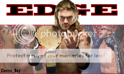
I decided to make a Edge sig because I'm really liking what he's been doing since he went to SD. I chose to have the colours red and black because they're sort of Edge's colours, and I chose to have the main image come out of the sig itself because I think it looks pretty cool. Anyway I'm pretty happy on the way it came out.

This one's pretty similar to the Edge sig, the main image comes out of the sig and it's based around two colours. I made a Jeff Hardy sig because he's my favourite wrestler and his current gimmick is great. I chose to have purple and black as the colours because they're darker colours which suits Jeff. I think this came out pretty good as well, but I think I'm going to edit this one so that Jeff's head isn't cut off.

I made a Randy Orton sig because he's one of my favourite wrestlers and when I saw these two renders on www.psd-dreams.de I thought I could make a pretty good sig with them both. I chose grey and black as the colours because I think they suit Randy. Anyway I think this is the best sig I've made so far.

I made a MVP sig because I've been impressed by him as of late, and I think it came out okay. I used red and black as the colours because they match what he's wearing. I didn't put any writing on it because I had nowhere to put any.
Please post your comments about the 4 sigs, whether you like them, hate them, what I can improve on, what's good about them.
I decided to make a Edge sig because I'm really liking what he's been doing since he went to SD. I chose to have the colours red and black because they're sort of Edge's colours, and I chose to have the main image come out of the sig itself because I think it looks pretty cool. Anyway I'm pretty happy on the way it came out.
This one's pretty similar to the Edge sig, the main image comes out of the sig and it's based around two colours. I made a Jeff Hardy sig because he's my favourite wrestler and his current gimmick is great. I chose to have purple and black as the colours because they're darker colours which suits Jeff. I think this came out pretty good as well, but I think I'm going to edit this one so that Jeff's head isn't cut off.
I made a Randy Orton sig because he's one of my favourite wrestlers and when I saw these two renders on www.psd-dreams.de I thought I could make a pretty good sig with them both. I chose grey and black as the colours because I think they suit Randy. Anyway I think this is the best sig I've made so far.
I made a MVP sig because I've been impressed by him as of late, and I think it came out okay. I used red and black as the colours because they match what he's wearing. I didn't put any writing on it because I had nowhere to put any.
Please post your comments about the 4 sigs, whether you like them, hate them, what I can improve on, what's good about them.