Catmobile Signature Showcase!!

Leakee

If I post, feel blessed.
Hi guys, I'm really new to sig-making and new to the Wrestlezone forums. This is my first thread and it is my official Signature Showcase thread! I will post most of my sigs that I have created that I approve of and if I don't like it; you probably won't either so I wont post crap.

**THIS IS NOT A REQUEST THREAD**

Anyways, here are the first two sigs I made.

wadebarrettsig.jpg


IMPACTSig.jpg


I personally think these sigs are average; to say the least. BUT they where my first two and I was tired when I made them. Out of the two I prefer the Crimson sig. He kinda looks like what I picture Satan looking like! xD The reason why I prefer it is that I believe that red and black are the colours most suitable for Crimson. After all his finishing manoeuvre is nicknamed the 'Red Sky.' Hope you like my first two posts, I'll probably post some more sigs after I've been to bed. (Im in the English GMT time-zone by the way.)
 
Hi guys, I've woke up and I'm ready to post some sigs! Here are the third and fourth ones I made:

jeffhardysig.jpg


I favour this one. I loved making it because I love Jeff Hardy, even though I will probably get hate for it. To make it I got a pretty cool pic of him on PSD-dreams of Jeff in Purple with lightning coming from his hands. I put that in and duped the layer twice, adding Gaussian Blur to one layer and Motion Blur to another. I got a C4D render from Google Images and put it in the corner there; resizing it downwards. I used a program called Cinema 4D to get the 3D text behind his head; I put it in and added an effect so it would be really faint and hard to see. I then added a stroke on the background layer. :)

hardyboyssigrequest.jpg


This one was my first ever request that I took for someone on these forums. It was made for TheIHWrestling. He instructed me to make a Hardy Boyz Signature, with a purple colour scheme involved; and possibly a Hardy Boyz symbol in the middle. I couldn't find a picture of the symbol so I cut it of a medallion I saw on Google Images and added Gaussian Blurs and Motion Blurs again, to make it look less 'medallion-ishy'. He also told me to add the text 'Nothing But Support.' I think it turned out pretty well to be honest!! :)

Thanks,

- Cat
 
Here is my last two signatures I have made before Christmas, I finished the Kane one yesterday and I have just finished the Swoggle one literally a minute ago. Hope you like them; with the Hornswoggle one I was just experimenting with a range of materials and stuff in the filter tab of Photoshop. Without further ado; the sigs.

hornsswogogglesignature.jpg


Kane1stsig.jpg


The little sign in the corner is my trademark; so anyone who uses my sig doesn't have to give credit as it already has my little logo in the corner:

This is my trademark:

trademark0076.png


-Cat
 
Hey man. Dunno whether you wanted it but here's a bit of feedback...

Wade Barrett sig doesnt work at all colour wise. I get the association to Wade but the blue doesnt work against him as he's not the most exhuberant of characters. the image isn't very nice neither and the blending is off with the logo into the background. HOWEVER this is the first one you made and is probably the best first try I've EVER seen.

The Crimson one is quite nice though. The text works well though the text is too much more of a focus than the main image of him which doesn't really work. However this is a GREAT attempt and looks pretty decent.

The first Hardy one is brilliant and I can barely find fault.

try to get a better pop on your text - like in the 2nd hardy one. Drop Shadow and Stroke is a way I always get a good text pop and if that fails, add on a soft white glow. Other than that, it's not "my thing" but a good sig.

The Hornswaggle one could be brilliant if it wasn't for him being off centre. Symmetry is a good thing to make usage of...if you're going to use 3 images, put one directly in the centre then bounce the other 2 and the background off it.

The ONLY thing that could make the Kane one any better is a border.

Hope that gives you some decent feedback and keep at it, you're a great sig maker for someone who has only just started.
 
^^ Thanks mate.

Hi, I'm back after what?, 3 months!! My school just broke up so I thought - Why not just make a couple sigs!!

RVDtransparent.png


:robvandam:

For this one, I think I've forgotten how to make a good sig. I saw someone else's one (think it was ARLO) and it had a transparent background so I thought: Why not? It looked cool. I just put in a few RVD renders with his TNA logo and put some gaussian blurs on, nothing much and just used the eraser and magnetic lasso tool to make the transparency. Please give me feedback :)

Wow, just looked at this on preview, it's way too big and looks horrible, ah well.
 
Due to the last one being so shockingly disappointing, I have made a Justin Gabriel one in about 5-10 minutes. There's a Wrestlemania poster thread and I'm probably going to compete in that. Without further ado:

gabrielsig.jpg


If I'm honest I don't like this one either. Justin Gabriel is my favourite wrestler and I feel I've let him down with this awful signature :p
 
I'm back with a sig which I think is my best work. It's got to be my best so far. I followed the Digital Arts and Graphics tips forum section to make this. I knew how to do most of it; but it showed me about saturation and how to make a gradient background much easier than I already knew. Without further ado:

safcsig.jpg


I also did a Wrestlemania poster but it failed and ended up as a sig. Its honestly not my best but it was a good try for a 5 minute work. I don't like it but anyone can use any of my sigs in their profile as long as you give me credit and if you could please link my showcase.

wmposter.jpg


I've just been looking through my files and I found a sig which I did as a request but my laptop failed and I never got to post it. Don't ask how I did it as I honestly don't know.

EPICEDGEREQUESTSIG-1.png


Any good sig makers like Australia's Finest, Theo or Jam, (Excuse me if I didn't mention you, these are just the top three in my head.) Anyway, could you please leave some feedback? I'll rep you.
 
I've just been working for about an hour on this sig. I just woke up and I was freezing so I did it in bed ;) I followed various tutorials on www.SigTutorials.com and took advice from Dave in the Photoshop tips section of this forum. I saw a sig on this website with manga on and I thought it looked pretty cool. I'm not into manga but when I was young the only shows I watched were Dragonball Z and Yu-Gi-Oh. (My childhood was great :L) Anyway, I saw this pic on Google Images and it looked awesome. There are some pictures where I just think 'that would be great on a sig' so I did it and following a cloudy background tutorial, came up with this! (I used Bebas Neue for the font.)

gokusig.jpg
 
Ok, I'm back. So I just watched Raw this morning and saw Brock Lesnar return. (I'm so happy!) So I thought about doing a sig of Cena being scared of Brock. I went on YouTube and looked up how to do speech bubbles. I found it then thought; why not do a comedy sig!? So I messed around a bit; changed the colour of Lesnar's eyes and this is what I came up with!

herecomesthekiss.jpg

http://i1185.photobucket.com/albums/z352/catmobile2011/herecomesthekiss.jpg

I was bored as well so I just got a picture of Jeff Hardy and it looked like he was falling out of a plane; so I thought about doing another comedy sig. These sort of sigs aren't my style and I don't know why I did them. To do this one; I got the render of the Jeff Hardy Swanton Bomb and applied it to a 400x400 pixel background. I added the speech bubble by the method shown on YouTube and put in the words "Forgot The Parachute!"

parachutesig.png

http://i1185.photobucket.com/albums/z352/catmobile2011/parachutesig.png
 
Here's my new picture which I did as I'm bored. If anyone has seen Botchamania on YouTube, you'll know CZW have the most and the worst botches ever. The 'wrestlers' they have must have been picked out of the bin and thrown into a changing room with some trunks and just told what to try and do.

here it is.

zyhhjk.jpg

http://oi43.tinypic.com/zyhhjk.jpg[url]
 
d-bry.png


ziggler.png

:lol: 
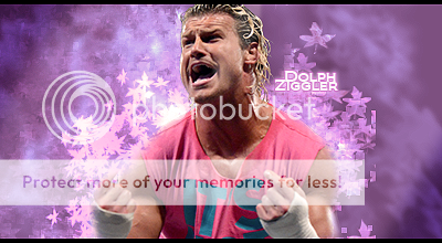
I'm back and better than ever! Reasons why I have been away I don't want to give but as soon as I could get on my laptop it was graphic-time! I did a couple but they where crap so I did another two with D-Bry and Dolph Ziggler!! I think they are amazing and I have been learning from www.sigtutorials.com and using other forums I have developed my sig-making skills! Here was my first two attempts!

I made a sig using a program named Cinema 4D to make the following sigs:

lilbubbg.png


and

sig.png

ANY FEEDBACK IS WANTED I'M HYPED UP AND READY TO TAKE REQUESTS!!
 
The D-Bry sig I like, the omly thing I'd say lets it down is the lack of work on D-Bry himself, maybe a few gradient maps or even a gaussian blur duplicate underneath the main focal would have looked a tiny bit better. The BG looks great to me though.

The Ziggler sig flows really well but again lack of work on the focal lets it down a bit and the dodgy looking straight lines on the leaf brushing on the right hand side.

Both good sigs though mate, just trying to throw some constructive feedback your way :) Won't comment on the C4D sigs cos I've never used it but I like the look of em!
 

Users who are viewing this thread

Members online

No members online now.

Forum statistics

Threads
174,826
Messages
3,300,732
Members
21,726
Latest member
chrisxenforo
Back
Top