HGR: The Workshop

The 1-2-3 Killam

Mid-Card Championship Winner
PLEASE FEEL FREE TO USE ANY/ALL SIGNATURES IN THIS THREAD, UNLESS THEY ARE SPECIFICALLY MARKED OTHERWISE! JUST REMEMBER TO GIVE CREDIT (and maybe some rep)!

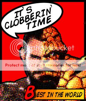
Once upon a time I tried to get good at signature making and light graphic arts work. And then I got busy and had to put it on the back-burner. But it's something I like and I want to continuing getting better at. So I'd love some feedback and/or suggestions from anybody who can help.

Here are a few simple "greatest rivalry" images I did last night. They're nothing special, just a "cut out" filter and some saturation; color added back in as necessary, and some messing around with the exposure. It's really damn simple, as you can probably tell. I'm not even that big a fan of them, except the Hogan/Rock image which I kind of like.

nafL1.jpg

DomYz.jpg

JndGc.jpg

CRt76.jpg

etr3Y.jpg


I can start a request thread if there's any interest in these, or anything else. I'll import some of my older stuff when I've got free time.
 
I think they are all pretty cool. The only one I wouldn't use in my own sig is Macho and Hogan. It just looks a bit weird. If I was looking for a sig, I would prabably go with the DX one or Sting and Flair.
 
Here's a compact list of everything remotely good I posted in the old thread. Definitely with varying levels of success. The Green Bay sig is my absolutely favorite, and not just because they're mah boys. Some of these are really good, and I can't seem to get back to that quality. Maybe I need to read more tutorials again.

I've been thinking about doing a series on the bigger tragedies in wrestling. Eddie, Owen, the life of Scott Hall, etc. Probably not Benoit, although I'm open to the idea.

Goldust.jpg


CRBorntobeGreat.jpg


layla.jpg


facesoffoley.jpg


ArcadeFire.jpg


packers.jpg


MountKillamanjaro.jpg


DDP.jpg


punk2.jpg


PunkCobberinTime.jpg
 
Some these sigs are decent, but you can go overboard with the effects. The Goldust one and the Cody Rhodes one are the best examples of that. Goldust's face is too obscured, it would have been better served if you'd put that render of Goldy ahead of the effect. The Rhodes one just has way too much going on. I'm not a fan of signatures that aren't crisp and clear anyway, but it's too blurry and distracting, for my taste. Pick a single focus and try to build a signature around that. Eliminate dead space, too (something I always had trouble with).

I don't know if you've ever tried them, but tutorials are very helpful (www.sigtutorials.com is a great site). You're pretty good, but you've got room to improve.

How about something like this? It's simple, and not cluttered in the least bit. There are only two imagine (technically three, I'll get to that). Obviously the right is totally desaturated; both of them have increased exposure. Zero filters. There's an overlayed image on top of the left Jarrett, that's been blurred slightly and gone over with an eraser. It's actually just a duplicate of the right image, only there to provide texture.
8upAH.jpg
 
My advice would be to use brushes more than effects. They make it everything cleaner, appealing to the eye and much less, easier to see. You're really not bad for someone who's only recently picked it up and the greatest rivalry cuts are pretty awesome!
 
My advice would be to use brushes more than effects. They make it everything cleaner, appealing to the eye and much less, easier to see. You're really not bad for someone who's only recently picked it up and the greatest rivalry cuts are pretty awesome!

I just discovered the wonderful world of renders. Like, just now as in, five minutes ago. Every image I've ever done I've used an eraser and/or the quick selection tool to carve out myself. Which could be the reason why a lot of my stuff isn't that great.

Alright, brushes downloaded, renders discovered...time to make some awesome.
 
Haha wow man props that you were able to do all of that with only an eraser. Yes, the lasso tool is significantly easier and efficient.
 
6YM5H.jpg


So how's this? I used renders, which made it a hell of a lot easier. All the sci-fi stuff I did with a brush tool called "SS-Tech" from Deviantart. The masks are from google; not renders, just scaled down and erased until the blended into their faces. Their bodies I beat up with another brush set called "Wounds", also from D.A.

What do you think? Kind of a goofy idea, but not too crazy or cluttered, right? I was originally doing it with Matt Morgan, but then it struck me that it would be way cooler with the world tag team champions of the world. And as Morgan took up less space by himself, I kept over-doing the background with all these tech brushes.
 
PbxdD.png


It's the Pokemans! "Pokemon" font from Dafont. All I did was get a bunch of images I liked, arrange them all, and then use the magic selection tool to select outside the pokemon text. Then I clicked each of the images individually and deleted it, so that only what was INSIDE the text remains. Really simple.
 
AWZQC.jpg


Graphic I whipped up for WWE Hell in a Cell this month. Not really a lot going on here, which is probably why I like it so much. Font is "Impact 2.0" (a little bit ironic, no?).
 
Series of Bound for Glory images I whipped up for Saturday's live pre-show on VOWLive.com. Background is the impact zone, brush is called "40 light streaks", and all renders from PSD-Dreams.

USY4V.jpg

urVYm.jpg

QhMTH.jpg

410Jo.jpg

Piawz.jpg

XnZP1.jpg

jRuaQ.jpg

Txj4V.jpg
 
Series of Bound for Glory images I whipped up for Saturday's live pre-show on VOWLive.com. Background is the impact zone, brush is called "40 light streaks", and all renders from PSD-Dreams.

USY4V.jpg

urVYm.jpg

QhMTH.jpg

410Jo.jpg

Piawz.jpg

XnZP1.jpg

jRuaQ.jpg

Txj4V.jpg

I dig them. The only thing I'd say that stands out awkwardly is the image you used of Bobby Roode. All of the photos look like posed images while his just looks like a screen shot. Other than that, dope.

EDIT: Also, you got the date wrong on them. Its 10-14-12, not 11-14-12.
 
AWZQC.jpg


Graphic I whipped up for WWE Hell in a Cell this month. Not really a lot going on here, which is probably why I like it so much. Font is "Impact 2.0" (a little bit ironic, no?).


It's cool work you do here. But the mistake in this poster is VERY glaring. Cena is reversed. I get what you were going for, but in such cases looking for another render was a better option. Or if you wanted Cena to have his then-current motif and couldn't find another one, you should've flipped Punk. This one is more of a detail of mine but having a tagline smack in the middle of the poster is very distracting. It should've been smaller and on top to avoid drawing attention away from the rest of the image. :)
 

Users who are viewing this thread

Members online

No members online now.

Forum statistics

Threads
174,826
Messages
3,300,732
Members
21,726
Latest member
chrisxenforo
Back
Top