Oh, you nerds have to reach into two different pockets of awesome for this round, don't you?
I'd call this for Doc. tHHHunder's entry is brilliantly conceived and shows a lot of love for the source, but feels a bit empty to one side over the other. This is going to sound silly, but it's also a little dark.
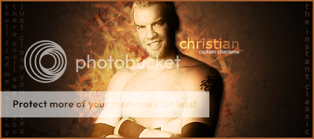
Doc captured that "Wanted" poster look for this one, without just defaulting to a sepia tone. Your background work is almost always impressive; you make it seem so easy!
Category 1: I really love how Dave had Orton in a close up. It's very unique. I didn't care too much for the viper in the background though. You could have probably went with a better picture and maybe had Orton have "viper eyes" because you're focusing a lot on Orton's eyes in the sig. I really liked Doc's sig and I would rock it as a my sig if Christian was a favorite wrestler of mine. Doc's looked like a finished product while Dave's had something lacking that I can't put a finger on. Doc's text brought everything together and Christian as the Sun was a great concept as well. I'm gonna have to give this round to Doc.
Category One: Random
Doc: A-
Dave: B
WINNER: Doc
Category 2: Doc had a sig of anime characters and I really love how everything blends together. It beautiful really. Text is the right size. Characters are positioned perfectly. Border is right on. I don't know what else to say but great job. I really like Dave's sig too. It wasn't too unique or special but I really liked it that way. Maybe it's my love for Doctor Who. I don't know but I'm going to have to call category two a tie.
Category Two: Genre
Doc: A
Dave: A
WINNER: Tie!
Category 3: Dave, I have to say that I did not like the Spiderman sig at all. It just didn't work for me. Venom on the left and the chest pic on the right is perfect but Spiderman in the middle was out of place. I think that you should have used a better picture or positioned them better but that pic really killed it for me. Doc meanwhile, what can I say. It's a thing of beauty. One of your best sigs (along with the one that you made me). The picture is blended perfectly in the background and the text is in the perfect place. I'm happy that you put the text there and not at the bottom. It truly made me happy. Your sigs make me happy Doc. Thank you.
This is my entry for the fourth category of the battle and I am quite happy with how it came out. I was going to submit the Randy Orton sig I am sporting in my signature but having already submitted an Orton one, I thought that I would just do one for my beloved football team and my favourite player. I am quite happy with how it came out. I used the same techniques as I did in the Randy Orton one and used it as a fountain of inspiration.
How I made this:
I started off with a black 400x200 canvas and added the picture of McGeady. I duplicated it 3 times and went to work smudging and creating different levels. After I done that, I added in the Celtic badge and transformed it so that it was rotated before transforming the smudges onto it to lighten it up and make it blend more. After this, I got another picture of Aiden and put it behind one of the layers that had been smudged before reducing the opacity. To finish it off, I put on the text and border.
In the Anime/Comic category I really like Dave's sig, but the only problem that I have with the sig is that it's to dark I know that it might be part of the sig's theme but it's just to dark for my taste.
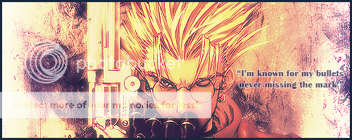
Doc's sig is cool and I like the way that he blend it of the colors and the awesome brushes that he used. Also trigun is one of my favorite Anime cartoons.
So my vote in the anime/comic category goes for DOC.
This is my last submission for the battle and I would very much like to thank Doc for once again being a very worthy adversary. I knew coming into this, that it wouldn't be very close but I think I have made some work that I can be very proud of. Doc has pushed me to becoming a good sig-maker and this has been the case since I started. We do this every now and then to get the traffic in the DAG forum up and it works like a charm. I have outdone myself and I know that it is a learning process. That being said, my last submission is something I am proud of. Now, I am not a fan of Link or the Zelda games but it came to me on a whim and I thought I would just go for it.
How I made this:
Using a black canvas, I imported that awesome picture of Link on and duplicated it 4 times. I then smudged and burned some of them so that I could get some contrast in the surrounding areas. After that, I put in the tri-force and did the same. I then messed with the levels and clipped it to Link before putting in some red behind the tri-force and smudging that just to give it some more pop. I then put it into a PNG, did the text and border and here we are.
Dave, I like your Randy Orton sig. It's got a nice overall general feel to it. I really like the snake in the background. But it's not as good as Doc's. Second, I gotta give it to Dave. Probably a little bias there for my love of Doctor Who but I like how it flows together with the Tardis in the background and the use of that blue. Doc's is also good. Round 3: Doc. The Spider-Man sig is okay but Doc's is really, really good. There's that whole wanted poster feel that someone mentioned before and it's really clear cut and well designed.
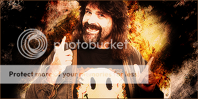
Dave said that he would have submitted his Randy Orton one (which is very, very nice btw) as Sport, so that means I could do wrestlers for this category. I made a sig of one of my favorite wrestlers ever, Mick Foley. It's because of Foley that I'm the big fan you see today. His books were interesting and really made me get into the world of pro wrestling.
To make this, I experimented by seeing what would happen if I combined smudging AND brushing, using brushes for the background and the smudges (Set to overlay) for color. I did a lot of duplicating and resmudging, and some erasing, and all sorts of other things. I added gradient maps and photo filters to get the colors right. Then I Applied the Image, duplicated it, did a gaussian blur, set that to lighten, applied the image again, and Sharpened it a few times to get...this!
1st category: David
-Both sigs are very good, just not really fan of the lighting on Christian. The close up of Orton won it for me, along with the snake in the background. A nice different approach by Dave and it paid off.
2nd category: Doc
-Both were good, but Doc's had the pizazz for my liking. It is blended well and it the color scheme works and the whole sig flows as one. Dave's is good too, as simple is sometimes the best approach, but I like Doc's a little bit more.
3rd category: Doc
-This was the toughest thus far. These may have very well been the best two from either of you. It killed to pick on, but I went with Doc. The picture goes well with the background, the dark style works as well. Dave's is top notch as well. The pictures are blended for perfection. Both fonts are a little bland, but Doc's has a bit more style and that may have been my deciding factor.
4th category: David
-Not a soccer/football fan, but I must say the sig is great. The only problem I have is the background picture is hard to see, but it doesn't take from the effectiveness of the sig. The colors are set to perfection. Doc's is also top notch and you can't go wrong with Foley. Though I would have liked to see a different sport, but no complaints at all.
First off, I want to thank Dave for participating in this battle and for helping drive discussion around this section. A forum is nothing without its members and Dave has been a great friend to me and has been giving it his all in regards to this little competition, his sig-making, and his feedback. I owe him a lot. Thanks, Dave. <3
Category 5: Videogames
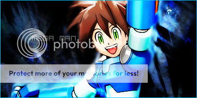
And of course I'm going to wrap things up with the one and only Mega Man. I tried all sorts of things with the background. I smudged various renders and clipped them onto C4D brushes, I desaturated images, I Applied the Image, and did a Gaussian blur, I smudged and smudged and brushed and this is the result.
I love Mega Man, but I think you might have already figured that out.
I think overall I'm gonna have to give this one to Doc, I'm sorry Dave, I liked yours a lot, and I know I didn't give a feedback on all of the Sigs, but I think overall while you (Dave) have some amazing designs here and there, I just find Doc's a little bit better, I think it's something about the firm flow he has in his sigs.
Doc wins this one. Great idea guys, and you better capitalize on another round!
Category 4: I'm not too fond of the Mick Foley sig Doc. It just seemed kind of bland to me. I really love the background but I didn't like the picture of Mick. Dave, I liked your sig all though I thought that perhaps you used a bit too much of the white smudging to create the smoke effect. I liked the use of the logo at the side but the smoke covered his other face to the left. It could definitely be cleaned up more.
Category 4: Sports:
Doc:B-
Dave:B
WINNER: Dave
Category 5: I absolutely loved both entries to this category. The Zelda sig was beautiful and so was the Megaman sig. Both have gorgeous backgrounds and the pic and the background blended well on both sigs. I can't say anything else really but that I'm happy to have witnessed an epic contest between two great sigmakers. Thank you both for letting me provide my input.
Category 5: Video Games
Doc:A+
Dave:A+
WINNER: Tie!
The final score for Thrilla11:
Doc: 2 Wins, 1 Losses, 2 Ties
Dave: 1 Win, 2 Losses, 2 Ties
Despite my love of Doc, I'll do my best to be impartial. I'm also no expert, so feel free to disregard everything I type.
1. Anything: While I find Doc's to be more aesthetically pleasing in terms of pizazz, I feel Dave's commands more of a presence. It seems to draw more with its dark undertones and somewhat disturbing imagery. Win Dave
2. A genre: I love Skies of Arcadia. Pure Bias. I love the colors, I love the brushwork, and did I mention I love Skies of Arcadia? Dave's is no slouch either. The colors for his blend in very well and while Docs' is more energetic, Dave's seems more serene. But I still give the edge to Doc for what is a perfect blend of light and shadow. IMO his best sig yet. Win Doc
3. Animation/Comics: Well, no offense to Dave, but looking at his incredibly dark sig made me want to turn away. I had to turn up the brightness of my monitor just to see it. Doc's sig on the other hand, was a little too bright. Don't get me wrong, it looks ok, but Doc's done better. Wasn't impressed by either but Doc's was a bit more appealing. Win Doc
4. Sports: While I think because of the color scheme, the flaws in Dave's sig are slightly more noticeable, they are very slight and hardly detract from its' appeal. Doc does use similar background colors that he used for the Skies of Arcadia sig but that hardly dtracts from it's appeal as well. Very difficult choice, but I gave it to Doc because after looking at both for a few minutes, I noticed the chops in Dave's were more then Doc's. Vote Doc
5. Videogames: I love Legend of Zelda. Not a pure bias vote though, since I love Megaman too. Dave uses the color scheme of Zelda to his advantage and melds it very well with Link. Doc does the very same but he does not do it as well as Dave does. Vote Dave
It was close, but I give my vote to Doc. Sorry Dave.
Category 1: Doc- I like how he put the lyrics on the one side, and the shade of the background fits Christians gimmick, but I don't like the sly, leering look Christian is giving, it doesn't fit with the rest of the Sig in my opinion.
Dave- I really like the colors in this Sig, I feel black and red are the best combination. The viper in the background really fits with his gimmick and the rest of the sig, and the photo of Orton is that perfect, heel-like glare that stares into your soul. I like how he doubled Orton's name, and faded it out a little behind it, that fit with all the other combinations.
Winner- Dave
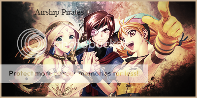
Category 2- I'm not exactly familiar with Airship Pirates, but the Sig looks pretty cool. The picture looks pretty hot, with the two girls, I like the way they smile, and the dude in the middle gives me a perspective of Doc, showing his bold and determined traits, also like the burnt looking edges, and feel it only adds to the already awesome looking sig.
Dave- It's a cool looking sig, but the color doesn't fit with the Sci-Fi theme, and picture it looking darker, maybe purple. The phone booth and the globe where good additions, and push the picture to a better motivation, but the guy in the picture ruined it, his look creeps me out, and his hair is a little bit outdated. The guy wasn't totally bad, I think the worst setback was the color, and you could have roughened it up a bit in the background, instead of making it solid, make it look more damaged. A space looking background would have been perfect.
Winner- Doc
Category 3- Doc- I never watched Trigun, in fact I don't watch much Anime, but this sig looks great! Western is always a cool theme, and love how you where able to fit that with the colors, it's like very old paper. I like the gun, in fact, Revolvers are my favorite type of handgun, so that also won you brownie points. Now not to fancy with the character in the picture, like I said, I never watched Trigun, but he doesn't look like a cowboy too much, this sig would be cooler with a cowboy-western sorta dude, as this character doesn't seem very intimidating.
Dave- This one seemed very dark, and gloomy, not in a good way like the Orton one, but in a bad way. I really liked the Orton one, it totally won me over, but I think you went to dark on this, and if you have to be pretty close to your computer screen to see the full thing. I think you had a good idea with the sig going in, but it was just to dark. You could have brightend it up a little more, but I feel you where stuck in a corner, and that was your only choice.
Winner- Doc
Category 4- Doc- The color is perfect, and fits Mick Foley in a lot of different ways, I think smudging and brushing really had an effect on it, as it looks different and more as an individule, but the shade of gray in the cornor looks perfect, kinda like smoke, and the yellowish color looks like fire, which could also fit Foley's dangerous, hardcore, and risking personality. Another perfect sig from Doc.
Dave- I don't know much about soccor, or how it is played in your country, but it the sig looks fantastic. I noticed by the logo that it has a four leaf clover on it, most meaning it's an Irish based team, which makes the green background perfect for the sig. I also admire the smokey fog around the player, and the faded alternative picture of the player in the other layer.
Winner- This was a tough one, but I'ma have to say Dave, It just kinda settles with me more for some reason, even though I'm more intreasted in Doc's sig, and his was freaking awesome, it was just something about Dave's this time that made me go for him.
Category 5- Doc- Not a Megaman fan, but this sig looks sweet. The icey type of blue theme that it's got really set's the mood for me, I love how it looks as if the blue is glowing off of his suit, plus the blackish cave looking background fits the icey theme even beter. The font used for the name just fits with the theme, and everything just seems to flow right in together. Nice job by Doc.
Dave-Not a Link fan either, a Call of Duty sig would have totally won me over, but this sig is extreamly good. I like the lava like background, and how the rock kinda forms around it. The picture used for Link, shows he's ready to fit, and looks extra aggresive and intimidating in front of the lava. Very good job.
Winner- Doc. Very close again.
I saw some very good sigs in this thread, My favorites of Doc include his Mick Foley one, the Christian one, and the Mega Man one. They where all very detailed and seemed like sugar to my eyes. My fav of Dave's gotta be the Orton one by far, it was extreamly good, and looked like a lot of time was put into it, it should be a promotional picture for an upcoming Pay per view.
It came down very close in my judging book, Dave had two, and Doc had three, that last one was really the tie-breaker, and a tough decision at that. I'd like to see another one of these in the future.
Overall I really enjoyed Doc's work, the style he chose to exemplify in this battle was exactly my tastes, I have always liked a grunge brush or smudge signature. That being said, Dave, your genre #2 signature, and your genre #5 signature (Link) were very well done, I have genre #2 and #5 being a tie, with #1, #3, and #4 going to Doc. Very well done to both.
I would personally like to see more of these face-offs if you can call them that, I think it raises the skill of the both artists, and I actually have an idea of my own. Perhaps non-participants could submit high quality renders, and both artists would have to use that in their signature, I think that would be very interesting, to see the different outcomes from the same render, or perhaps have style themes, such as vectors, grunge, smudge, and things of the like. Just something to think about
Seeing as I have no experience making sigs like you two gentleman do, I will only go by personal taste. Both of you have shown very good work in all of the categories. When it came down to choosing who's I enjoyed a little more it was pretty tough as it was very neck and neck. There was only one factor that I saw a noticeable difference in and that was texts. I enjoyed Doc's ever so slightly more. He had more interesting texts in general and the seemed to blend in much more with the sig overall whereas I felt that Dave's where at times too contrasting. Tough call though, but I'd say Doc takes it but only by a tiny margin. Good job to both men.
This site uses cookies to help personalise content, tailor your experience and to keep you logged in if you register.
By continuing to use this site, you are consenting to our use of cookies.


")