Doc vs. Dave, Round 2

Who had the better body of work overall?

  • Doc

  • Dave


Results are only viewable after voting.

The Doctor

Great and Devious
Staff member
Super Moderator
A few months ago, Dave (tHHHunder) and I decided to have a sig battle, as a way to improve and have some fun. It brought lots of traffic to the section.

We've decided to do it again.

The way it will work is simple. In this thread, we will post one sig, one for each category. We will post them one at a time. After each category's submissions are submitted, the people of WZ will offer feedback for both sigs and pick the winner of that round. After all submissions are in, I will open a poll and the final winner can be chosen.

Categories:
1. Anything
2. A genre
3. Animation/Comics
4. Sports
5. Videogames


In the words of my uncle...Allez Cuisine!
 
It's awwwwwn!!

Category 1: Anything

christianclassic.png


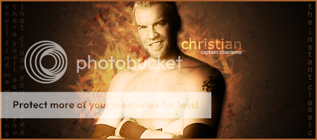
I decided to make a sig using Christian! I like Christian, and am excited for his future now he's on Smackdown. I also wanted to test out some new smudging techniques. I made a brush out of an X and smudged several orange layers and set the blending modes in various ways. I then smoothed out the Christian render and added a clipping-gradient mask in order to have him fit the rest of the sig. I also exaggerated the lighting and shadows using the dodge and burn tools. The text is there to balance the whole thing out. The text on the left side is from his entrance theme, and on the left is his TNA nickname, "The Instant Classic", which is a nickname I always really liked.
 
I think that was very well done. It would be a good fit for anybody who's looking for a Christian pic for their sig. The colors are a nice choice and it sounds like you worked hard on it. The only things I'd change are to include The Instant Classic underneath "Captain Charisma" because that way the sig represents his time with TNA equally to his time with WWE; and to copy/paste the lyrics from the left onto where The Instant Classic currently is. Nice job though!
 
I really like it, it's not to busy with some many colors or little things grasping your attention that you lose focus of the overall sig. It's fairly simple, but effective. The coloring isn't eye watering or too bright, it fits the sig nicely. Well done Doc.
 
I really like the Christian sig made by Doc. I would definitely rock this sig if Christian was my favorite wrestler. I love the use of the words from his entrance song on the left side. It's a nice touch and the two scripts on the sides really bring the sig together. I also like the way that Christian seems to be in 3D. I don't know how you did that but it looks like Christian is coming off the sig. That's pretty bad ass Doc.

My only concern is the brightness of Christian. His left side, opposite the shadow, seems a little too bright. By looking at the background, I thought that perhaps you were going for a concept of the Sun in space with Christian as the radiating Sun. Christian just seems a little too bright in my opinion in this sig. I really love the concept though if you were in fact going for that. If not, its still a great looking sig. If I were to grade it, I would give the sig an A-. Exceptional work as always Doc.

two-thumbs-up-150x150.jpg

 
It is a very good sig Doc. I only have one problem with it however. Im not too big of a fan of the lyrics that are on the side of it. To me, it just kind of makes the sig look crowded. In my opinion, you could have written something shorter like "Thats how I roll", or you could have just simply shortened the lyrics to, "Just close your eyes." However, other than that, it is an extremely good Christian sig. Props to you my friend.

9/10
 

The Good
  • Colours overall are very nice
  • The text on the sides is an interesting idea and works well here
  • The flow of the signature is very good overall

The Bad
  • The two things I would suggest is having some of the smudging or brushing appear over Christian. You wouldn't even have to smudge over the render, just lasso around it, select the inverse with a feather of four or so and press delete one.
  • If the above was done, the darkness on the right of the render would be perfect, as it is now, I feel it stands out a bit

I am nitpicking how ever, this is the best signature I've seen of yours IMO. 10/10
 
I think it looks pretty good Doc, the only problem I might have with it would have to be that I think the light on Christian is a little too bright, seeing as it's slowly making him look like the color Sheamus is trying to become..

But I absolutely love the lyrical text in the left corner, and the "The Instant Classic" in the other, I like it a lot.
 
Lovely work Doc. My only complaighnt would be that It's a tad difficult to read the lyrics from Just Close Your Eyes on the side. otherwise, it's a great sig. Several great ideas there.
 
The sig is awesome, the colors are well blends and the background is easily to see, It's just well made. The font on the side is kind of hard to see, but other than that the sig is plain and simple and that's what I like about a sig.

Now I need to see Dave's sig, I can't wait to see it.
 
Category 1 - Random

28343_1315057122613_1416252161_30928628_5632108_n.jpg

Right, here is my first attempt at this.

So, I had an idea in my head that I was going to do a Triple H sig and to be honest, it looked a lot like Doc's and although no one would accuse me of stealing his idea, I wanted to create a bit of variety. So, I found a good cut of Randy Orton and put it in the corner. After that, I added a radial gradient behind Orton before duplicating the Orton picture and putting it all over a black canvas. Then, I added some cracks with the Crack brush pack and then added some more contrast and colour with the levels tool and clipped it to the layers below Orton. Afterwards, I found a picture of a viper and cut around it before inserting it under the text. I kept it dark and simple because I think it illustrates the feeling that Orton tries to get across.

My first attempt and I will likely get better as I start to get on my roll again. This is a competitive effort though.
 
Love it Dave, I really do, the close-up of Randy kinda surprised me especially seeing as it's not something you regularly see around these forums of the sigs that I've seen, I think it catches a new view on Sig making really.

I love how you blended the snake in the back, with red colors, and the text.

Only problem I have although is the fact that there's the "double Randy Orton" mainly because it seems rather blurred out the one in the back, and I think it would look much better with just the one in the front.

It's really ashame that Randy doesn't have a visible shoulder tattoo from the front, because being a tattoo fan myself, I love it when a sig shows off the a little more of the person in the sig, but since we all really know how Randy is build, it doesn't hurt this one at all

Very nice job Dave.

Edit: Doc wins this one in my opinion.
 
I really like your sig Dave. It's awesome the way the sig is created, I especially like the Viper in the background and the way the black and the red are blend in together. The close-up picture of Randy Oton is also great. The only thing that's kind of hurting my head is the double font, but other than that the sig is great, and it's also simple and like I said it before that's what I like.

Sorry Doc, but I will give my vote to Dave in this category.
 
Damn Dave, that is a wicked sig, I love the darker coloring, the reds and black play nice together. I love how the snake seems to be coming out of thin air to strike. My only thing would be I'd love to see the picture of Orton be sharper, just stand out a bit more and maybe play around with his eyes, make them brighter or something. Over than that very well done man.

Now I love Doc, he's made me two bomb ass sigs, but man I have to give my vote to Dave for this round. The Orton sig just grabbed my attention more. Good job to both of you though.
 
Wow Dave that sig is amazing. If I weren't repping my tourney sig right now, without a doubt I would rep that sig. I love how close up Orton is and it really shows how sneaky Orton is and can attack at any moment.
 
I'm not digging Doc's too much as I think the devine light coming from Christian's chest is unsightly. That said, the text in Dave's submission cost him my vote. Too small, too ordinary, too hard to see.

Doc wins the first round.
 
Dave's orton one is incredible, but my one complaint with it that the viper in the background is too dark. I would make it just a tad bit easier to notice. Other than that, its great and I think it gets my vote. Sorry Doc.
 
Dave, it looks good. Although, Doc's is just a bit better. To me, the problem with yours is the whole picture of Orton. It just seems a bit too dark and a bit too blurry. It is very orginal, so I give you an A for that. I like the whole snake in the background thing. Very good usage of colors. It pretty much defines Orton. However, like I said, the picture of Orton just isnt doing it for me. Good sig otherwise.

8/10
 
Category 2: A genre.

steampunk.png


Steampunk!

Steampunk is hard to describe, but you know it when you see it. I define it as going into the past and imagining the future taking place then, using technology available at the time. For example, zeppelins and airships being very common, clockwork-powered robots, and more. I've always liked the free feeling of "Anything is possible" that the genre gives you.

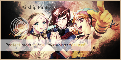
I've always loved the idea of sky pirates. I've never played Skies of Arcadia (though I really, really want to), but when I think of a sky pirate design I think of Vyse. I made this sig while listening to the Abney Park (a band with a steampunk gimmick) album "Lost Horizons" over and over again. I started off with a picture of an airship from the book that got me into Steampunk in the first place, "Airborn" by Kenneth Oppel. I smudged it in several ways, duplicated the layers, set the blending modes differently, and added the render (which I cut myself). I then added all sorts of adjustment layers, gradient maps, and photo filters in order to give it a sepia yet still colorful look. The text is the title of Abney Park's best song, and I felt it fit with the sig.
 
Category 2 - Genre

28343_1315186205840_1416252161_30928970_3190909_n.jpg

This is my submission for category 2. For this sig, I really wanted to take what I had learned from the first round and put it into practise. What people were saying was that the writing was too dingy and unclear and that things were slightly blurry. So to combat that, I have put a stroke around my text and thus it is more clear. I have also sharpened things and blurred others. I blurred the Earth and sharpened the tardis to show the distance between the two as it looked very flat.

How I did this:

I stated by having a black canvas and then doing a cloud render with blue as the secondary colour. After that, I searched for a star field and then put it on top of that before setting it to a blend mode of multiply and then using levels to sharpen it. Then I found a picture of the Earth and darkened it. I then put in the picture of the tardis and sharpened it up, whilst smudging some of the stars behind to emphasise the distance. After that, I found the picture of Matt Smith I wanted and cut around it and gave it an outer glow. I burned and dodged the edges and added the text. I hope you like it.

Edit: Oh and fitting in with Doc's description, I listened to the Backstreet Boys - "I just want you to know" whilst making this... :)
 
Doc: Very very nice work, looks a lot like the stuff you threw out with the Christian sig when you look at it, and I think that's gonna give you an edge, especially because of the fact that there's no (as Coco said) divine lights, which I think is what killed your sig the most in the first round, love the "border" effects you have between the black and the light brown, looks like some photo that had caught fire if you ask me.

Dave: nice sig, Not too fond it it although, I think while it's decent, it's kinda bland as opposed to the stuff you had going with Randy's sig, I think it might be the fact that I think there's a little bit too much blue in it, which is slightly killing it for me.

Doc wins this one.
 
For round one I picked Dave's Orton pic because having it be a close-up was a nice touch, and the snake in the background as well as the text style look awesome! It's a great pic that I'd say would fit for use by any Orton fan.

I've always loved the idea of sky pirates. I've never played Skies of Arcadia (though I really, really want to), but when I think of a sky pirate design I think of Vyse.

Never? You really REALLY should man. It's such a good game. You did a fantasic job on that Skies of Arcadia pic though. That is one of my favorite pictures from the game's artwork and you did a good job on this version of it, so you win my vote for round 2.
 
Category 3 - Animation/Comics

28343_1315363770279_1416252161_30929400_7196029_n.jpg

I finally got there!

For a while, I was stuck on this topic and found it very difficult coming up with something that I thought was passable for this competition. Those who follow my work will see that I first tried a Batman one and then an animation one. Neither of those hit the button but I took what I learned from both of those and combined them all into one for one uber-sig that I am very proud of. I knew that I wanted some awesome quote in their and it to be quite dark in theme.

How I made this:

I basically knew what quote I wanted before I started making this and that was something that I learned from the Batman one. Once I knew that, it gave me the inspiration to go with Venom, one of my favourite anti-heroes. I knew then that I wanted to have Venom and the actual spider-man symbol. I inserted the Venom image onto a black canvas and went round it with a soft edged brush. Then I inserted the Spider-man logo before making a new layer and filling it with black. I then clipped it to the symbol layer and took the opacity down. Then, I found the image of dark Spider-man and inserted that before messing with the curves and making it darker. Then, I put in the quote and made a border.

Simple as that.
 
Category 3: Animation/Comics

vash.png


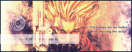
Vash the Stampede, from the anime Trigun.

Trigun is an awesome space-western, featuring deep characters, great dialogue, and one hell of a plot. I recommend it to anyone and everyone.

I decided to try and make mine have a Western-feel, and I achieved this using brushes to make the background, which I then filled with smudged clipping masks of the Vash render. I moved lots of things around and smudged using different brushes. I then centered the Vash render and smoothed out the edges. I then applied a black and white layer mask under the render but above the background, and added a gradient mask at 50% opacity to get the coloring right. I then made a new layer, went to image > Apply Image, and did a gaussian blur. I set that layer to Lighten, duplicated it, turned it black and white, played with the blending modes, and finally made another copy on the top, which I sharpened. Then, I added the border and a quote from him.
 
Doc is winning across the boards. Every round I have seen he has gotten the better of you. Believe me, I am a HUGE Spiderman fan, but his Trigun entry is fantastic. It alone actually makes me want to watch the series.

As for the wrestling sig, the viper was kind of odd to me. Like it didn't flow with the sig. It just looks to much like a cartoon for my taste. Keep at it as your chances become greater in every round in my opinion.
 

Users who are viewing this thread

Members online

No members online now.

Forum statistics

Threads
174,826
Messages
3,300,733
Members
21,726
Latest member
chrisxenforo
Back
Top