Mac Attack
I'm neat.
Every Sig maker needs a showcase and I feel like it is time to make mine. I could really use advice because I'm still refreshing myself on photoshopping. So any and all advice would be greatly appreciated.
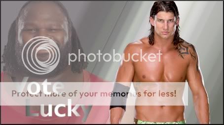
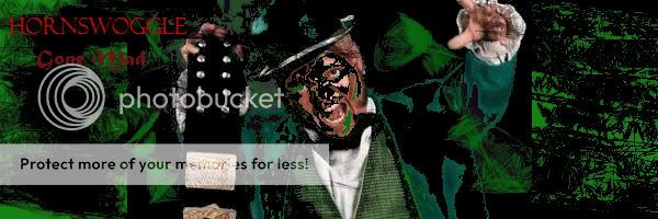
I was making a Hornswoggle Sig when I ran into trouble but it was trouble that I thought looked okay. I think the way that I did it makes Hornswoggle look almost evil. Also when looking at the blackness and him being a shiny green I thought the contrast made sense. I think overall it is an okay signature. I personally love Hornswoggle as a character and think that he is very interesting to watch and see him get involved.
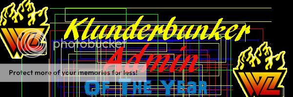
I aslo made one for KB which i really liked how it turned out. Pretty simple here as there are two WrestleZone logos as well as interesting text and a standard background. I think it is the best thing I have made so far. Hopefully KB likes it.
Please critique it and give advice since I am new to this stuff. Thanks.
Evil Hornswoggle
I was making a Hornswoggle Sig when I ran into trouble but it was trouble that I thought looked okay. I think the way that I did it makes Hornswoggle look almost evil. Also when looking at the blackness and him being a shiny green I thought the contrast made sense. I think overall it is an okay signature. I personally love Hornswoggle as a character and think that he is very interesting to watch and see him get involved.
I aslo made one for KB which i really liked how it turned out. Pretty simple here as there are two WrestleZone logos as well as interesting text and a standard background. I think it is the best thing I have made so far. Hopefully KB likes it.
Please critique it and give advice since I am new to this stuff. Thanks.


")