Welcome to my new DA&G Thread and first I think I have to tell you the reason for that new showcase.
First because I think that the DA&G Section is dying and the sigmakers need new ideas and something to give them excitement to be back on photo edition and sig creations;
Second because I've improved a lot since my old showcase and I want that to show only work with high quality;
And the last reason is because I want that you guys give me the best feedback and have some new inspiration as well -It is time to make this Section relevant again.
Let me introduce to you my Old School Showcase - next 5 sigs about the old school wrestlers.
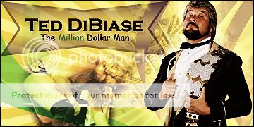
Easily one of my favorites, I used a lot of adjustments here, as well as smudging and brushing (I even created my own brushes).
The background in my opinion fits very well and it's attractive to the viewer.
The render is glowing and I did a lot of work, I really love it.
I made a lot of things, I worked the main render a lot to have the BG effect, so the only thing I used was the Main Render and a C4D, the rest is filters, blending, adjustments and smudging.
I chose the red, but I also made a blue effect that I'm really proud of, but the red looks better and darker in my opinion.
I know not the best signature ever, not even that attractive but nobody in the world is going to have a signature like mine, just because the main render is black and white in the original and I painted it, so there you have the main reason for the signature look a little bit pixelated.
A signature from Lou Thesz is pretty rare, so I am damn proud of this one.
Wikipedia photo + colorizing, after that I created a new blank page added the main picture, edited to fit the size and made a lot of smudging around and some cool new brush to give the effect in the bottom.
The text is simple but it fits in my opinion.
I urge the WZ Universe to please give me some feedback, give me some new ideas and request from me if you like my work.
I want some Old School marks here, saying what you feel.
First because I think that the DA&G Section is dying and the sigmakers need new ideas and something to give them excitement to be back on photo edition and sig creations;
Second because I've improved a lot since my old showcase and I want that to show only work with high quality;
And the last reason is because I want that you guys give me the best feedback and have some new inspiration as well -It is time to make this Section relevant again.
Let me introduce to you my Old School Showcase - next 5 sigs about the old school wrestlers.
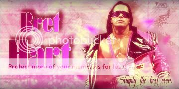
Bret "The Hitman" Hart
Easily one of my favorites, I used a lot of adjustments here, as well as smudging and brushing (I even created my own brushes).
The background in my opinion fits very well and it's attractive to the viewer.
The render is glowing and I did a lot of work, I really love it.
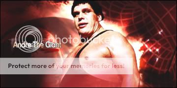
Andre The Giant
I made a lot of things, I worked the main render a lot to have the BG effect, so the only thing I used was the Main Render and a C4D, the rest is filters, blending, adjustments and smudging.
I chose the red, but I also made a blue effect that I'm really proud of, but the red looks better and darker in my opinion.
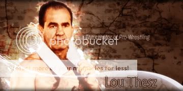
Lou Thesz
I know not the best signature ever, not even that attractive but nobody in the world is going to have a signature like mine, just because the main render is black and white in the original and I painted it, so there you have the main reason for the signature look a little bit pixelated.
A signature from Lou Thesz is pretty rare, so I am damn proud of this one.
Wikipedia photo + colorizing, after that I created a new blank page added the main picture, edited to fit the size and made a lot of smudging around and some cool new brush to give the effect in the bottom.
The text is simple but it fits in my opinion.
I urge the WZ Universe to please give me some feedback, give me some new ideas and request from me if you like my work.
I want some Old School marks here, saying what you feel.