FutureShock Showcase

Kane​

Kane1.jpg

It's easily one of my favorites signatures so far! TOP 3 at least.
The text is the main attraction here, I sure had a lot of work on it.
I've used a texture that imo really fit Kane character, a lot of adjustments, smudging, blending, brushing, etc...
And that gave this awesome effect, i'm almost in love...

Please guys FEEDBACK ME, say if you like or not.
Tell me what your favorite so far, but reply here :D


Next Time: Naruto Series character or CM Punk
 

This one is pretty good. In fact, it is likely the 3rd best one you have did. 2 things I would have changed though...

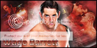
Firstly, why does Wade have a shadow when the light source is coming from behind him? Have a think about that. It's not just about making them look pretty, it is also about making them make sense.

Secondly, the text is horrible. It sticks out too much and the colouring needs some work.

Still, this is a good effort.


This one makes me want to choke you with remorse.

Firstly, I have no idea who came up with the idea to have people pop out of the sigs like you have. I will blame it on Stinger because he was the first one I recall having it. Nevertheless, cutting people off for no reason annoys the fuck out of me. If you have a border, then at least it makes sense. You've did it TWICE!

You're not just catering to me though. Take what I have to say with a pinch of salt. I just find that aspect of sigs to be completely amateurish.


This is the second best one you have did.

Everything is good except for one thing. There is no light source but Kane has glowing edges in places. If you added a white brush on soft light at the very top with a 100 pixel brush, it would have made a lot more sense. As is, it just looks poorly cut.

You're doing well. Just cut out some errors that I have talked about and you will be on the right track.
 
Im really liking the Kane one.I am very impressed with the text and the overall structure of the sig.You should make more dark sigs like you did with Kane I like it.
 
Im really liking the Kane one.I am very impressed with the text and the overall structure of the sig.You should make more dark sigs like you did with Kane I like it.
Dude. Who made your sig? Did you do it? Siiiiiiiick.

On Topic: My favorite sig of yours is the Kane one, but the popout effect at the bottom is completely unnecessary. The Barrett sig is okay, the inconsistent casing in the font is distracting. It should be THE TRUE LEADER, the true leader, or The True Leader.

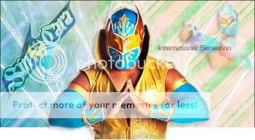
For the Sin Cara one, work harder to blend your background images into the background. It's pretty clear where you erased (there isn't a sharp line, but there is a pretty clear cutoff point) and that looks sloppy. The logo on the left is absolutely sick.

Solid job on the Kane sig, that one's my favorite for sure. Not really too much to say, just that it's all one color which isn't necessarily good. Great job otherwise, though.
 
Since even I mock with my Randy Orton signature, I thought I should make a new one, at least just to proof myself that I could do it, and here I have

Randy Orton V2.0​

RandyOrton3.jpg

Okay, It's not that good, but at least it's better than my previous one :)
I sharpened the image for the first time in my Sigmaking Career here at WrestleZone.
I like how the final result turned out and I thought about posting it here.

What you guys think?
Better than the previous?
Feedback!! Keep up my work!!
Pretty good. Sick and Twisted doesn't fit at ALL, it looks very out of place. Everything else looks pretty cool, though. Only other gripe I have is that the render of Orton on the left looks pixelated or just low quality.
 
John Morrison​

JohnMorrison1.jpg

It was a request that I've made... And I really like the result of it.
The background is really amateurish, but it turned out very good and it fits in my opinion.
The main image works very well with the BG, and the secondary images also blend very well.

Hope you like it!!
Feedback and rep if you want!

I like this. It fits him. The text flows well. The secondary image i can see is good, and the main render fits. The only problem I have is with the Background on the top right of the main render, it covers a part of his head. It's offsetting. Aside form that, great work.

8.5/10
 
Jack Swagger​

JackSwagger1.jpg

That's right the former World Heavyweight Champion in that simple signature, that can came out very simple and lazy, but I just love the effect, I really do and it is one of my favorite signatures for now.

Should I had this one to my "Random Signature"?
Feedback me on this one!


Thank You for every feedback you post guys, you are truly awesome, and I've learned a lot with you...

Note: WWE Divas Champion!!
 
Justin Bieber

JustinBieber.jpg

I must be really fucked up to make a signature of the most hated guy on the planet, but lets be realistic the guy has style and the signature turned out pretty well.
The color scheme really fits nicely and I really like this.
I like the effect where I inserted is text, and I hope you like it.

Feedback me on this one!
Thanks guys :D
 
As weird as it might sound, I think the Beiber sig is your best to date. Everything flows really well. The color scheme fits really well, like you said. The only problem I have with this sig is the massive dead space created by his jacket and the black gradient coming from the right. Great job, though. :)
 
Kelly Kelly​

KellyKelly.jpg

Of every piece of work I've ever made this one is the one that I loved to make above everything, she is sexy and the color fits so nicely that is a shame that it wasn't done for her :p

Kidding aside, I really like this signature, she is one of the sexiest women on Earth and I just love playing with Dark photos.
To all sigmakers and photoshopers, a black background really gives you wings to use your imagination, and it is the result.

Hope you like it as much as I do, maybe not my best work, but definitely the one that I enjoyed the most!

Note: Jam22 makes great sigs, check is showcase and request page.
 
Kelly Kelly​

KellyKelly.jpg

Hope you like it as much as I do, maybe not my best work, but definitely the one that I enjoyed the most!

Note: Jam22 makes great sigs, check is showcase and request page.

Lol. Thanks for the note. Anyway, Kelly Kelly, Damnnnn. That's all that's need to be said. Haha. But really, yes I agree that black gives a lot of options. And your choice of color is pretty good. Not a lot in the background though, you can add some C4D's that could match. But overall, I like this sig. I like the text, flows really well.

Also, open your own request thread already! Lol. I'm sure it'll be fun and challenging. But that's how sigmakers learn. Am i right? :)
 
David Otunga​

DavidOtunga1.jpg

Here we have... Jeniffer Hudsons husband.... or should I say one half of the current WWE Tag Team Champion.
I'm really digging the dark sigs, the text looks awful but believe me I tried very hard and nothing really fitted here.
The main image has a lot of adjustments in the lights, and the BG is smudging, with a brush effect.

What you guys think of that?
 

I'm not sure what to make of this one, dude.

I mean, it is a good enough signature but it is very basic in terms of the techniques you have used. For someone like me, adding additional features to make things pop is vitally important. For example, a camera flare where it says “A-List” would have been spectacular and I guess you can add that in and see what you feel.

The main thing that is annoying me about this signature is that it is far too dark around the edges. Yellow is an awesome colour and you could have made it better use of it, if I am honest with you. Stretch that yellow behind him out a little and take a little bit of the darkness around the sides away. Right now, I just find it to be too dark for my tastes.

Quite a basic signature that could use a little bit of work but you're getting there.
 
At what place do I need to get in, Dave? :rolleyes:
I wanted to make it simple but effective, the only problem is the text, I couldn't find anything to fit in there, but I love your feedback is always very constructive mate :)
Thank you...

Zack Ryder​

ZackRyder.jpg

I actually like this one, a little bit empty I know, but the overall effect turned out good in my opinion.
Once again, the fucking name bothers me, but the secondary text fits nicely in my view.
The BG is probably the highest spot in here and the main image also fits nicely.

What do you guys think about this one?

I will try to make a wallpaper, in the following days, keep on notice.
 
Zack Ryder​

ZackRyder.jpg

I actually like this one, a little bit empty I know, but the overall effect turned out good in my opinion.
Once again, the fucking name bothers me, but the secondary text fits nicely in my view.
The BG is probably the highest spot in here and the main image also fits nicely.

What do you guys think about this one?

I saw you sporting this piece of awesomeness and thought I'd give you a bit of feedback.

It is very, very goo (and not just because it has Zack Ryder in it). The background is blended really well and the colours are perfect. That's really what makes this sig work. While the image is still the main part of the sig, it blends in really well because of the colour. The only downside is the text. I'm not really a fan of text which isn't horizontal. I have no idea why, it's just how I feel. I also can't see it very well. You'd be better off using a different, more striking font. Apart from that, it's really well done. Keep up the good work!
 
Harry Potter​

Potter1.jpg

I'm a big fan of the franchise, and I've seen the idea in psd-dreams, so I tried mine too...
This is what I came up with, I'm in need of names for new brushes, and stuff like that, if you could give me some cools in the feedback I would be very glad.
I like the part of this image having a dark and a bright side, dark in the BG and bright in the main image.
 
Drew McIntyre​

DrewMcIntyre2.jpg

I've put a lot of effort on this one, because it is going to be my last this month.
I've noticed that I've made a lot of sigs, but quantity isn't quality, and people are starting to lose interest in my work.
I will practice more and more, I will learn as much as I can, and I will try to make this section relevant, again.

Give me feedback in that and previous sigs.
What is your favorite sig?
What would you change?
 
Well I told you that I was trying to make something different like a Wallpaper and this is what I came up with...

CMPunkWall2.jpg

Also a simple way of the same wallpaper
Wallpaper1.jpg

So give me feedback on my first ever wrestling wallpaper...
Even I know that this is a piece of crap, but believe me it's pretty hard to make a fucking wallpaper.

What you think?
Rate it in a scale from 1/10, PLEASE!!
 
CM Punk​
CMPunk2.jpg


CMSig.jpg

After Monday Night RAW I just felt the necessity of making a CM Punk signature, but well I've made Two of them.
Both has blue has the main color, and I don't know why but it fits CM Punk.
In the first the text is simple, but in the 2# the texts is awesome in my opinion :p
Same Main Render and Same BG render, but I liked the brush differences and stuff.

I miss you feedback guys, I want to read about what you think of my signatures!!

Request from me if you like ;)
 

Users who are viewing this thread

Members online

Forum statistics

Threads
174,851
Messages
3,300,884
Members
21,726
Latest member
chrisxenforo
Back
Top