FutureShock Showcase

FSWWE

Championship Contender
I actually love Photoshop and since Arlo told me to open a showcase, i will make one!!

I will upload two or three signatures per month for now!
I accept requests from PM, however it will depend on my time...
In the summer i will open my request page...

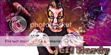
For now here you have the faces of the WWE...
John Cena

Im new here in the signature business so that is my favourite signature for now...
I used a space image for the background, and an image from Cena doing a double AA to Edge and HHH and an AA to The Rock
I blended it to hard light and put the opacity around 60%
Mixed the levels and wrote "U Cant See Me"

Then i used Cena as wwe champion from 2011 and mixed too with the levels
I wrote Cenation, put a gradient going from yellow to red, and put the opacity around 60% and the stroke was a gradient too...
Easy but i really liked it...


Randy Orton​
randyorton2.jpg

These one is the lamest signature i've ever seen, but well it is the only one about Orton that i have xD
I liked every part of the text!!


Feedback guys please and thank you :D

Next Week: The Miz
 
Having a showcase thread is definitely the thing to do. So I'll give you a bit of feedback seen as you were so kind to give me some.

John Cena

Yeah, this is pretty good. I like how the main image of Cena looks and the main text is nice (text is something I always struggle with). The background looks good but could be changed a bit. Cena is wearing red, so why not have red be the unifying colour of your signature? Instead of the greeny/browny/ yellowy colour. The white gradient isn't really doing anything for me, sorry. It could be blended a bit better. But overall, it's a nice signature.

Randy Orton​
randyorton2.jpg

I don't like this one as much as I like Cena's. None of the text is the same, so it looks a bit messy and the main text doesn't suit Randy's character. It looks a bit soft. The background looks nice and I like how the colour of it is blue. This one does has some good parts, but I do prefer the Cena one.

What I will say about both of these is that two things are missing.

1) Drop shadows on the main images. Drop shadows help blend the main renders into the sig.

2) They both need borders. The first thing I learnt when I started posting sigs on here is that borders are essential. The make the signatures look more complete.

Anyway, nice going. I'm looking forward to seeing The Miz here next week.
 
Hey man, I thought I'd drop by and give your first 2 sigs a critique.

johncena1k.jpg


I really really like this. The only thing I don't like is the white gradient. It's just unnecessary. The background and blending of the background pics are awesome.


randyorton2.jpg


I agree with you on the BG, it's really cool and a perfect colour scheme. The bits I dislike are the left image and text. I can't really tell what the left pic is and you're right about the text, it looks a tad messy. I love the central pic and the blue text over it.


Here are some bits of advice that I got told when I started that really helped me. I think they could assist you too.
1. Borders
Definitely add borders. Something about them just seems to complete a sig. They can make a good sig great. I suggest you just use black ones and it usually only takes a 1 pixel border to do the trick.

2. Size

Both of these are really big. 500x300 is the limit and your Cena one is 500x200. I usually start with 400x180 for a standard sig.


There you go man. I'm glad you took my advice and opened this showcase because I think you've got a lot of talent. You're definitely better than me when I started :lmao:
 
I want to thank all of you for the feedback and the rep :)

I managed to get half an hour clear and I made this two signatures...

The Miz​


The thing that I liked more in that image is the color, I used an effect that I didn't have used called photo filter!!
I think that the blend and the background are alright, the text is awful and i usually am very good with text!
I think it is harder to make it in a signature, but overall I liked this signature


Rey Mysterio​


IMO the best part of this signature is the main image that sadly I didn't do :(
I made a background with a radial gradient going from white to blue.
I created a new layer and I used a brush that I love named "Fractal Chaos" to make the white effects...
Both of the background images are blended in "Luminosity"
The most lame part is the text, but even that I think that it fits well :)

I used the borders like you told me and I really loved the effects
Thank you both!!
I also used a pattern that I made to give the effect of little squares :)
About the size, It's to differentiate my style from yours but i will make it randomly :blush:

Don't forget the feedback (good or bad it's appreciated) or the rep (red or green depending if you like it or not)

Next Time: .... It's going to be a surprise eheh!!
(okay I admit i don't have a clue :p )
 
on the Orton one, the blended picture on the left is a bit hard to see. Also, different text should be used, its too plain.
 

My first non-wrestling signature... This time featuring Jensen Ackles a.k.a Dean Winchester from one of the best TV Shows in the last 10 years, Supernatural.

I used 3 pics of him in the tv show and overlayed it, used some brushes to give the effects...
The main image is good, however the arm (fail)!!
But overall I think it's a good signature!!

Rep if you like and feedback!!
Thank you guys!!


Next Time: Sin Cara or Dolph Ziggler
 
Dolph Ziggler​


I like this one, it's not the best, not the worst but the overall effect I think that looks kinda good...
I tried to make things that I don't know how to do, so i probably ruined the signature...
I used only two images from Dolph Ziggler, the main image and the little image on the right!!
Blended it in Pin Light and Opacity around 60%
In the main image, i used motion blur in a copy and placed it on the back.
I used a brush to give that sunny effect and photo filter in yellow, density 50%

Feedback and rep if you like :)
Thanks guys


Next time: An old image I have about Edge
 
Edge​


I made this for a guy about 3 weeks ago, that sadly he isn't using it...
In my opinion it is one of my bests, I liked the blue and the two effects on the right and on the left that are blended in "Luminosity" and Opacity around 80%.
The text looks nice and the star could be better, however it is also good...

Feedback and rep if you like
Thank you guys

Next time: Sin Cara or Daniel Bryan (or another TV Show)
 
Daniel Bryan​


I really don't have anything to do...
I loved this signature, it's simple, I used a layer with a gradient going from Red to White in Radial, also a grunge texture and a grunge brush for the background...
The image on the left is blended in "Luminosity" and the image in the right is normal, but mixed in "levels"...
"Daniel Bryan" text is in Impact font, and used a motion blur in a copy to add the 3D effect!
Overall I think it's a good signature...

Feedback please guys :)
I want more tips and ideas from you guys!


Next Time: Sin Cara or Christian
 
Dolph Ziggler​


I really like this one man. I've never made a good Ziggler sig but you've managed to knock it out of the park straight away.
I think you've picked the perfect colour scheme


To be completely honest, I don't like this. It's all great until you get to the main pic's head. When doing a transparent-topped sig (Something which I think has become my specialty) You can't have part of the pic cut off like the top of his head. I think if you used a different pic then this would be way better.

Edge​


I love this Edge sig. It's pretty hard to fuck up an Edge sig.
I love the BG images and text. 10/10


Overall man, You are improving with literally every new sig you post. At this rate in a month or two you could be the best sigger here at WZ.

I love how you're taking in everyone's advice.

Keep improving :)
 
Thanks for all the recent feedback, i'm loving doing sigs just because of that :)
For today, I have two new sigs...

Christian​


I used a background made by brushes and one wall image blended to give the colour scheme and the texture effect.
I placed Christian reaching the gold in the ladder match, and reduced the opacity...
For the main image, I used to images, the one from the bottom is smudged and gave the effect behind Christian that i really love...
Some adjustment layers and the textm which is in "Ash" font...
Maybe one of my bests...

Uchiha Sasuke​


Since I am a Naruto fan, I really wanted to do one and since Sasuke is my favorite character I made it...
This is my best non-wrestling signature, I just smudged some renders to give the effect of the background, which is the hardest thing to do in that image...
Then I placed the secondary image and "overlayed" it and opacity around 60%
I placed the main image, adjusted with some levels and with a mask and blended in the bottom.
The text i think that looked nice...
"The hate is my dead." in the middle, with opacity around 60%
And "Sasuke" in normal way and a outer glow...
Overall I think it's a pretty good signature...

Keep follow my work, if you want to do it, share it with other people and feedback or rep if you like :)

Next Time: (I'm avoiding a Sin Cara signature) I will post an old Cody Rhodes signature that I did for Xemnas and then make one of Wade Barret maybe ;)
 

Feedback for ya, my good sir.

First of all, I love your work, I just picked your most recent [wrestling] work to critique.

this is a good sig. The secondary image fits well into the background, the color choice is good, and the background fits the goal of the image. The text is wonderful, and text always seems to be a strong point of yours. The left, primary image is fit into the image well.

The only advice I can think of, is that 1. this image may have been a great one to give a transparent top to, and have Christian pop out of the top, but it wasn't necessary, and 2. to put the scanline/dot effect behind the main render. It takes away from the focus that should be there, but we've all been there at one point. :p

Overall, god work, keep it up.
 
I think you are a very good GFXer sir.I love your Edge sig.Everything about it looks good.I also like your Drew McIntyre sig quite a lot.
 
Can I ask How do you do them little squares on the rey mysterio sig? It would be very much appreciated if you told me.
 
Can I ask How do you do them little squares on the rey mysterio sig? It would be very much appreciated if you told me.

Actually it's very simple...
You need to create a new file, let say 2 by 2 pixels...
Zoom in and take the pencil and make a 1px square in the top left and other in the right bottom.
After that go to Edit/Define Pattern...
Now you have your pattern, so you just need to create a blank layer, go to pattern overlay, and the last one should be the recently created, click on it, and reduce the opacity of the pattern around 10% :)

Cody Rhodes​
CodyRhodes1.jpg

Its an image i've made and that is not being used I want to show you here...
I used three different textures of old newspapper, i add the Cody Rhodes image and blended it in Multiply...
I've made a grunge effect surrounding the signature and i have written Cody Rhodes and Wretched and blended the lat one in Linear burn...
 
Sheamus​

Sheamus1.jpg

New Signature, this time from Sheamus and it looks though and strong so I kinda like this one...
The background looks awesome, I used a grungy texture image and adjusted to gave a dark greenish effect. I blended both of the images in Hard Light and opacity around 60%...
The main image I think that fits very well and I didn't have to make a lot adjustments in here and the text looks weak, but fits nice too...
And last but not least I added the Celtic Warrior logo and the text "My time fella", both blended to give the greenish effect!!

Hope you like it!!!
Give me feedback, even if you don't understand a piece of shi** about Photoshop, it's always nice to support the sigmakers :)


Red Skull is getting better and better every day, it's incredible!!
Check his Request Page... Damn!!


Next Time: Surprise!!
 
Wade Barett​

WadeBarett.jpg

Here is the surprise, Wade Barrett...
I've to tell you that I really love this signature and it took me awhile to do it!
The background was totally made by me from scratch with brushes and adjustments!
Then I added the main image, aligned it at Center and make it with that dark reddish effect...
Added two images to the background, blended it and reduced the opacity!
(The John Cena/Barrett pic is awesome)
Then added the text and adjusted it!!

One of my favorites!!

Feedback guys and rep if you like!!
Thank You ALL!!


Next Time: the next guy to give feedback can chose!!
 
Well thanks for that thing I will have to try that.And that Barrett sig is amazing.I love it but the Sheamus one not so much.Its very good but not as good as the Barrett one.The Only thing I dont like is the main text but the rest makes up for that.

And Ive tried doing that thing but it just doesnt work for me lol
 
That is a "Hamlertainment" idea!!
He asked me to make a signature about Family Guy, so I chose my favorite character...

Stewie Griffin​
StewieGriffin.jpg

This is the third signature that I upload into my showcase today!!
This is a pretty good signature for every Family Guy fan imo...
I used a gradient going from black to red, then I blended a texture to give the effect.
Brush here and brush there to give the other effects.
I used the main pic and expanded the selection of the same, to put the white effect, and also in the main image I made him look darker
Write the text and make a hand stroke :rolleyes:

Thanks Hamler for the idea!!
Please WZ Members, give feedback, green(liked) or red(didn't like) rep


Next Time: Some other person idea or The Undertaker
 
Man how do you do it like on that Sheamus sig you cant see the background images lines how do you do it.
 
Wade Barett​

WadeBarett.jpg

Here is the surprise, Wade Barrett...
I've to tell you that I really love this signature and it took me awhile to do it!
The background was totally made by me from scratch with brushes and adjustments!
Then I added the main image, aligned it at Center and make it with that dark reddish effect...
Added two images to the background, blended it and reduced the opacity!
(The John Cena/Barrett pic is awesome)
Then added the text and adjusted it!!

WOW! Easily my favourite sig of yours!

I love the smudging around the main image and the background is absolute perfection! I love how the BG images are on an angle.
The subtlety of the minor text fits well and the main text slots in perfectly.


I had to give you some feedback, this is a masterpiece! Keep it up man!
 
This one is an ARLO idea, check is showcase here, he has pretty sweet signatures!!

Sin Cara​

SinCara.jpg

I'm very disappointed with the final result! I thought I was one a role of making good signatures, and that one, I didn't felt that was in the same standards as the previous three.
The main image don't really call for attention, in my mind it still a good signature but not as good as my previous three or four :x

Please feedback on this one!!
Next Time: Another ARLO idea, Jeff Hardy!
 
Jeff Hardy​

JeffHardy1.jpg

It turned out a pretty sweet signature in my opinion.
The color scheme is good and the main picture is awesome, I've made some effects in the background with brushes and a texture (pin light), smudged and used a brush to give some of the effects.
The two secondary pictures are very good and they fit very well here, TNA main pic, 2 WWE secondary pics :)
Simple main text an secondary text!

Overall it's one of my favorite signatures
I'm still on a role :lmao:
I want more feedback from you guys, I didn't get almost none :(

Next Time: Kane (really good signature)
 

Users who are viewing this thread

Members online

No members online now.

Forum statistics

Threads
174,826
Messages
3,300,732
Members
21,726
Latest member
chrisxenforo
Back
Top