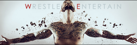
I like the smears you used to an extent, but I think you did too much in the upper left, and covered up the render a little too much than you should have. I think you should have made it a little more transparent, and went with a foggy effect to let us see his entire body, while giving the same sort of coolness to it.
Another thing I dislike is the font and text color. The black is hard to read, and you can't see it as well. I would have chose a different color, and a style of font to make it stand out more. Maybe even bold it as well.
This one I like A LOT more. The color of the render's body seems to look really good with the cyan background colors, and the spikey/mountain background effect gives it a more dangerous feel. The choice of font you use seems to match perfectly, as well as the color. It stands out, and can easily be read. I also like where the font is place, as it's smack in the center yet doesn't get in the way.
I like them both, but your second one looks a lot smoother.
Edit: And sorry that I reviewed only the first two you posted. I'll take a look at some of you later ones soon.

")