Boondocks Graphic Showcase!

Boondocks

Wrestling pro with JC Epick someday
Here it is, the showcase of Boondock's graphic work!

[Note: I was formerly StraightEdgedSoldier, but my showcase is on the next page or something, it's really old, and I have a new name. :p]

So I'll start off with a piece of work I did earlier today:
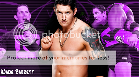
Alex Riley

AlexRiley.png


Ths one was a request on another site. I started with a medium blue background, and added some lighter blue brushes. I then added the two secondary renders, and edited them to be at about the same color. I duplicated them, used hard light, and added a blue cover filter to them. I then added a fractal C4D (Which was one thing I was determined to add to this, and so I worked to suit it) and put it on Overlay. I then added the main render, and used a technique I learned from fellow sig maker ARLO, that he calls DDO (Duplicate, desaturate, overlay) and I repeated once. I put the second DDO on 30 opacity. I then added a fuzzy brushstroke to the top right to make the main render's glow make sense. I added blue text with a white stroke, amnd then a multi-color border. I really like how it turned out, and it inspired me to make one for myself.

Edge

Edge.png


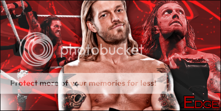
As I said, it inspired me to make one for myself. I started similarly, with a mdark red background, and light red brushstrokes. I added the two secondary renders, darkened one to match. Then I used Hard light, and added a red layer to overlay them. I then added scanlines, and a C4D on soft light. I then added the main render, used DDO. I then added a red layer to the rain render to give it a slight tint. Then I added a slight black stroke to the render and used a gaussian blur to make it like a shadow (not sure if I like it). Then I added a light to the bottom right to make up for the glow on Adam. I added medium red text with a white stroke next. I topped it off by adding a thin black border and called it a sig.

Mighty proud of these two, and I plan to wear it.

Feedback will be GREATLY appreciated, and either returned or repped. :)
 
Not trying to be a dick, this is a serious question...what's up with the patterns? Theo has a sig with dot patterns, you're using vertical scanlines...it's all just so offputting. That being said, I'll ignore the scanlines with my critique.

The A-Ri sig's background is wayyyyy to dead imo. I suppose you can count the background images as a part of the background, but aside from those two renders it's just nothing. Simple is good sometimes, but overly simple is usually overly boring.

It's really hard to mess up an Edge sig, and yours is pretty good. Better than the A-Ri sig mostly because there's more going on in the BG and your main render of Edge blends into the background a little better, what with similar coloration and all. I'm not sure if I like the extra props (ropes, title) that your BG images have in them or not, but I think I do, especially the one on the left.

Basically, get rid of the scanlines, blend everything a little bit better (that doesn't necessarily mean make everything the same color...a la my A-Ri sig) and just work on making more detailed backgrounds.

Off-topic (kind of), how long have you been doing GFX?
 
The background of the A-Ry sig had much more going on, but it got all mashed up and looks solid after the solid layer I placed on top with a different effect.

To the scanlines, I don't know what Theo uses them for, but I use it as something that not only separates the BG from the main render, but it sort of makes the main render pop more.

And to your question, I've been doing graphics on and off for about 7 months, and due to my lack of money and a proper pirated PS code, I've been using GIMP for those 7 months.


Alex Riley

AlexRiley.png


Edge

Edge.png


Mighty proud of these two, and I plan to wear it.

Feedback will be GREATLY appreciated, and either returned or repped. :)


Ok Alex Riley feedback. Overall everything looks presentable. You went pretty conservative with having the three pictures which isn't a bad thing although you should experiment with doing different looking sigs. Not just the three picture one or the single person one. I think the color scheme is good except the only thing I dislike is the little wavy areas where the color is slighly lighter. I think the way you wrote Alex Riley is appropriate and well suited for the picture. I would also put the centre picture actually directly in the centre and move the pic on the left more left. Overall a pretty good, conservative pic.

Edge feedback. I think that the background is okay. I like that you tried to match the colors to his color scheme except that it looks almost bloody which I don't know you were going for. My favorite thing about the picture is the picture on far left because it is very classic Edge. I think the picture in the middle needs reworking because of how many times I have seen others use that exact picture. (considering I even used it and I don't make sigs-too much (if i do for myself). One annoying thing is the light that is reflecting on Edge's arm seems a bit random as well as the light on the bottom left hand corner of pic. But overall a good, conservative sig.
 
I understand that the A Ri sig might have a lot more going on, but when all is said and flattened, the BG is just blue. Also, it's really easy to make a main render pop out from the background without the use of scanlines. I personally don't like it when a main render is massively separate from the BG because it looks chunky that way, but if you do want it to look like that, you can duplicate the render and set the top layer to Overlay, or add a drop shadow or black outer glow so that it looks like he's casting a shadow on the BG. Scanlines (really just patterns in general) ruin sigs imo

And not sure if this helps, but you're wayyyyyyy better than I was after 7 months. Wanna see one of my works from 7 months after I started photoshopping?

AJStylesBanner.png
 
Wade Barrett

Barrett.png

Not gonna really go in depth, it's generally the same thing as the Edge and Riley images. Only difference is, there's no modified C4D in this one.

And yes, Kayoh, it has scanlines. I just like the idea of them. But I did experiment more with adding a shadow to the main render this time.
 
I like the new one. The scanlines have a low enough opacity that it doesn't bother me THAT MUCH. How are you making your BGs? Aside from the images in the background, what is that? Are you using C4D renders or something? It's odd. It just looks like random lines. Don't get me wrong, it adds a decent effect but I'm just wondering, from a GFX guy's point of view, what it is. :p
 
I like the new one. The scanlines have a low enough opacity that it doesn't bother me THAT MUCH. How are you making your BGs? Aside from the images in the background, what is that? Are you using C4D renders or something? It's odd. It just looks like random lines. Don't get me wrong, it adds a decent effect but I'm just wondering, from a GFX guy's point of view, what it is. :p

On all of the three I've showcased, the BGs are made up of me choosing 2 colors, and using a simple brush I found on Deviantart. I forget what they're called, but yes, they're simply wavy lines, accompanied by spots and blotches. I feel they're simple, yet nice.
 
Oh, I see, you're a brush guy! Check out xALIASx on DA, his brush sets are phenomenal.
 
Wade Barrett

Barrett.png

Not gonna really go in depth, it's generally the same thing as the Edge and Riley images. Only difference is, there's no modified C4D in this one.

And yes, Kayoh, it has scanlines. I just like the idea of them. But I did experiment more with adding a shadow to the main render this time.

Hmm I like it, overall but I feel that it has some flaws that need working out. I am glad you tried to brighten up the background, however with that being said I would not have used the color purple. I would have picked maybe a modified yellow color. Also consider changing up some of the sameness of the renders. For example how about using the middle picture as faded and possibly using the other two as normal. (Just a thought, although it might look funny for this render). Also I like the black spotch behind Barrett but to improve upon it I would give it some purpose. Apart from that I think it's pretty good.
 

Users who are viewing this thread

Members online

No members online now.

Forum statistics

Threads
174,826
Messages
3,300,732
Members
21,726
Latest member
chrisxenforo
Back
Top