The 1-2-3 Killam
Mid-Card Championship Winner
Hey everybody! I'm really new to this section, so I'd love any help you guys are willing to give. I've been using PS for years for general stuff, but it wasn't until this week that I started actually trying to do some design work with it. I've been watching tutorials and trying to get a feel for some more complicated stuff... Anyways, I'm going to post my first three attempts. The first one is from last year before I started working on improving. The second one is from a few weeks ago, and the newest from today. You can definitely see the improvement...I think so anyways.
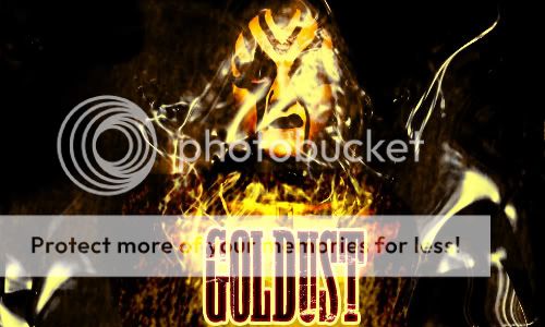
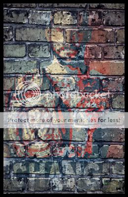
 So this is the first one I did. As you can tell, just some basic cut and paste and blur effect, leaving a little black around the edges because I thought it looked cool. I'm not sure, but I may have just swiped the back image from google. Not a work of art, but the first thing I tried to do...
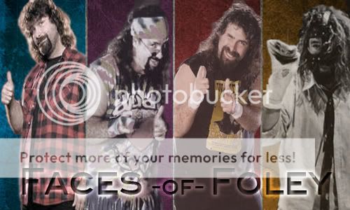
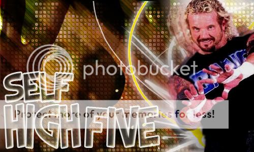
 I made this recently when talk of the new nWo started making its rounds through various dirt sheets. I figured Ziggler, Rhodes, Nash, and Christian were safe bets, but I also thought they needed some muscle. Brodus Clay is a great talent that needs to make a strong debut. And then I thought about the old nWo and how they had HUGE swerves with returning talent. Batista and Jericho are the two biggest talents I could see returning. Jericho could be this generations HBK swerve.
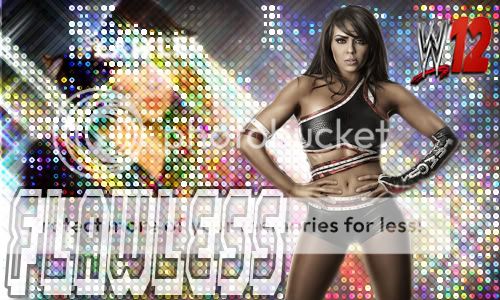
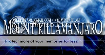
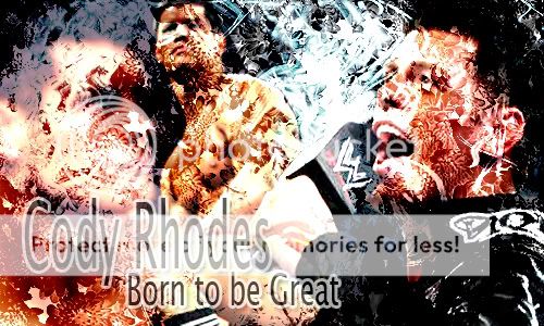 And this is my most recent work. I started working on overlapping backgrounds using lens flares, fades, and different blending options. I was going to go with some elaborate font, but then I realize the basic Lucida with a drop shadow and white stroke looked really great. I'll be honest, after I got the crazy background done I just messed around with things until it looked cool. I suspect that happens a lot...
I know they're not very good, but if anybody wants to use anything I ever do as a sig, feel free. Just credit @MikeKillam (my twitter name) if you'd be so kind. Hopefully I keep improving, and again, any feedback would be excellent!
I know they're not very good, but if anybody wants to use anything I ever do as a sig, feel free. Just credit @MikeKillam (my twitter name) if you'd be so kind. Hopefully I keep improving, and again, any feedback would be excellent!