Couldn't think what else to call it. We have an Ask-A-Question thread, and a Tutorials thread, but this is (hopefully) something different, and might get more people into graphics and design. It'll be a multi-part topic and anyone can chip in if they so desire.
Update: The first few posts are old. That is why they're hidden in spoilers. Look through them for reference, though. Once you get to the non-spoiler'd post, you've reached the new guide.
Update: The first few posts are old. That is why they're hidden in spoilers. Look through them for reference, though. Once you get to the non-spoiler'd post, you've reached the new guide.
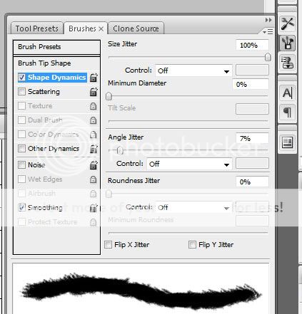
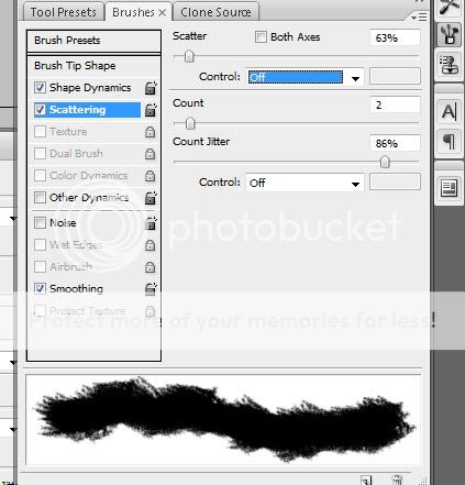
Brushes!: Now, I'm not going to pretend to be the be-all end-all guy with brush knowledge. I only started using them recently, and boy am I glad I did. With them, making your own background is a snap.
Click here for my favorite brush set.
I’ll be doing this from the perspective of a Windows and Photoshop 7 user, so you’ll have to improvise and work around some things if you’re on a Mac.
Be sure you have WinRAR and WinZip installed. Many brush sets are packed in either a RAR or ZIP file.
When they have downloaded, you have to put them in the "Brushes" folder, which is in the "Presets" folder which is in the “Photoshop” folder which is in the “Adobe” folder which is in the “Program Files” folder which is on the C:/ drive.
C:\Program Files\Adobe\Photoshop 7\Presets\Brushes
Got it?
You’ll want to download a variety of brushes. Abstract brushes are nice, as are Fractal brushes. There are brushes for pretty much anything out there, for things like Cityscapes, to fire, to water, to ancient circles, to blood spatters, and more.
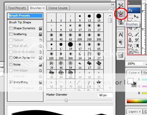
To add your brushes, make sure Photoshop isn’t open when you put the brushes in the right folder. Then, open up Photoshop and select your brush tool.
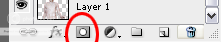
Afterwards, open the brush menu and click on the little arrow to show all your brushes
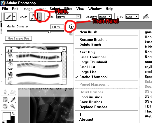
And then select your brush that you want to add.
When this dialogue box comes up, I usually click “Append” because it adds the brushes from that set onto your default set. Very useful.
Click here for Midnight City, another brush set I quite like.http://shiftyj.deviantart.com/art/Midnight-City-Vector-Brushes-131187390
IMPORTANT: If you have an older version of Photoshop (for example, Photoshop 7), many brushes made with the new versions will not work! To get around this, you‘ll have to do things the long way. Luckily, the long way isn‘t that bad.
Download the ABR Viewer by clicking here. When you have that downloaded, use it to open up your ABR file, and click Export>Thumbnails. This will save every brush in the ABR file as a PNG. It is recommended you export into a new folder, just to make things easier.
Anyway, open the PNG files with Photoshop, and for each one click “Define Brush” which is under the Edit menu.
BE WARNED: If you ever replace your current brush set, these brushes will be deleted and you’ll have to define them again!
It’s very useful to have some paper texture brushes, in order to make different types of backgrounds. Here are the three textures I use for paper brushes:
http://www.alfenn.com/hsquaredscarves.com/External/High Res/paper texture 2.jpg
http://www.drudoo.com/wp-content/paper_texture.jpg
http://fc06.deviantart.com/fs18/f/2007/154/3/e/Paper_Texture_2_by_Insan_Stock.jpg
For those, you will probably have to cut sections out. I usually cut out a quarter of them. To get a perfectly accurate measure, go to View>New Guide, and type 50% when the dialogue box pops up. Do this for both horizontal and vertical, and Voila! Your image is now split into quarters. Simply crop it and use Define Brush.
Well, that pretty much wraps it up for the Brushes section. Let’s move on to designing backgrounds.
Backgrounds!:
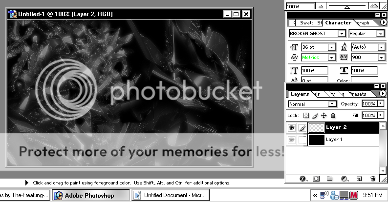
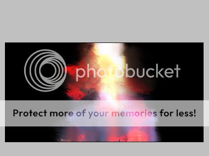
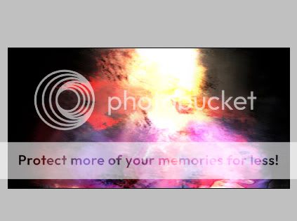
Now, when designing a background for a sig, I usually start with either a straight black or straight white background. It's easier that way. Then, I create a new layer. This is very important. With a new layer you can edit very easily, and apply color overlays and the like. I usually use white for the brush strokes themselves, as it is very easy to change colors later.
Here are some useful tips when designing backgrounds:
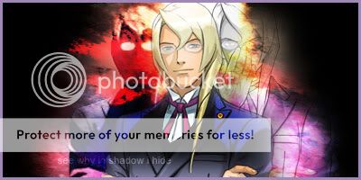
The one thing to remember when designing sigs is Everyone has their own style.
For example, I favor high contrasts or colors, while Rebecca usually has faded, sepia sigs. Just because someone has a different style does not mean that they are better or worse than you.
That’s about all I have for the first installment of this thread. Next up: Selections, Fonts, and Strokes.
Any graphic designers and others who want to pitch in their own guides, tips, and tricks, feel free to!
Bye!
Click here for my favorite brush set.
I’ll be doing this from the perspective of a Windows and Photoshop 7 user, so you’ll have to improvise and work around some things if you’re on a Mac.
Be sure you have WinRAR and WinZip installed. Many brush sets are packed in either a RAR or ZIP file.
When they have downloaded, you have to put them in the "Brushes" folder, which is in the "Presets" folder which is in the “Photoshop” folder which is in the “Adobe” folder which is in the “Program Files” folder which is on the C:/ drive.
C:\Program Files\Adobe\Photoshop 7\Presets\Brushes
Got it?
You’ll want to download a variety of brushes. Abstract brushes are nice, as are Fractal brushes. There are brushes for pretty much anything out there, for things like Cityscapes, to fire, to water, to ancient circles, to blood spatters, and more.
To add your brushes, make sure Photoshop isn’t open when you put the brushes in the right folder. Then, open up Photoshop and select your brush tool.
Afterwards, open the brush menu and click on the little arrow to show all your brushes
And then select your brush that you want to add.
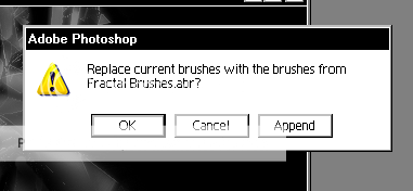
When this dialogue box comes up, I usually click “Append” because it adds the brushes from that set onto your default set. Very useful.
Click here for Midnight City, another brush set I quite like.http://shiftyj.deviantart.com/art/Midnight-City-Vector-Brushes-131187390
IMPORTANT: If you have an older version of Photoshop (for example, Photoshop 7), many brushes made with the new versions will not work! To get around this, you‘ll have to do things the long way. Luckily, the long way isn‘t that bad.
Download the ABR Viewer by clicking here. When you have that downloaded, use it to open up your ABR file, and click Export>Thumbnails. This will save every brush in the ABR file as a PNG. It is recommended you export into a new folder, just to make things easier.
Anyway, open the PNG files with Photoshop, and for each one click “Define Brush” which is under the Edit menu.
BE WARNED: If you ever replace your current brush set, these brushes will be deleted and you’ll have to define them again!
It’s very useful to have some paper texture brushes, in order to make different types of backgrounds. Here are the three textures I use for paper brushes:
http://www.alfenn.com/hsquaredscarves.com/External/High Res/paper texture 2.jpg
http://www.drudoo.com/wp-content/paper_texture.jpg
http://fc06.deviantart.com/fs18/f/2007/154/3/e/Paper_Texture_2_by_Insan_Stock.jpg
For those, you will probably have to cut sections out. I usually cut out a quarter of them. To get a perfectly accurate measure, go to View>New Guide, and type 50% when the dialogue box pops up. Do this for both horizontal and vertical, and Voila! Your image is now split into quarters. Simply crop it and use Define Brush.
Well, that pretty much wraps it up for the Brushes section. Let’s move on to designing backgrounds.
Backgrounds!:
Now, when designing a background for a sig, I usually start with either a straight black or straight white background. It's easier that way. Then, I create a new layer. This is very important. With a new layer you can edit very easily, and apply color overlays and the like. I usually use white for the brush strokes themselves, as it is very easy to change colors later.
Here are some useful tips when designing backgrounds:
- Be sure to vary your brushes! Don’t just use one abstract brush over and over again. Try and use multiple to make the background pleasing and more interesting.
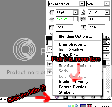
- Experiment! Try using a gradient overlay instead of a color overlay, or try making a new layer and doing brush strokes of a different color.
- Blank space is not a bad thing! If your background looks good with a few brush strokes and a large chunk of black in the middle, that’s fine. Do whatever you think looks good.
The one thing to remember when designing sigs is Everyone has their own style.
For example, I favor high contrasts or colors, while Rebecca usually has faded, sepia sigs. Just because someone has a different style does not mean that they are better or worse than you.
That’s about all I have for the first installment of this thread. Next up: Selections, Fonts, and Strokes.
Any graphic designers and others who want to pitch in their own guides, tips, and tricks, feel free to!
Bye!