Stinger's Sigs

15hdfzt.png

This was done via tutorial, and I kind of like how it turned out. I started by putting the render in a blank layer. Behind that, I put a gradient of various brown colors. I duplicated the render and smudged and picked the duplicated layer. After that, I put in some c4d's and a stock image of nebula. Then it was just a matter of putting 'Copy From Visable' in various modes. I added text and a border and I was finished.
 
It's not that great, Stinger. The pic of Zeke's OK, the colors are all right, but there's a huge amount of dead space. It's not even very interesting dead space, just a big cream-colored blob hanging out on the right side of the sig. Centering Zeke or blending in another render would have done wonders for it. Heck, even cropping it would have worked. As it is, it doesn't look very dynamic or interesting, and the dead space is a big reason why.
 
I've decided that I'm going to follow a bunch of tutorials today. Here's the product of the first one I followed.

6telht.png


It was a very simple tutorial and it only took me about 5 minutes. I started by filling the canvas with a rain effect and then I smeared and colorized it. Following that, I put on and smudged some different spark brushes. Then I added my renders. I added them at different sizes. The first one is set to screen, which is why it blends in with the background. The second one is just the regular render. I added text and a border and I was done. Again, this was a very simple tutorial, so I didnt expect an amazing sig to be made out of it. But for what it's worth, I think I did alright.
 
9h86df.png


I'm pleased at how this one came out. It's a tutorial I've been seeing for months but never got the chance to actually do. I decided to actually complete the tutorial today. This is basically a mixture of various grunge brushes and gradients. A lot of copying visible layers was done, and I used a lot of gradient maps. I added text and a border and I was finished. I'm happy at how this turned out.
 
in5x8h.png


This is something that pretty much came to me overnight. Instead of doing sigs length-wise, why not do them height-wise? That's exactly what I did here. I pretty much didn't do anything too drastic with the background. Just some various brushes, and a C4D all set on different modes. I put in the render and duplicated it twice. I gave those duplicated layers a gradient map, and lowered the opacity on them both. Yeah, I forgot to add a border. Oh well.
 
10z8llx.png


Something I whipped up real quickly to promote the DBZ Thread. I just started with a black background and put on some orange brushstrokes. Then I put in the render of Goku and sharpened it thrice. Behind that, I put in an effect that I thought looked cool and set it to Grain Merge and then I colorized it. The text I used for this one is my Saiyan text, which has come in handy a lot. I made it white and stroked it with a 3px black stroke. Added a border and I was done.

Go check out the DBZ Thread.
 
I'm not a fan of the show, nor am I an expert sig analyst, or a good sig maker, but I feel you did a good job here. The mash up of colors, and the attire the character is wearing blends well.

Plus, the cartoonish font fits the rest of the sig, and the amount of empty space is perfect with the placement of the font, and the character towards the side. It leaves just enough space to make the sig not look crowded.

The brush you used also fits the colors, and almost makes a firey look, somewhat like how in the show, they have the character getting angry and bursting into a ball of fame.

I'll give it a 6.5 out of 10.
 
2u89l3o.png


Here you have it folks, my first ever sig using Photoshop. Obviously, there are still many things I have to learn and improve on in order to get better, but Photoshop is so much easier to use once you understand it! Anyway, I started with my render and I motion blurred it. I duplicated the motion blurred layer and moved it around to fill up the whole canvas. Then for the background I used a distort effect. After that, it was a matter of duplication, more blurs, and different modes. I added text and a border and I was done.
 
Great job man. I liike the colors, I really do. I hope I was some help. I'm a huge Dragon Ball Z fan, but I've only ever made a couple of DBZ sigs. If yo ever run into a render that you might want to make more...."Intense" if you will... Try going to Filter/Sharpen/Sharpen. It really brings out the render, which I think this sig could use. You could also try to add an outer glow to the render to bring it out a bit more.

Overall, for your first sig using PS I think it's a great piece of work.

I'd give it about 7/10. :)
 
Thanks Safari. I had actually sharpened the render itself about three times and was contemplating a fourth, but I didn't think it was necessary.

Anyway, this next sig is actually modeled after some of Safari's sigs.

2n86f7q.jpg


It's Brent Smith. This was pretty easy to do, actually. I started with the render on a blank canvas and behind it, I added two other pictures of Brent. I created the scanlines and put a blue filter over the pictures and under the scanlines. Then I cut out Shinedown's logo and put in my text which was "mith." I think I added a border, and I was done.
 
2l9tm45.png


Very easy to make, but I like the outcome. All I did was start with a white background and using some metallic brushes, painted black over it. Then in a new layer, I did the same with white brushes and set it to soft light. I put in the render and burned it a few times. Added text and a border and I was finished.
 
2a63scn.png


Found the two pictures of Piccolo from Dragonball Z, and put them in the background. Desaturated them and put a green filter over them. Then I added scanlines on top of that. I put in the render of Piccolo and added a drop shadow. Added text and a border and I was done.
 
2hs3d4l.png


Finally, Stinger has gotten the inspiration to create a sig of The Rock! Started with the render on a black background. On the background, I put a lightning stock and a cooling filter. Then I put a black brush on it to cover it up a bit. I put two C4D's on top of that and set them to overlay. Added text and a grid pattern to that. I added a drop shadow to the render. I put a picture behind the lightning stock and erased some of it to reveal the picture. I stroked the text, added a border and I was done.
 
t6a1lc.png


This was a very simple sig, but I really like the outcome. I started by filling my canvas with clouds and after that, I used abstract grunge brushes in both black and white to fill up the cloudy canvas. I pasted in the render of Vegeta and selected a column of pixels using the column marquee tool. I pasted that column in a new layer and stretched it out. I then set it to overlay. I then duplicated my render layer and blurred it. I added a cooling filter to darken it a bit. After that I added text, stroked it and added a drop shadow. Then I put on a border and I was finished.
 
I hope you don't mind but I went back to the first few pages of this thread and it's safe to say you have improved a lot since then. Reading other user's comments of your work, I can see a theme and that is the use of 'dead space' or 'negative space' as I prefer to call it.

Now, in my opinion there is absolutely nothing wrong with the use of negative space in an image as long as it fits the overall balance and composition. The eyes cannot focus on every single part of an image at once, and the use of negative space allows the eyes to rest whilst enhancing the details of the 'positive' parts of the image. I'd keep using negative space but I'd also use a bit of thought about position of models, typography etc whilst doing so.

At first I used GIMP, but recently I started to use Photoshop. I think that's the reason for the improvement. But even with my early GIMP sigs, it was easy to take Doc and Dave's advice because I was just a rookie -- and very creative. Since I wasn't paying attention to fine details, I just did whatever I wanted without a care in the world. Things change, however. Shame, isn't it?

As for the dead space, I think it's more relevant in some sigs than it is others. With GIMP, it was hard for me to fill dead space because GIMP is just so damn annoying with everything. If I ever wanted to add an effect to that space, it would pretty much enlarge my canvas and make the enlarged space transparent. With Photoshop, it's so much easier because I can pretty much do anything without my canvas size being screwed up. As for typography and stuff, I sort of have OCD when it comes to placing little things. If something doesn't look right in my head, I just can't put it in that one place. If you look at my Vegeta sig, you can tell that's what happened. The text is at the top and there is a small amount of dead space next to the render. Really, I couldn't think of anything else to put there. Anything there would just mess the sig up. But I see what you're saying in terms of placement and stuff like that.
 
As for typography and stuff, I sort of have OCD when it comes to placing little things. If something doesn't look right in my head, I just can't put it in that one place. If you look at my Vegeta sig, you can tell that's what happened. The text is at the top and there is a small amount of dead space next to the render. Really, I couldn't think of anything else to put there. Anything there would just mess the sig up. But I see what you're saying in terms of placement and stuff like that.

I've looked at the Vegeta piece, and I can see why you had problems with the text; symmetry.

In my opinion you set about making the sig without really considering the text until last. You made your background, placed your model or focal point, and then finally slapped the type work in there.

The model has been placed perfectly in the middle of your image which is why it looks unbalanced. I imagine the piece looked symmetrical until you added the text which is dark and heavy, and has effectively unbalanced the whole image. In my opinion, the model would look better slightly off-centre, with the type balancing the piece on the other side. It therefore wouldn't look as awkward as it won't be making the image look unbalanced and asymmetric.

The image is cool by the way, the above is just my opinion as to why the text is frustrating you a bit.
 
178n01.jpg


I did this following Dave's tutorial in the Photoshop Tutorial thread. It really is a simple graphic to make, and it comes out so well. I couldn't find a person that I wanted to use as my focal point, so I used a render of Cell that I had lying around in a folder. I followed all of Dave's directions and I got this as my outcome. The one thing I didn't do was the border that he was talking about because it made the graphic look a bit too tacky. Anyway, the text is pretty generic, I rotated and resized some spots of them. That's pretty much it.
 
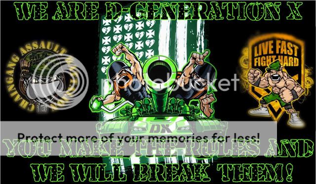
If you ever feel up to it I was wanting something of a mash-up between the DX Army and the Chaingang Battalion, maybe using these images:

196070-bigthumbnail.jpg


res5.jpg


cena-live-fast-fight-hard-wallpaper-1.jpg
 
What's this? Posting in this thread? Me?

Yup, I'm back! After a few months, I've finally decided what I want to start doing. I enjoy making poster sized graphics that feature just one person. Yesterday, I opened up Photoshop again and I made two posters. I'd like to share them with you today. Excuse the rust that I may have.

2vt5bfp.png

First we have John Cooper, lead singer and bass guitarist for the band "Skillet." There aren't any renders of Cooper, so I had to take a picture and cut him out. I started on a 400x600 background, and I put in Cooper. Then, I found Skillet's logo and put that behind him. I found a few stocks on Google. One was of overlapping colors, and the other was of space. I put them behind Cooper, but over the logo. I set them both to lighten. Then I added a white stroke to the logo. Behind everything, I filled the background with black. Behind that, I put a picture of Cooper in action. Using one of my brushes, I erased some of the black background so the picture was visible. I gave Cooper and the logo a drop shadow as well as added an outer glow, and I was done.

l9no7.png
bj8hf9.png

Next is Myles Kennedy, lead singer and guitarist for the band "Alter Bridge." As you can see, I made two different versions. This was made before Cooper, so it's a bit more simple. However, it follows the same formula. So I put in Kennedy and behind him the logo for the band. The logo didn't exactly stand out, so I filled it with a space effect. Behind all of that, I got two different space stocks, and set them to lighten. Then in the corner, I put in a small render of Kennedy and set that to a certain mode, and lowered the opacity.

Feedback welcomed.
 
It's been a while since I've made something, so please excuse any rust I have. But I made this last night for the Battle Zone Tournament:

2mev9g6.png


After Goku lost, I decided to back Mario in the tourny so I created a sig that links to the Mario HQ. I followed a tutorial for this, and it was actually very easy. All I had to do was use some fractal renders and C4D's. I would erase over the parts I didn't like. There are a couple of gradient maps in there as well as some sharpening of the image. Then I added a border on the top and bottom. I think this may be one of the best sigs I've ever made.
 

Users who are viewing this thread

Members online

No members online now.

Forum statistics

Threads
174,826
Messages
3,300,733
Members
21,726
Latest member
chrisxenforo
Back
Top