FunKay's Fresh and Fine Sigs

FunKay the Inevitable

People Like Me, We Don't Play
Many of you may have noticed I've started working on Photoshop a fair bit recently. I've actually been using it for roughly two years now, but only recently have I improved quite a bit and acquired it at home (on a trial basis so it's uncertain as to how long this sig burst will last). Here's my thread for presenting my newest designs and such.

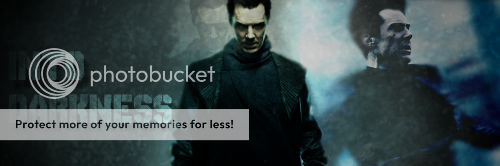
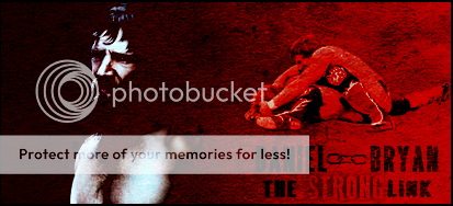
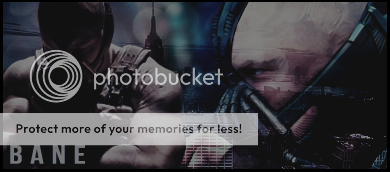
First up is a sig I did for BC relating to the Rock and Cena's feud:

i5swv6copy.jpg

It border was an addition BC put in, but otherwise it's of my own doing. I followed a tutorial* Doc posted over a year ago that involved smudging and this was the end result. The idea behind this was fairly natural as two forces collided. I also blended the WrestleMania logo into the background to make it seem these two were at war as it were. Overall it's a pretty damn fine looking piece (or at least I think so).

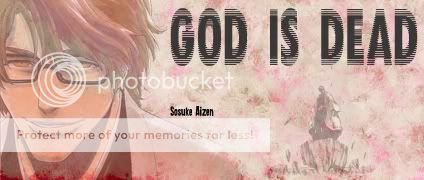
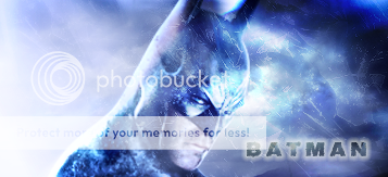
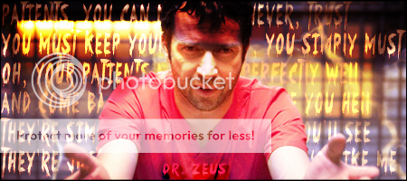
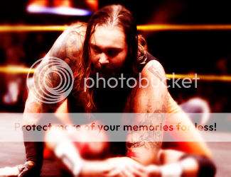
Next comes this Grimmjow Jeagerjaques sig:

380019_2199314349588_1449171744_31802124_846970513_n.jpg

This was the result of me fiddling around for awhile and also of me recalling and old sig that Theo had done for me concerning Batista. I had a paper background and put a light blue painted layer in behind it before setting the paper layer to "Pin Light". That created the background before I added the actual image of Grimmjow along with a duplicated piece of the paper background. I erased both a little on the sides so it appears as if there is a torn effect. I then multiplied the Grimmjow image giving it as textured look.

The font is entitled "The Sickmen" and I played around with it for awhile before getting the desired effect with the nickname and actual name. The already mentioned Theo sig that he did featured a cool effect where Batista's name also had a ripped effect which I duplicated here with Grimmjow's name. Then, finally I added the black borders and got the “Sexta” symbol of Grimmjow, overlayed it and there you have it.

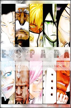
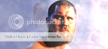
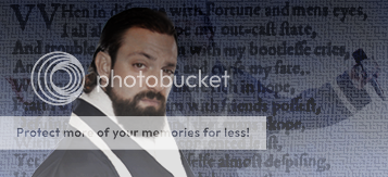
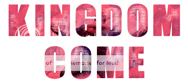
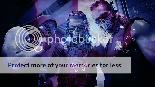
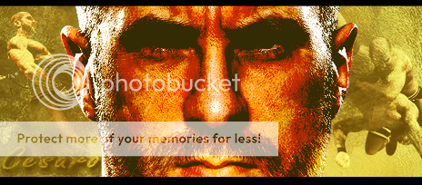
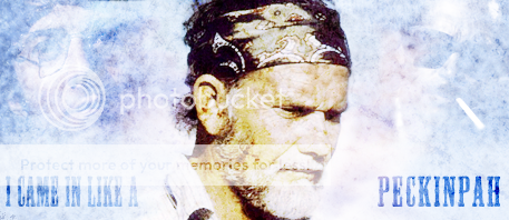
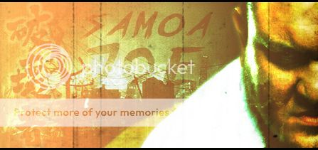
This served as a trial for four other sigs I created also which followed similar paths, but were slightly smaller in size. Here they are in one merged document:

384667_2199019102207_1449171744_31802040_1911241503_n.jpg

All of them feature Bleach characters and follow them same idea as Grimmjow though due to the black background featured in Rukia's, I had to use two black layers and multiply the background instead of using pin light, but the desired effect remains.

Any feedback on any of these pieces is of course welcomed (and encouraged). Any requests for sigs that people may have should not be posted here, but can be requested via PM or in rep comments.

Thanks for taking a look :)

*Tutorial found here: http://forums.wrestlezone.com/showthread.php?t=64123
 
Aizen-GodisDead.jpg

Newest addition is another Bleach one. This is a little different to my prior work however and I really liked the way it came out. The entire concept is based on the idea that Aizen himself is a rather unsettling figure and that he believes his power to dwarf all others. The sig features a number of brushes used to create the background. Most of these are sparkle brushes that I've eventually merged into the one layer after creating a variety of backgrounds with a variety of colours. I then added the image of Aizen and erased it slightly, making it look partially erased. It also led to a slight look of blood rising up from the bottom which was an accident, though a nice addition.

The other image was added in and after tweaking the opacity and fill, I set it to "Luminosity". I then added the title which stems from the final volume of the Aizen arc's title. It also suits Aizen's character as he believes he is superior to all others. I then put in the name of Aizen and it is completed.
 
Alright my Bearded Funk other half, I promised you a review and thus it shall be received.

I really like the Cena/Rock piece. Only issue I have is the reddish/orange background behind Cena. The light color (purple, light blue, white, whatever color it is) works behind Rock and it blends well. However the color behind Cena seems off and Cena seems forced in there. I understand that you probably went with a color scheme similar to the WM logo. I probably would have went with an off red that was lighter and maybe closer to pink so it didn't seem as if Cena was forced. The sig is still top shelf though, just a minor complaint.

As for your other pieces, they are fantastic. It is a different style and I love that in sigs. If it is something new it catches my eye. I immediately thought then when I first saw the sig you are currently wearing. It is a nice style, something new and something different. We see things get pretty repetitive around here in terms of style as we try to "top" each other in terms of sig quality. Your Bleach pieces are by far my favorite of yours. They are unique and everything is just top shelf that I couldn't find any criticism. The fonts work, backgrounds work, images work, everything. Keep up the great work my friend and I hope to see you become a fixture around here.
 
It's update time!

BarrettBarrage.jpg

This first piece is the result of me messing around with a range of sparkle brushes. They create a fabulous glass shattering like appearance and can work in a number of ways (each sig here is the result of some use of these brushes). I chose to use the blood red like colour and layered the image with a sheet of red too. This just adds that extra sinister tone. Then I moved both the left hand sided text and the render of Wade and placed them between the brushes and the red sheet, making Barrett look like he's emerging from the background.


Booker-1.jpg

This one is the result of me looking to try something a little different and I wanted to create a baseball card style. I chose Booker for this one and it's come out pretty well. I, once again, used the sparkle brushes this time using a combination of grey and gold before sticking the render of Booker on top. Then I added the text which is a font called vtks message and added a shadow and inner glow.


Espada-2.jpg

Last, but not least, is this one. Yes it's another Bleach related sig, but I'm a big fan of this one as there's a number of different styles coming together here. Like I mentioned before, I layered the image with sparkle brushes before placing a background image of concrete over it and setting that to soft light. Then I put a white sheet over that. I next added my image which I then separated into two sections. I took a colour related to each Espada (so for Ulquiorra I took emerald, for Starrk I took white etc...) and coloured over where they would appear later (having hidden the image at this point). I then set to overlay and reintroduced the Espada's. Then I added some text and a border and we're done.


Any thoughts on these new pieces guys?
 
As a Bleach fan, I love your sigs. Especially the Grimmjow one. Also loving the Rock/Cena and the Barrent and Booker ones. Awesome work man.
 
As seen elsewhere, FunKay is back in the graphics section. What does the future hold for the funky one? Well let's take a sneak peak at some of the fairly basic and simple work he's been having a crack at over the past couple of weeks, starting with this piece inspired by Breaking Bad:


HeymanGuycopy.png

Pretty simple idea here, based around the "Better Call Saul" videos and advertisement material you see on Breaking Bad considering their resident slime-ball lawyer Saul Goodman. I was inspired to do this when Heyman started referring to marketing and branding concerning Curtis Axel upon his debut. The top text is Brush Script while the others are all slightly edited versions of Bebas Neue. The render of Heyman was set to a brush stroke filter and then coloured red before being set to luminosity. It's a nice homage to one of my favourite shows and both Heyman and Goodman work well as comparisons.

Cumberbatchcopy.png

This is inspired by Doc's smudge tutorial's and came out pretty well actually. I duplicated the central cut-out of Cumberbatch before smudging it and setting the various layers to different sets of styles like Colour Dodge, Linear Burn etc... I duplicated the image and took down the fill to get the additional central figure. Then I took the second image, erased part of it and blurred before hiding it between layers of the smudged images. Finally I added the text and set to colour burn and there we are.

Barrettcopy.png

I wanted to do something a bit like a piece of graffiti and set onto a wall like texture so that's what we have here. The text is dull and not that interesting and arguably the piece works better without it. The colours of yellow and blue are a result of a combination of silver sparkle brushes, a basic wall texture duplicated and set to Hue and Difference, setting the background colour to a royal blue and then adding the same render of Barrett thrice, burning one and setting it to Darken, applying Difference to another and for the final layer I dodged it before setting it to Luminosity.

These final four are all part of the same sort of block of works and come as a result of fiddling around with simple concepts and discovering the gradient tool, getting to know it better and trying to create fairly clear, simple images. They are a tad boring, but they are the result of trying not to overcomplicate the images as I somewhat did in the Payback contest:

PunkGradientPlaycopy.png


CurtisAxelSimplescopy.png


SandowSimplescopy.png


BatmanSimplescopy.png

All four of these would likely benefit from a border, but I like them for the most part, particularly the Curtis Axel one. The effects are simple, easy and it took no time at all to make it.

Feedback on these pieces are welcome and encouraged as the previous batch of feedback I received helped me discover a few more tools on Photoshop and increase my knowledge of the programme. Cheers.
 
Update Time!:

BryanUnchainedcopy.png

Who hasn't been loving Daniel Bryan's recent push? Well I have, so here's a new piece all about "The Dazzler" or as I've called him "The Strong Link". I started by looking at the poster for Django Unchained and thought about the simple colour scheme and adopted those colours (red and black). I took the main render and applied the duplicated it, dodging one layer and burning another. Then I applied overlay to both layers. Next up I tossed on the second render and repeated the rpocess before throwing on a background texture, a border and the text. Pretty simple but looks pretty good too.


Jokercopy.png


BigEcopy.png


Voldemortcopy.png

These three are all inspired from looking through Sanka's graphics thread. First up the Joker piece which is layered with a variety of different background and textures along with awith a purple and green (shocking) gradient and a bit of brushing, multiplying the main image and blurring/smudging. I added some sparkle brushes in there too somewhere. There's probably a bit much going on in all honesty and if I'd taken my time a little more it would likely look a bit more refined. I may have another crack at that one in the future.

The Big E. piece was one I'd considered for awhile, but it wasn't until today I was hit with a wave of inspiration. I took the render on the left, duplicated it multiple times and smudged three different layers, leaving the original alone, and then layered them in different orders and played around with different applications (Overlay, Colour Difference etc...) until I was satisfied. What the end result looks like is something in the vein of Dragon Ball Z which was the intention so I was pretty happy. Then I repeated much of the same proicess from the Joker sig, but applied less before adding in the render on the right of Big E. , duplicating it, smudging the top layer, and overlaying it before applyign Free transform. This gave a different appearance of shadow layering on Big E's and created a more sinister appearance. Then I chucked on the thick borders on top and at the bottom. I really like this one.

The final piece was a request from my girlfriend who likes Harry Potter so I followed pretty much the same routine as the Big E. one minus the smudging. The gradient applied created a lense flare type look at one point, but it became very overpowering compared to the rest of the image so I toned it down considerably.

Well that's it for this update. Any feedback is welcomed and very much appreciated, especially with this section being so dead as of late. Cheers folks :)
 
  • Like
Reactions: TLC
Great theme on the Paul Heyman sig. Your work is progressively getting better. What I like more about the last batch is how there's not much empty space; you're using as much of the canvas as you can.

Looking good, man, keep working.
 
I am loving all of these, especially the Batman/Joker ones. Also, the Heyman thing is genius.

If there's any chance you could rustle up something for me at any point, let me know, because I'd love a sig.
 
Its time for the first update in a few weeks and there some stuff to get through.

First off, a piece I did a little while back, once again following a sig/tutorial by Sanka:

Banecopy.png

Pretty sleek looking piece here...if I do say so myself. Idea is pretty much turning the colours down on the two principal images of Bane and letting the blue shine through from the stock image I set to soft light behind the two Bane images. For a backdrop I used Chicago, the place where Nolan's Batman trilogy was largely filmed and used for skyline shots of Gotham. The Bane on the left is set to about 60% opacity too to show Gotham through him whilst the other on the left is solid, over the top of Gotham and what you're eye is drawn to first before examining the background images. This is topped off with some borders and a white font title.

DrZeus.png

This one was a request from Dr. Zeus (or as he might be better known, Haiku Hogan). He's recently joined the e-fed (WZCW, please check it out, you can find the link in my own signature) and has been causing quite the stir with his new character who is shockingly enough called Dr. Zeus. It took awhile to get this image the way I wanted and even now I'm not overly satisfied with it. The colours on the forehead particularly annoy me for some reason. Perhaps it’s that it makes him look too alien, but it bugs me. Anyway, his only limitations were that I use the specific image of James Purefoy he provided and that it be dark and creepy. Most pieces of the dark and creepy kind rely on blacks, greys and contrasting to make them appear grim, but I felt like going down a more vibrant route and so there's a strong sense of yellows and reds throughout.

I duplicated the central image multiple times setting it to various lights (Linear, Vivid etc...) before spraying over a layer of red. Then I blurred the background sufficiently so that the central figure stood out more. Then it felt like the sig was a bit empty so I decided to include some text and what better source than Zeus' own RP's? The poem/haiku above is taken from his initial RP in WZCW and written in a font called "Something Strange". It works really well, set to vivid light, burning through and hid it behind the main image before finishing off by adding the name "Dr. Zeus".

KCcopy.png

This one is a case of looking to be simple and effective all in one stroke. I had just recently finished reading DC comics Kingdom Come miniseries from the 1990's and was really enthralled by the concept as well as the art of Alex Ross. Ross is arguably the most famous painter in comics and you'll no doubt recognise his work if you take a look at it. Its been used in designing stages of films and even featured in the opening titles of Spider-Man 2. I shan't spoil the event for anyone who wishes to read it, but the book is anchored by a pastors impending visions of a super-human apocalypse brought about as a result between conflicting meta-human factions as well as the stirring of the Mankind Liberation Front (headed by everyone's favourite bald headed baddie; Lex Luthor).

I wanted to capture some of that Armageddon like atmosphere and so I took the image of Superman, used the font "Seedy Motel" and set the Superman image to "Screen". This way the image appeared in the writing itself. Then, I went over the image in red to add to the death and destruction and set it to "Soft Light". Then, ever the genius, I decided to tie it in to what is WZCW's biggest event, coincidentally, also called Kingdom Come. Again, click the link in the sig and you'll find out more information. Alright, enough with the WZCW plugs...honest...

These final sets of images aren’t typical signatures and are more edited images. Let's take a look:

PunkReturnEditcopy.png


Wyattcopy.png


Luthorcopy.png


Perfectioncopy.png

First up is the image of CM Punk upon his return. I used this as a sig for a little while just to see how it worked and it wasn't too bad, though something about it never felt quite complete. Using duplication and gradients as well as a couple of stock layers I created a "holy" like image for Punk who is often idolised as a prophet of sorts...or something to that effect.

Next, a Wyatt related image. Couldn't do one of these without addressing wrestling's hottest new star (even if he has been on NXT for about 18 months now). Duplicated the image, filled a layer in with pure red, blurred out the fallen Yoshi Tatsu and set the images to lightened style effects and hey-presto, this was done in no time at all.

Then we come to another comic inspired piece. Again, Lex Luthor is involved as this is taken from Luthor's own mini-series "Lex Luthor: Man of Steel" and the art is drawn by Lee Bermejo. If you like morbidly detailed art, then check him out. His stuff is pretty damn great. Anyway this is the iconic image created from the series and all I've done here is duplicate the image twice, set one layer to "Saturate" and the other "Soft Light" and done a bit of blurring around the chest and that's it.

Finally we're up against a piece I like a lot: Perfection. I was listening to the Mike Shinoda remix of Bruce Faulconer's Perfect Cell theme from Dragon Ball Z (if you love techno music then you should really check out the US DBZ soundtracks. They are littered with some cracking bits and pieces) and felt the sudden urge to create a piece related to him. I've taken alighting stock image and a background stock, stuck them to the Perfect Cell render and duplicated it before filling a layer in with the same colour green as Cell himself then applied two different gradients to create additional shadow before topping it off with the font "Nervous" and editing it slightly, adding a drop shadow and some noise too. Simple, but pretty damn good.

But what say you guys? What are the good, the bad and the ugly of my work? Any questions or requests, feel free to drop them in here too, but remember this is a non-spam sections fellas.
 
Holy return from the dead. This section is quiet...a little too quiet for my liking. So, I've got some Photoshop work I need to do in the coming weeks, so I figured I'd work off the dust and clean out the cobwebs and what so forth. So here's what I came up with!

BAZZAcopy.png

I've been digging Bad News Barrett as of late and figured hey, why not start with this guy. I focused on trying to combine elements from my two favourite previous pieces (the Bryan "Strong-Link" and Big E. ones). This isn't as polished as either of those, but it did work for what I wanted. A lot of this involves duplicating Wade's face over and over and setting it to different shades, burns and layer modifications. Then I tried to do the text just as I did to Big E., but man it just looks a little odd. I guess that's what happens when you're out of the game so long. Not bad, not great.

SHIELDcopy.png

I saw this image of the Shield on WWE's website and thought "that's pretty bad-ass". I figured some basic image manipulation would make this pretty fun. So really all this is a thin layer of blue, some grimy stock image for the background, a stock image to add the light and what not and topped it off with the tron image that Shield have (you know the one, with the three headed dog). It's a simple piece but pretty fun.

CESAROcopy.png

Here's my favourite of this batch. Cesaro's looked awesome as of late, golden even. So I put on a golden theme. I was going to layer it up with shadows and gradients and masks and all that gimmicky stuff but then I did a couple of simple settings changes (Soft Light on Cesaro onto a gritty background with a golden Overlay) and it just clicked. Either side looked a wee bit empty so I got one image of the Swing on the left, one of the Neutralizer on the right. Both were Overlayed or Soft Lighted (I forget which) and it looked real solid. Added the text just to top it off. Really happy with this.

Peckinpahcopy.png

I have no idea where this came from. I know who Sam Peckinpah is. I asked for a box set of his films for Christmas. I got it. I still haven't watched any of them, so why I put his name into the song Wrecking Ball is beyond me but I did and it gave me a chuckle. This is a more by the numbers bit with three images blurred, erased, burnt and smudged. It's simple, it's clean and I quite like it.

But I'm fed up tooting my own horn. What do you guys think? Any feedback is welcome and appreciated and if you're interested in a sig, drop me a PM and we can talk about it.
 
Well, I've been fiddling round with Photoshop again. Most of these are cases of layer and blending changes along with pasting in some grungy backgrounds and bokeh effects or in Joe's case a scene from the original Godzilla and in Eddie's case some clouds.

Joe.jpg


AJ%20Styles%20copy.jpg


Suzuki.jpg


Sasha.jpg


Eddie.jpg

Let me know if you like em, if you have any advice on how to make my work better and the like. And if you have any requests, just message me and I'll see if I might be able to work something up for you.
 
That's nice.

Only complaint that the names of the wrestlers are overblurred except Eddie's.

Everything else is good. I am no expert but I do like these.
 
The blurring on the text is fine for my money. You don't want the text to be too over=powering in a piece of work like these. You have come on remarkably well since your last work. The Eddie and AJ pieces are brilliant, mate. Some fine, fine work.
 

Users who are viewing this thread

Members online

No members online now.

Forum statistics

Threads
174,826
Messages
3,300,732
Members
21,726
Latest member
chrisxenforo
Back
Top