Fuel's new sig's

Fuel The Fire

Getting Noticed By Management
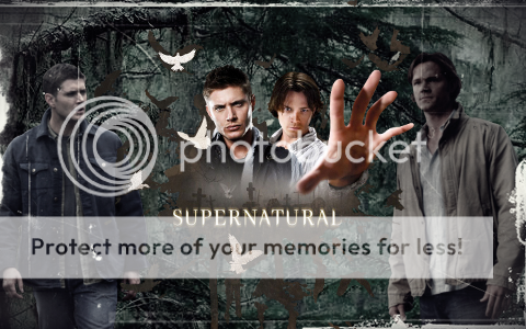
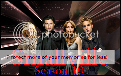
well I just decided to try out gimp and with my favorite character of all time ..superman I wanted to try something out with smallville. I love the sigs that my wz friends have made for me but I just wanted to try and see what I can do. It's one of my first "sober" sigs that I have made so I hope you can cut me some slack on how bad it sucks. If you have any suggestions on how I can do better I would really appreciate it.
Untitled-1.png
 
Well it's not bad, yet it's not very good. It's very average to me. While you seem to have the subject of renders down pretty well, the background and text really bother me. The background just isnt pleasing to the eye. If you want to stay red and blue, might I sugeest using a gradient, or blurring or smudging it? Also, the text seems very big, and that takes away from the sig. If you want other fonts, you can go to places such as www.dafont.com to download new fonts. Other than that, the sig is average.

Grade- B
 
Are you shitting me I can download new fonts, well that is cool as fuck.
I will try that out and make a new one with some new fonts and I will working on doing new things with the background also. I really appreciate your criticism on it and i want to improve. Im still learning on how to do all this extra things with gimp and what they all do. Hell it took me forever on how to figure out how to resize the layers.

I like how I can twist the layers on there also , that is a cool thing to do. I'm thinking about checking out some you tube videos and see if i can see some tutorials because the one on the forum has basic stuff so im going to try and see what other stuff I can do with gimp.
Again thanks.
 
No problem, man. I remember my first time using GIMP. It wasnt a pleasant experience. Also, you can go to DeviantArt to get different brushes, or if you're lazy like I am, you can just find pictures off of google to use as backgrounds, and then alter their settings a bit.

But don't worry, youre getting there and you are a hell of a lot better than me when I first started.
 
miz2.png

Well this is take two, I wanted to do something for the miz because we lets be honest. I think most of us marked out when he won the money in the bank. I googled a back ground so its easier on your eyes and I tried to do more with the text also. I hope you guys like this one.
 
miz2-2.png

Ok so this is my best one yet I think, im starting to get a handle on how to use gimp a little better. I was searching for backgrounds and i found this one and I had to try something with it and i was really wanting to make a good miz sig so this is what I got. I wanted to find some pictures with out the us title it to make it look like it would be more for the future. But hey i think im getting there. I hope you guys like this one.
 
Really good, Fuel! I just have one problem with it though, look at the render of The Miz on the left, see how his arm isnt even on part of the background? I have no clue what happened there, but it sure as hell doesnt look good. Other than that, the renders are clean, the background is nice, and I love the text. Good job.

Grade- A

Edit: You fixed it
 
hogan-2.png

Well I dont discriminate , I'm doing one for the tna fans and thought if there is a tna fan that would like to use this go for it. I was looking at backgrounds and this one really just shouted out tna to me and I thought I want the I want you pose and saw hogan for that so I thought this would be a great tna sig. Again I hope you guys like this as well.
 
air.png

Well I wanted to do one with Even Bourne and I thought this would be creative with the airplane and having him go over it. I needed to add him to the corner to add something more to pit for it to pop out. I was having some trouble trying to find something interesting in the font and text so I hope you guys like that. The Airplane I had to move that around just a little bit so it looked like it was under bourne.
 
Untitled-3.jpg

I thought this would be really fun to do. Superman vs John Cena. Everyone also called him superman so this gave me the idea to make this thread. I thought a tale of the tape comparing some of the stuff they do would be funny and also fun for me to do. So there it is folks. Enjoy.
 
MIZ-1.png

this is a sig that I want to add for people to see. I did this when I was drunk with a fast background I made and a random picture of miz. Thought You guys would get a laugh out of it.

I think it took me 20 mins to make this sig also.
 
BWAHHAHA hey for being drunk, not bad. Better then what i can do, i cant even open up photoshop let alont find the brushes. now for the serious "non spammish" part the position of the render is nice, the star effect on the background is a nice touch =^_^=
 
Untitled-5.png

Well with supernatural coming around the corner, I had to make this. This is one of my favorite shows and im sure there are other people that like this show as well. So I first made the background with dean and sam and edit the background in photoscape and made some different effects on it. Then I went back to gimp and I added the middle peace to it. So again. I hope you guys like this.
 
Untitled-6.png

This is a new one. I thought this would cool to kick it old school. I use photo scape with the text on this one as well and i like it alot better the gimp. I use gimp to put it all together and then I use photo scape for the affects on it. So I hope you enjoy this one as I call it the masterminds.
 
The Supernatural one looks really good. Great use of brushes and whatnot. The old-school one is just amazing. It seriously looks likes an old piece of paper found in the attic. You've come a long way since your first one. Good job.
 
Untitled-7.png

Well I thought this would be a cool one to make for goldust. I know its bright but thats what I wanted. For being gold I wanted something shiny. Again I use photo scape and I really like what I can use for that. So I hope you guys like this one as well.
 
halloffame.png

Had to one for the man himself. I may make some different one's with him but this is my first one that I came up with. I only used gimp this time trying to play around with that a little more and tryed some different filters and did a soft glow with the macho man and it looked perfect with him. So I hope you guys like this one. If you want to use it go for it and that goes for any of the sigs.
 
Wow that Goldust sig is just sick. I think its one of your best yet.

I like how you were able to bring out Goldust personality so well in that sig. I think that makes it just flow and work so well compared to most sigs people make. Especially about Goldust.
 
Untitled-8.png

I wanted to practice with the brushes and I made my first background from scratch and didn't Google a background for this. So that's what I came up with and thought I should make one for the whole family.
 
With my busy schedule that I have had lately I have had a little free time and wanted to make a sig about smallville and that is coming up soon for season 10. I wanted the cast in front and have some mystery of lex in the background and this is what I came up with. I hope you guys enjoy.
smallville.png
 
miz.png

Well I was looking for psd dreams and I saw the back to the future writing on there and I had to try something with it and I must say that I am very happy how this ended. I picked a background that was futuristic and it really didnt look like a time warp like i wanted then I added the star light in the corner and that did help so I hope you guys enjoy this one as it is one of my favs.
 
workhorse.png

I was thinking of tenta when I made this and I thought he would like this even though it does not have tenta in it but I know he is known for his old school post and I thought he might enjoy this but this is what I came up with. I was wanting Some of the great i.c. champs in it and since that is known as the workhorse title that is what I decided to use. I had to cut some of perfects arm out of the way and i think it looks good. I added some texture to the background and then when I had the text with the wrestlers in it and added some more texture to it. I even made my own background as well. I hope you guys like. Feel free to use it.
 
cena.png

Wanted to make a John Cena one. Also I need practice with brushes for the background and so I put them both together. The Font I think looks really good with this as well. I feel like it all flows well. I hope you like
 
GREAT work! The font is perfect, the flow is excellent, and everything fits. It's a really attractive, really good sig, and easily one of your best. I especially like how well the colors match. Good work, man! The only problem I can see is that the border is impossible to see, so if it's there you might want to make it a different color.
 

Users who are viewing this thread

Members online

No members online now.

Forum statistics

Threads
174,826
Messages
3,300,732
Members
21,726
Latest member
chrisxenforo
Back
Top