Big Designs - Signatures Showcase

BigDesigns

Dark Match Jobber
Hey guys!! This is going to be my signature showcase, as you may have seen, I've posted an Eve Wallpaper, and no, I'm not going to post any wallpapers on this showcase, just due to the fact that making wallpapers is rare for me, and every time I create one, I will post a thread for you guys to critic.

This is only going to be a Signature Showcase!
I will try to be different in every single one of my signatures and I want to start with the "hottest" superstar currently... that's right CM Punk!

CMPunk-SplatterPapper.jpg

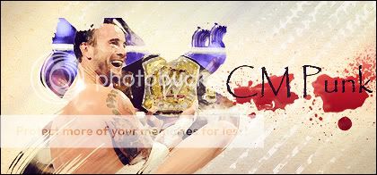
As you can see, it's not the best looking signature in the world, it doesn't even have C4D's or different kinds of brushes it is only something different, with the dry paint in CM Punk!!

So tell me what you think guys, and I would appreciate if you guys DON'T QUOTE ME, because that looks awful in a showcase, just give me your thoughts about the signatures or an overall critic about my showcase!
Thank you guys :)

Note: BTW here is the link for my Eve Wallpaper!
http://forums.wrestlezone.com/showthread.php?t=182300
 
Yeah could have added some flare.You could have mde some more graphics.So my rating will be a B-.Keep up the good work and those sigs.
 
Im gonna be honest with you i really dont like that sig very much. Ive seen your work on other requests and such and they were much better. Everything just doesnt fit in my opinion. I cant to see more sigs though from you. Keep practicing and you will get better :)
 
You already offered me a new sig and I took it quick smart! Really happy with this sig, deffinately giving it an A+, the images are awesome and the renders and what not just look amazing, really happy with my sig and will be requesting in the future from you (if you are doing requests?)
 
Like I said in my original post, this is weird signatures... I can make better looking sigs if I want to, but I want to stick with the "always different" style!!

I was searching for inspiration for a signature, and I saw an image filled with smoke, and I thought... what about a Smokin' Natalya signature? (noticed the joke? xD)

SmokinNaty.jpg
I used pretty much the basics, I worked with smoke brushes, masks and a little bit of adjustment effects.
I loved the idea of the white eyes, so "Supernatural"!!

What you think?? Cool idea ah? :p
 
Really cool and wierd but in a good way the natalya pic really works great with the smoke affect.My rating for this would be A+ cause of the smokey affect.
 
I'm iffy on the Punk sig. Don't really like the waterpaint like effect used on the main render of Punk. I do however love the background that goes with the image. It has that nice simple approach to it.

Now that Nattie sig is just absolutely awesome. Everything blends and I love the Undertaker like effect on Nattie's eyes. Not sure you did that yourself or if the render came like that. Either way it is a great piece of work. Good to see you finally make a showcase to show off your work Big. Can't wait to see some more.
 
Hey guys!!
Well I felt inspired with Seth's graphics so I tried to make some non-wrestling photo editions too.
Well the truth is that I'm not that good and I can't have any good ideas.

Original Picture
burberry-2010-07.jpg

My Picture
EmmaWatson.jpg

I Worked with some flower and fractal brushes, I also used some c4d's and patterns!
I think that the original picture is beautiful, so I didn't have to do much but I kinda liked it :)

Give me your thoughts!!

You asked me for some feedback, so here I am.

I like what you've done to the base image. The way you've just lightened it in a subtle way. It's nice. What my eye is immediately drawn to, however, is the brushing around Emma Watson. I'm not a fan of that technique. It can sometimes be good, be I really don't think it fits in here. Then we move on to the texture which looks nice. The stripes blend in well. On the other hand, the text doesn't. This graphic wouldn't suffer from not having text. Finally, there's the floral brushing, which I like. But it's only small. You could brush more, but the fairly complex image doesn't really allow for it.

Really, I think the problem is the image you've chosen. It has quite a complex background, the focal is quite wide with the bags and it's at the side. All these factors mean that editing the image in any profound way is going to be difficult.

I hope this feedback was helpful and I'm looking forward to your future work.
 
Thanks for the recent feedback :)
I was really inspired with your work Seth so I made a new thing, and I really hope to have more feedback from you fellow artists!!

This time I chose "Black Eyed Peas"
Original Picture:
5eizkj.jpg

My Edition:
BlackEyedPeas_Edition.jpg

I'm really proud of that one, first of all I added a black and white gradient and I brushed in the mask layer the BEP only, which I spent a lot of time doing it.
After that I added some effects with curves, saturation and another gradients, all blended!
I added the text, with this font that I really love.
Some C4D and some bubbles and triangles!!

It's probably my best edition since I'm here guys, please give me your thoughts, I will be really happy if you manage to give me some tips and feedback!!

Take Care boys :D
 
I really like that BEP picture edit. You brightened up the group in a way to make them shine and become the true focus of the image. The background editing is superb and very well done. I'm iffy on the font selection but it doesn't take away from the image too much to make it a huge concern.

On the Emma Watson one, I'm agreeing with Seth. The image was a bit complex and that in itself makes it a difficult task to handle. Either way your image editing is fabulous and top notch Big.
 

Users who are viewing this thread

Members online

No members online now.

Forum statistics

Threads
174,826
Messages
3,300,732
Members
21,726
Latest member
chrisxenforo
Back
Top