Awesome sigs

Alex

King Of The Wasteland
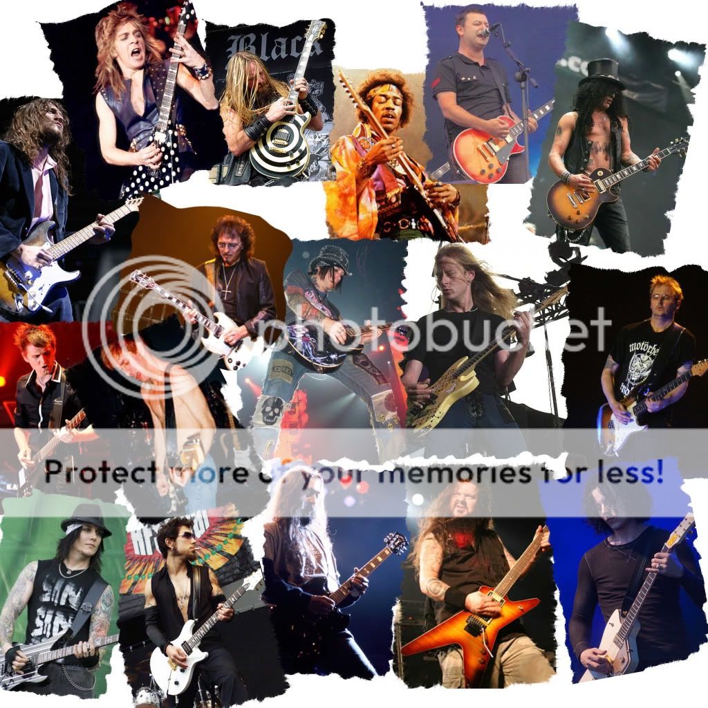
So I got my photoshop working and decided to try making some sigs. I've been using the Graphic help thread and decided to make a rather basic sig

SIG.jpg


I used Doc's advise and got some brushes, experimenting with different ones, I decided to go with just one because it looked cluttered otherwise. I used Drop Shadow, Inner Shadow, Bevel and Emboss and Stroke and just played around with them until I got the finished effect.

For the guitar I got an image off Google and took off the bckground, I then used a luminous effect, downgrading the opacity a bit and taking off the blue channel and gave it a bit of a stroke.

For the font I used 'Hard Rock' made it yellow and gave it a largwe stroke.
 
I did this at college for a self portrait. We were given an artist to mimic one of their works and I got Peter Blake.


sgt-pepper2.jpg


I got a Sgt Pepper cover and made a new layer. I took the images of the people (images from google) on my cover and edited them in Photoshop, keeping their heads and editing out the background on their image so that they could be placed onto the Sgt Pepper cover. I hid the editing I did using other people to hide it or making new layers of existing parts of the Sgt Pepper cover (the wax dummy and the tree are new layers and they help hide the editing)


(Sorry its big)

If you can name all the people in the sig I'll be impressed.
 
So Theo made this sig for me a while back

zvct4n.png


So I decided to make my own (except mines bigger)

Untitled-1.jpg


I used a blue background and used a yellow music note brush with the opacity turned down a bit and dotted them around. I then used the music notes I had done for my music sig (the one with the guitar) and placed that in a new layer over the first one and downgraded the opacity on that as well.

I then took the images of the various musicians and used the rubber and magic wand tools to take off the background and excess bits I didn't want. I then went to effects and used a sepia style as well as downgrading the opacity to 80% and placing them around the sig.

For the font I used hard rock with a black stroke.
 
So I made a Jeff Hardy sig with some variations


1.
jeffhardysig1.jpg

2.
jeffhardysig.jpg


So I took the background image and made a copy and used an ink outline filter and the other i used a photocopy filter using green and white. I then got the other photos and got rid of the background. I then changed the opacity to 65%.
 
I like the first jeff hardy sig. It would be a really good poster for tna to sell as it make jeff hardy look like he is the face of the company there. I love how the tna logo fits right in there and fades really good. Nice all together.
 
The TNA logo in the background was completely by accident, it was in the picture of Jeff preparing to do a swanton, however I thought it looked good so decided to keep it.
 
So I made a sig with some of my favourite guitarists in it in a collage style, similar to how you cut things out and paste them onto a piece of paper or card etc


Guitarcollage.jpg


I'm thinking of doing a Frontman, Bassist and Drummer ones as well at some point.
 
So I decided to do a something charting the history of the Red Hot Chili Peppers


redhotchilipeppers.jpg


On the down side I couldn't find any pictures of the The Red Hot Chili Peppers (album) era or the Freaky Styley era or one with Josh Klinghoffer (the new guitarist) but I think its pretty good.
 
So I decided to make a Murderdolls sig as I recently got into them

murderdolls-1.jpg


I basically used three different versions of the picture, one with a red and black stamp filter, another with a black and white filter and just the original picture using different opacity strengths . I then put their logo at the top and then put the name of the two core members (Joey Jordison and Wednesday 13) underneath them.
 
Seeing as Nirvana's Nevermind is hitting the 20th Anniversary mark I made a sig

NirvanaLineup-1.jpg


I used the two main line ups they had (with drummers Chad Channing and Dave Grohl) with two pictures apiece, I made them look like a cut out, then applying a stroke to them. I then added the smiley face logo with the name of the band in the centre with a slight transparent look.
 
So I made two different backgrounds for this pic of (underrated) guitarist DJ Ashba

dj-1.jpg


and

dj1-1.jpg
]

Basically the first one I used a picture of him as the background with a blue tinge and the I used the two pictures of him playing guitar with a stroke and changed the opacity.

The second one I used a different picture in the middle.

I think both work pretty well, but which one do you lot prefer.
 
cards2-2.jpg


So I decided to make some playing cards using some musicians that I like to make (what I think) would be the ultimate metal band.
 

Users who are viewing this thread

Members online

No members online now.

Forum statistics

Threads
174,826
Messages
3,300,732
Members
21,726
Latest member
chrisxenforo
Back
Top