The work of jsmizzyy (feedback and requests)

smizzy

Doubt it, bud.
This thread includes a few pieces that I'm especially proud of. I realize I'm not a Photoshop prodigy. In fact, I don't even use Photoshop. My style is unorthodox, I tought myself this style over the past seven years and I am only now beginning to really feel comfortable with my work. But regardless I really, really enjoy creating these images. I usually make one for a topic that I am currently obsessing with.

I am open to any feedback.
I am open to any request.


Enjoy.

Trent Reznor (Nine Inch Nails):
TrentReznor1.png

Kurt Cobain:
KurtCobain1.png

Kurt Cobain is my favorite musician. I made this a few years back and feel like I can improve on this one. I will definitely be recreating this one again.

Elliott Smith:
ElliottSmith1.jpg


Albert Pujols:
AlbertPujols2.jpg

The quote Mark McGwire's analysis of Pujols. I debated on pasting some dollar signs, a fly-infested shit, and large middle finger on this one back on December 7 when this man broke my St. Louis Cardinals heart, but I decided against it after the time I put into this one.
 
Working on a new signature, so I'll add my current one to the showcase.

DeanAmbrose1.jpg

Feed back on this one would be appreciated.​
 
This was a request I'd done probably two years ago. My work has greatly improved on the matter of blending. I also wouldn't leave as much unused space nowadays. And yes, they wanted all of that text, ha!
eddieguerrerogfxv2.png
 
Sean "Slug" Daley
SlugMinnesota.jpg


My inspiration behind this piece was that I really respect this man as a rapper. He's a story teller and one of the most respected, yet underrated artists out. I highly recommend any serious hip hop fans to check him out if you haven't yet.

I've met him twice now, both times before performances in St. Louis. He just walks around outside the venue before the shows and conversates with fans. I've posted this picture of my friend, Cole, Slug, and I in the "Post Your Picture" thread:
Meeting Slug, frontman of Atmosphere, and one of my favortie emcees.
299102_10150340745727559_1759004_n.jpg

Remember, I've opened my own request thread. If you enjoy my work, feel free to make a request. I've already fulfilled two within the 24 hour period that the thread has been opened.
Click this or you can click my signature to be directed to the thread now!

-Jake
 
I like the Dolph sig. However, there is one thing that bugs; the color. I just don't see it fitting with Dolph tthat much. By that I mean it doesn't blend well with him. I hope this helped out a little.
 
I appreciate that. It was all about impulse, I had a strong urge to use a light blue, but when I create these, I also try to capture the subjects' personalities via color, font, lightness/darkness, ect. Anyway, thanks for the critique and continued support.
 
No problem. I always try to help out as much as possible. You have a lot promise to turn to one of the greats around here. I just feel right now t's just you and DarkFlame who are keeping this section alive. I don't want it to be dead/silent/etc. So, just keep up the good work.
 
Grizzly Bear

GrizzlyBear1.jpg


New piece for the band Grizzly Bear. Tried some new elements out including the faded lyrics, used from this song:

[YOUTUBE]bteY_fs3Y18[/YOUTUBE]

Probably won't ever use this one as a signature, merely just a test run on some new things I'm trying. Feedback is appreciated, not to mention quite helful. And as always, feel free to request a signature from me in my request, I love to do this and usually get back to you with the finished product in a matter of hours.
 
I like how you tried to use all the space possible. The sig looks really nice. My only problem(this is probably my picking) the color. Not the color itself, but rather the white spots. That takes away from the sig a bit. I still like it anyways. It looks pretty cool and a nice little touch with leaving little empty space blank.
 
Radiohead

Radiohead1.jpg


A lot of my work comes from an impulse. This piece is a good example of that. My iTunes switched to some Radiohead and I really felt the desire to make a Radiohead sig. I only focused on two members of the group, Greenwood and Yorke because I wanted the contents of the image to be bold, and in order to have all the group in it, it would take away from impact. Overall I'm pleased, but I believe I can do a lot better one of these days.

What do you think?

Next signatures: Nirvana, Tupac, Jeff Hardy, AJ Lee. And as always, you can send me your requests through my thread in the request section and I'd be more than happy to complete it for you within a matter of hours.
 
Nirvana

Nirvana1.jpg


I'd have to say this is one of my best pieces, as well as one of my favorites to date. I was extra passionate about this because Nirvana is my favorite band and I'm a hardcore fan at that. I'm quite pleased with the way this looks, considering my unorthodox style got even more complex with this.

Comments, feedback, requests - all appreciated.
 
Two new banners.

Damien Sandow

Sandow1.jpg

Sandow is golden. Finally cracked down and had to do something for him. I tried utilizing all of his colors in the background.

CM Punk

CMPunk2.jpg

Not the first Punk piece I've done, but this was specifically inspired by his latest heel work.

If you are impressed by my work and want a sig created by myself within hours of your request, post in my request thread.
 
Ryback1_zps50c2962d.jpg


Pretty pleased with how this turned out.
Only thing I'd do different would be to try and throw in some Punk confrontation in there some how.​

Feedback?
Request?
 
It looks great. The only thing I would recommend you adding is the Feed Me More catchphrase. Also, I say try out some different options for the name.
 
Pac

2PacBGb_zpsafb51f49.jpg


2PacBGc_zps2fa1511c.jpg


2PacBGd_zps4695ae48.jpg


I've wanted to do Pac for a long time.
I finally gave it a go but wanted to try something different.
Basically, I wanted to represent his personality using one of his most iconic portraits.
The lyrics are from "Thugs Mansion" and are there to show his character. They're faded as to not overpower the image, but still have a presence.


KendrickLamar1.jpg

Zero doubt in my mind that Kendrick Lamar is the greatest rapper out right now. He'll be a great. Lyrical content, rhyme patterns, and conviction are traits of his that won't be contested for years.​
 
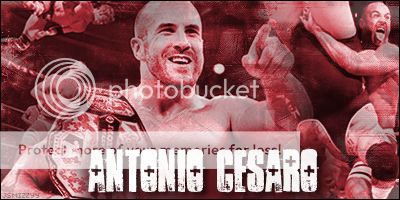
AntonioCesaro.jpg


RG3.jpg


My two most recent works. Haven't had lot of time for graphics lately whihc is frustrating. Still have a few requests to get to too.
 
I enjoy doing edits no doubt about it, but wow I'm a loooong way off you guys in here, genuinely I'm impressed + I'm pretty rubbish with any type of blending/airbrush

My signature and the 3 pics below are an attempt at editing, not as good as you guys, but I was kinda pleased with myself... Until I came here aha

2po1mpv.jpg
[/IMG]
2gwexoz.jpg
[/IMG]
fod5s2.jpg
[/IMG]
 
Edit - I've had a pretty boring night in tonight so I've decided to do a few edits (as well as those above), I know they're not amazing but I thought I'd share them with you guys if you don't mind

10comlg.jpg
}

30270wh.jpg


zy7yhe.jpg
 

Users who are viewing this thread

Members online

No members online now.

Forum statistics

Threads
174,847
Messages
3,300,827
Members
21,726
Latest member
chrisxenforo
Back
Top