The Fail Pit-Noah's screwing around with GIMP

I Suck Ass

I survived the Rapture
I was bored earlier today, so I decided to get some brush packs for GIMP and mess around a bit.

Here's the first one I did.

RandyOrtonTheLegendKiller.jpg


I used two renders of Orton from PSD-Dreams, and then took a brush from what I think was the Vector Grunge brush pack, and used that as the background. I also smudged the edges of both renders, then added the text.

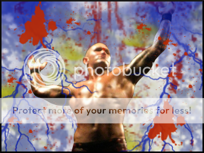
This is the second one I did.

PercyWatsonITSSHOWTIME.jpg


For the background, I made red and blue streaks and blended them, then used a brush from the Vector brush pack and did two of them close to each other, then used a render of Percy from PSD-Dreams, and added the text.

This is the final one.

GoldustTHEUNUSUALONE.jpg


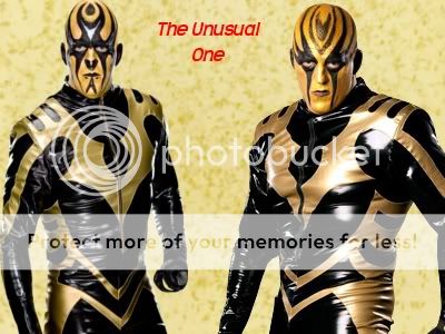
For this one, I used various brushes from the Glitter Brush pack, and then used two renders of Goldust from PSD-Dreams, then added the text.

Feedback would be greatly appreciated.
 
I dig the background our used for the Orton sig, very psychedelic, though I don't know if it really fits in with Orton's personality. The neon is a bit hard to read, maybe a different color, and a little bit bigger.

The Percy one is the best in my opinion, everything looks smooth, and the colors go good together. Maybe just a little bigger font, but I like it.
 
The biggest things wrong with your sigs are the borders and the text. The borders are nonexistent. Borders are extremely important and you need to have them in order to make your sig look complete. It doesn't matter if they're one pixel, they need to be there.

Your text just does not fit. It's all the wrong color, except for the Percy one. It also looks really unprofessional. You should try doing something to it, like adding an outline or blending it in with the background.

Maybe you should also try working with a smaller canvas. I like using 400x200, because it's small but still big enough to work. I find it way easier to make good-looking sigs with a smaller canvas.

Most of all you need to read tutorials and keep broadening your skill set. Create, create, create, and continue to improve and learn. This is a good start, but the journey is never over.

:thumbsup:
 
Those are really nice looking. It just seems that when I look at the Randy Orton sig I wanna see John Morrison because of the background.

The only negative comment I have to say is the font (Orton's is hard to read and the others don't match the flow of the sig). Other than the font I believe all your sigs are really good. Keep it up.
 
Here's the latest one.

RandyOrtonLightningandBloood.png


First, I blended some gray into the background, then I used some grunge brushes for the background in dark blue, red, and yellow, then I added the render of Orton. Next, I used some lightning brushes on the sides, then used a splotch brush to make the "blood". Added a border to finish. Tell me what you think!
 

Users who are viewing this thread

Members online

No members online now.

Forum statistics

Threads
174,826
Messages
3,300,732
Members
21,726
Latest member
chrisxenforo
Back
Top