WWE Payback Poster Competition

The 1-2-3 Killam

Mid-Card Championship Winner
WWE Payback is live on pay-per-view June 16th, from the Allstate Arena in Chicago, IL. I will be there live and in person, as I make my glorious return to my home state for the event. But in an attempt to spice things up around this ghost town of a section, I'm organizing a competition with AN ACTUAL PRIZE!

Here are the "rules" -

1) Submit your "poster" by Saturday, June 15th.

2) You get ONE submission. That's it. You can post more than one, for fun, but you must designate which design is up for competition.

3) Submissions can be in any size, from a small postcard, to the larger "poster" concepts.

4) Any Superstars, themes or ideas are totally up to you, so long as you can obviously tell that it's centered around the upcoming WWE Payback event.

5) Winner will be decided by myself and receive a $10 WWE Shop gift card. I know it's not much, but it's kinda fun, right?

6) Anybody can submit, but only those in the US are eligible to win. It's just simply not worth it to pay WWE's crazy fees for international shipping. Sorry...

REMEMBER, this is still a non-spam section. I know you might have forgotten, since it's empty 99% of the time, but your posts still need a reason for existing. What did you make? Why did you make it? How did you go about doing the work? It doesn't have to be a novel, but enough to constitute a non-spam post.

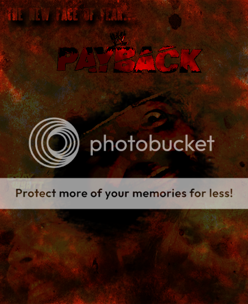
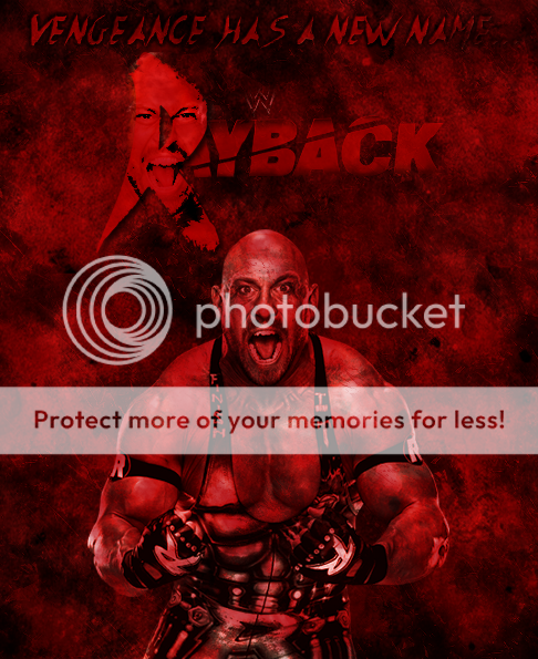
Here's a few concepts I've been working on, just to get the creative juices flowing:
BX0meRG.jpg


CcKSFRm.jpg


9NfxE5X.jpg
 
A shock entry? I think so too. You'll likely see me around a little more in this section:

PaybackWyattcopy.png

I recently downloaded CS2 from Adobe for free and was fiddling around with it (hence why you'll likely see me a little more). I initially came up with a totally different poster featuring Ryback with a play on the title of the show (Payback, Ryback, get it?) and while it look alright (and the logo looked rather nice in one's opinion) I felt the need to go down the Bray Wyatt route as his debut has me rather excited. So after duplicating the central image, enlarging and shifting it multiple times, I really came to like the somewhat deformed look I created. Then I added a couple of extra bits and inserted some logos and there you have it. I present Bray Wyatt: The New Face of Fear.

PaybackPostercopy.png

And here is the Ryback one I mentioned above. It is probably the better poster, but eh, who cares.
 
The first one is really good and has a nice look to it. I like yours to Funkay, but they are kind of tough to see. A little to much red in the Ryback one. But, (this a good but), I do think they are really nice. Better than anything I can come up. Waiting to see more, hopefully there will be.

Nice job guys.
 
I've been getting that graphics itch lately and I've always enjoyed making PPV Posters, so I figured I'd make a rare appearance here in the graphics section. Shall we unveil the piece?

paybackpostercopy_zps60bb98e2.png


I was sort of at a creative lost here with Payback and I was going to use The Shield, but I couldn't find peace with it. And then it hit me. The PPV is in Chicago, why not use Chicago's Son as the poster boy. And then everything seemed to fall into place. I started with an artwork of the Chicago flag that I thought was pretty sweet as my background piece. I had originally done the city in ruins, but it looked like a clusterfuck. I then added in the CM Punk render and the Payback logo. I then put a concrete texture on top and set that to lighten. I then copied the Punk render and moved it up front and put that on soft light. Then I added the PPV and location font and moved that behind the Punk render. Then added diagonal line pattern over the poster and faded it a bit. Ended the process with a desaturated image of the whole poster set on overlay with a 38% fill. Pretty simple process, but really happy with the outcome.​
 
Meat, I like the concept, but the glass in the beard doesn't really work for me. It'd probably take a ton of time to do what you're attempting to do, and have it look realistic. But I really like the idea.

FunKay, there's a little too much of the same color going on in both, but I really like the second. Try to make the text pop a bit more. Instead of using a drop shadow, maybe use an outer glow. Or perhaps if you're feeling adventurous, duplicate the layer and mess around with radial blur effects on the bottom text.

Theo, can you post it again without the concrete texture? I just want to get a feel for what it would like like simplified. I'm not sure I like the stroke on the text. It's not bad, but something isn't sitting well with my eyeballs. Sweet concept though. Love the background.

Keep it coming guys!
 
Here's my entry:
paybackn.jpg

This event will mark the return of CM Punk, and it takes place in his hometown, so it only makes sense that he's featured in the poster. And the way I made it reflects this; I started with a render of CM Punk and worked around it. I started with a blank canvas, I added the render, added a background image, and from then on I played with various overlays and gradient options. Last, I added the necessary text. Not the most overly convoluted poster, but it is simple and what I was hoping to achieve.
 
Theo, can you post it again without the concrete texture? I just want to get a feel for what it would like like simplified. I'm not sure I like the stroke on the text. It's not bad, but something isn't sitting well with my eyeballs. Sweet concept though. Love the background.

The stroke around the text is based off the Payback logo as I wanted to be as similar to that as possible. And per your request here is the poster without the concrete texture.

paybackposter2_zps121b10bf.png
 
Chippers and Theodore's are the top two so far. With the Daniel one still being third. Man, I wish I could make these things.
 
Chippers and Theodore's are the top two so far. With the Daniel one still being third. Man, I wish I could make these things.

It's not terribly difficult to learn. I picked it up by coming to WZ, looking at some of the graphics, and trying to make signatures for myself. There's a ton of tips, guides, renders and tools at your disposal.
 
Theo wins! I really enjoyed all the submissions, and I'll definitely throw up another $10 gift card for Money in the Bank. Thanks everyone, you rock! Next month let's aim for at least twice as many submissions!
 

Users who are viewing this thread

Members online

No members online now.

Forum statistics

Threads
174,827
Messages
3,300,730
Members
21,726
Latest member
chrisxenforo
Back
Top