PPV Poster Competition: SummerSlam

Daniel

Of Ace Stevens fame.
Ver_SummerSlam_2010_en_vivo_Online_en_directo_avispa24.png

It's that time, ladies and gentlemen! With bright colours, Divas in bikinis and a constant use of catchy pop songs, SummerSlam is one of the times when WWE gets that bit less serious. The cool, laid back vibe of SummerSlam can make for some great posters.

The rules are simple. Don't plagarise and don't spam. For a conventional poster, I'd recommend a size of 400 x 500. But if you want to deviate from that be my guest.

So let's see what you've got, let your creativity run wild!
 
e023ab.jpg

Sigmakers! Where are you? Lol. This section isn't getting much activity so I decided to contribute to this thread. Well anyway, on to the sig. I saw a poster somewhere and the idea just came to me. It looked cool so I made my own version of it. It's just a beach background with Kelly Kelly basically. Along with some Gradients, Contrast, and a lot of heavy playing with colors. I'm pretty pleased with this. Might not be as great as Seth's own that I know he will post up, but I tried. Tell me what you think! :D
 
dy821d.png

Ever since that Punk wallpaper I've hit a slump, however after hours of trying to get something to work I came up with this. Pretty simple poster. Typed in starry wallpaper on google images and found the main background. Then I added in the LA skyline and set it on lighten. Followed that up with a light source on linear dodge with a fill of 39. Then I added in my three superstars, Miz, ADR, and Ziggler. Reason I chose those three was due to the fact they dress very Hollywood and Summerslam is in Los Angeles like always. Then added in my logo, catchphrase, and details. And there you have it, my Summerslam poster.​
 
summerslam2011.png


Here is my entry!

I started with an image of the LA sunset I found on Google images. I messed around a little bit with it.
Then I put the logo in and hid it.
Then I put in the Orton pic and the Maryse/Eve ones behind him. I adjusted them a little and set the Diva ones to Multiply.
Then I made my text and added this year's sponsor, 7-11's, logo.
Then I added the little pic of Kofi Kingston.
Lastly I duplicated the logo and on the lower layer did some smudging.


I suppose it's an alright poster, but I can't say I like it that much. I'd Love some feedback!
 
summerslamposter.png

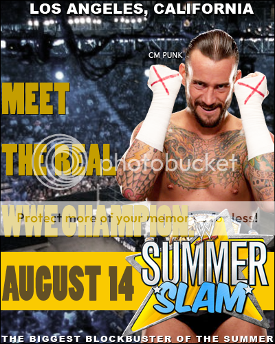
OK, so, I decided to go with something a little different. I've always enjoyed the whole "Biggest Blockbuster of the Summer" theme, so I thought I'd try and make a parody of a current movie poster, and since we got a new boss this week, my first thought was Horrible Bosses. I also feel that Punk may be back by then, so the rest fell into place. I also tried making it similar to a real WWE poster, with the wrestler name next to the wrestler, and the text at the top and bottom. I know the tagline doesn't look quite right, but I tried making it fairly accurate to the original movie poster, with a change here and there.

I've been in a bit of a slump myself, but I still had fun making it.
 
I am not that good making posters, but I tried to make this one and this is what I've got

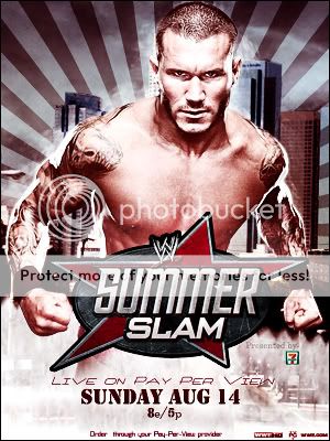
SS2011V4.jpg

I know that this has nothing to do with SummerSlam usual concept, but this is what I could do.
I think that it looks official or passable at least.
The main render looks cool because it shows Randy Orton chasing something while anger.
I used the grunge logo of SummerSlam that really looks badass and that fits completely well with Randy Orton.
The BG is a picture from Los Angeles (I guess at least is what google gave me)

I rate my work as an 8/10
 
I feel like Ive been gone too long from WrestleZone forums, I missed this Graphics section, lot of new faces here, and lots of guys who have taken over this section with AWESOMENESS!

Ladies and Gents...Angelic Diablo is BACK with a new creation:

summerslamposter.png

What inspired me to put together the color scheme of Yellow & Purple is simply because those colors are inviting, and it gives off a cool summer feel to it. And simply because the colors purple and yellow go amazing together.

Now I started off with a 500 x 300 canvas, and was debating wether I should add Miz or Rey as the posterboy of this poster, I added a render of Rey, and it didnt look too good, then added Miz and was WOW-ed. I added a dark purple color on the background canvas, then added some outerglow on Miz, and behind Miz I added 2 layers for some brush strokes which I faded to opacity level 19%. Behind Miz I added 2 renders (Del Rio & Randy Orton)

I then added a SummerSlam logo on top of Miz' render, and used the Hue/Saturation tool and made it a bit Bronze, then I selected the letters of SLAM, and colored it in to this neon purple color.

I then added a shape behind the SummerSlam logo so there wont be dead space, and added the numbers 8.14.11 (August 14, 2011)

Then I added the sponsor Slim Jim, and to make it look official I added PG TV logo, WWE HD, and WWE.COM

I thought this was a 9/10 work TBH, deff better than WWE's PROMO POSTER AKA THE BOTCH POSTER lol
 
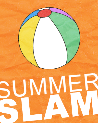
Righty-o! Well, may creativity seems to have said "fuck you, I'm never coming back" to me. Which sucks. So although I haven't made a "serious" poster, so to speak, I have done something. Presenting...

a_minimal_summerslam_by_rollingthunderdesign-d46ud82.png

So I've really gotten into minimal movie posters. You can find a page on Tumblr with a lot of movie poster which have been made minimalist. Seriously, I got transfixed for what seemed like hours. So, I thought I'd make my own. Like the idea suggests, it's very simple. I started with an orange canvas, and added a crumpled paper texture and a wash texture. Next came a picture of a beach ball which I coloured in. Then came the text which is Futura (my favourite font). That's it.
 

Users who are viewing this thread

Members online

No members online now.

Forum statistics

Threads
174,826
Messages
3,300,732
Members
21,726
Latest member
chrisxenforo
Back
Top