CodeBreaking Showcase

HopsinSig.jpg


I was inspired to make a sig for hopsin since i havent stopped listening to him for days ahaha. I took his album cover as the backround and cut the hopsin part and made it its own layer. I then played with some brushes on the album cover and added noise to give it the scratchy look. I then added the text Hopsin across the sig the finish it off.
Let me know what you guys think.

Btw i just started a Request page so go check it out!

Yiour number one critic is back now to start off the sig looks amazing.The gold/yellow goes really great with his look.With this I really wouldn't change anything so my final rating is A+.Keep the sigs cause you know I am here to help you with this sigs and give my rating.
 
My showcase is gonna be a lot of pages i feel, I just cant stop making sigs!

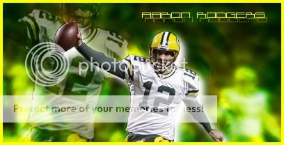
AaronRodgersSig2.jpg


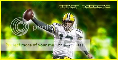
AaronRodgersSig3.jpg


I wanted to make another rodgers sig, hes my favourrite player! :)
These two are pretty much the same besides the extra render. I pretty much used a picture of rodgers and used some brushes and filters around him. I then added a drop shadow to the main render and made it white to make it seem as if he glowing.

This is one of my favourite pieces i have made. :)
Let me know your thoughts!

Love it not only because I'm a packers fan so with this pics I really like the top one cause of the glow.The second one only glows but that still an awesome sig.Now for my rating will be an A.It doesn't matter how long this is going to be but do stop awhile so you don't lose your flow ok.
 
Don't put quantity over quality!! Half of your sigs look amateurish, try to make different things and don't make them look low pixelated.
Work with lightning effects, but don't get to wild on that and I think you use to much textures..
Look at your signature it looks like toilet paper lol don't get to wild on the effects, the basic things is the most important.
 
CodeBreakingLegend13, I think you should chill from making sigs. Remember, Quality over Quantity. I admit that your first sigs were really bad and the new few were alright. But I don't think you'd wanna post all the time. Experiment and try some new stuff is what I'm saying and to slow down bro.
 
2h4jhig.jpg


so my first sig right here is of my favourite football player Aaron Rodgers. I was inspired to make one of him so i plated around with some brushes and got a simple backround. i used the drop shadow so the main render has more depth.

Aaron rodgers is also my favorite football player, so i felt i had to give feedback on this as arlo made me an aaron rodgers sig as well....but you def did him justice and was good especially for your early work
 
Thanks for the feedback everyone. I took a bit of time off making sigs just like u guys said and i decided to make one today.

JGSig4.jpg


I keep trying to make a good Justin Gabriel sig. Hes becoming my favourite wrestler and im trying to come up with some good work for him.
So i put some lighting effects behind gabriel to make him stand out more. I then outlined him and added a drop shadow.
I then added a line affect to give the backround more of a design.
Lastly i put two pictures of gabriel on each side with the text, and played around with the lighting for both pictures so it blends with the backround.

I worked hard on this one and i feel like im getting better. Leave me some feedback on what im doing good and what im doing bad :)
 

Now we are reaching somewhere... No more toilet papers, can you see the difference? :)
It's your best signature by far!

Now some tips, first don't add strokes to your main renders, that in my opinion, make them amateurish, work with adjustment layers and lightning effects, it will always give you good pics!!
Learn how to smudge, it's easy and gives good effects.

Practice and participate in Poster Competitions and stuff here at WrestleZone!
I would like to give you a challenge to make a Christian signature, he is very easy to work with!!
Give it a go!!
 
Thank you man, and i agree with you i hate the outline more as i look at it LOL

ChristianSig.jpg

Im glad u told me to try and make a christian one, i had a pretty good idea right away on what to do! My favourite part about this has to be the text. I think it looks great in this sig imo. I used the canadian flag as the backround and duplicated the layers, then played with the lighting for each, I did the same for the two christian renders except i duplicated the main render and smudged it a bit. I added a glare to the belt to to give the main render some lighting and i ended it with a border.
Hope u guys like it :)

Hey man sorry I haven't given feedback you so I decided to feedback you today.First the text works but could have been bigger and also the brush tones were great.Also those pics were great especially the one on the middle.So keep up the good work.
 
Hey guys i decided to make another sig

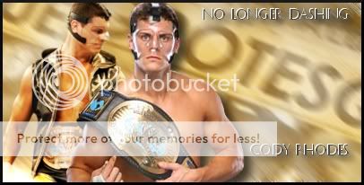
Rhodessig.jpg


I think this is my best work yet. I love the way i made the backround look, blending it with the grotesque images, and the two pictures of Rhodes fit perfectly together. I used the same idea for the text as my Christian sig above because i thought it looked proper in this sig.
Tell me your guys thoughts on what you think :D
 
JG450Backround.jpg


i havent been here in awhile, but i got some new work!

So i decided to do another one on Justin Gabriel. Hes my favourite wrestler and i needed that inspirtation to go ahead and make a sig.
First i made the south african flag, then used noise to give it a cool looking effect. Added some text and a pic of JG and there u go. pretty simple but took me a bit of time. i know i may be rusty but give me your feedback! appreciate all negative and positive :)
 

Users who are viewing this thread

Members online

No members online now.

Forum statistics

Threads
174,826
Messages
3,300,729
Members
21,726
Latest member
chrisxenforo
Back
Top